
a)
To explain: The set of values that appears to be distributed normally.
The second set of values appears to be
Given:The given set of values
| 5 |
| 7 |
| 7 |
| 7 |
| 4 |
| 11 |
| 7 |
| 7 |
| 7 |
| 9 |
| 7 |
| 7 |
Concept used:
The data which is symmetrical appears to be normally distributed and it has values of mean, median, and mode all three the same.
Calculation:
With reference to the given data, the second set of values has most of the values 7, so the mode of the data is 7 and the mean and median are calculated as shown below
Mean of the data set is
The median is the middle data point when data is arranged in ascending order as shown below
The middle value of the set of values is the average of the middle values at the 6th and 7th position
Conclusion:The median and mode of the set of values are 7 and the mean is 7.083. As the mean, median, and mode of set of values are the same and there are two values above 7, two values below 7 and the remaining values are 7. Thus it can be concluded that the second set of values is normally distributed.
b)
To plot: The histogram for the set of values that appears to be distributed normally.
The histogram of the given data is shown below
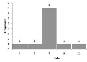
Given:The given set of values
| 4 | 5 | 7 | 7 | 7 | 7 | 7 | 7 | 7 | 7 | 9 | 11 |
Plot:
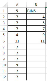
Enter the data in excel in one column and the bins as shown below
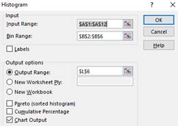
In excel click on Data → Data analysis → select Histogram and click ok.
Enter the input data rage and bin range in the window and select the output range and click on the option for chart output as shown below
Once the histogram is generated right click on the histogram to format the data series and adjust the gap width to get the following histogram.

c)
To plot: The normal curve on the histogram plotted for the set of values that appears to be distributed normally.
The normal curve on the histogram of the given data is shown below
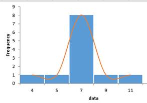
Given:The given set of values
| 4 | 5 | 7 | 7 | 7 | 7 | 7 | 7 | 7 | 7 | 9 | 11 |
Plot:
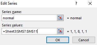
Right-click on the histogram and select the data to add the frequencies from the given data from the histogram output and name its series as normal as shown below
Now histogram with two bars for each data value is formed, right click on the histogram and change its chart type to
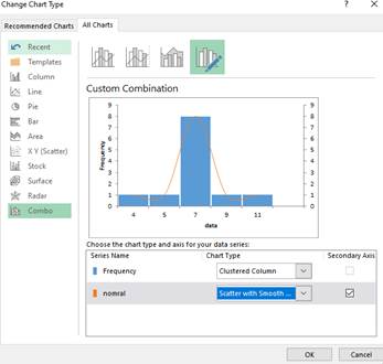
Once clicked ok, the histogram with normal curve is generated as shown below

Chapter 11 Solutions
High School Math 2015 Common Core Algebra 2 Student Edition Grades 10/11

 Algebra and Trigonometry (6th Edition)AlgebraISBN:9780134463216Author:Robert F. BlitzerPublisher:PEARSON
 Contemporary Abstract AlgebraAlgebraISBN:9781305657960Author:Joseph GallianPublisher:Cengage Learning
 Linear Algebra: A Modern IntroductionAlgebraISBN:9781285463247Author:David PoolePublisher:Cengage Learning
 Algebra And Trigonometry (11th Edition)AlgebraISBN:9780135163078Author:Michael SullivanPublisher:PEARSON
 Introduction to Linear Algebra, Fifth EditionAlgebraISBN:9780980232776Author:Gilbert StrangPublisher:Wellesley-Cambridge Press
 College Algebra (Collegiate Math)AlgebraISBN:9780077836344Author:Julie Miller, Donna GerkenPublisher:McGraw-Hill Education