Applied Calculus
7th Edition
ISBN: 9781337291248
Author: Waner, Stefan.
Publisher: Cengage Learning,
expand_more
expand_more
format_list_bulleted
Concept explainers
Videos
Textbook Question
Chapter 3.6, Problem 52E
SAT Scores by Income The following graph shown U.S. math SAT scores as a function of parents’ income level.81
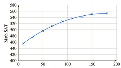
Income ($1,000).
The regression curve shown is given by
f(x)=−0.0034x2+1.2x+444 (10≤x≤180) where f(x) is the average math SAT score of a student whose parents earn x thousand dollars per year. Compute and interpret f′(30).
Expert Solution & Answer
Want to see the full answer?
Check out a sample textbook solution
Students have asked these similar questions
Graph y= log(x − 1) +4
10+
9
8
7
6
5
4
32
1
10 -9 -8 -7 -6 -5 -4 -3 -2 -1
1
2 3 4 5
-1
6 7 8 9 10
-2
-3
-4
-5
-6
-7
-8
-9
-10
Write an equation for the graph shown below.
5
4
3
2
1
-5-4-3-2-1
-1
1 2 3 4 5
f(x) =
-2
-3
-4
-5
1. We want to graph the function
f(x) log4 x. In a table below,
=
find at three points with nice
integer y-values (no rounding!) and
then graph the function at right. Be
sure to clearly indicate any
asymptotes. (4 points)
3
2
1-
-1
0
1
2
3
4 5
10
X
log4(x)
-1
-2
-3-
6 7
8
00
Chapter 3 Solutions
Applied Calculus
Ch. 3.1 - In Exercises 14, use the given table of values to...Ch. 3.1 - Prob. 2ECh. 3.1 - In Exercises 14, use the given table of values to...Ch. 3.1 - In Exercises 14, use the given table of values to...Ch. 3.1 - In Exercises 534, estimate the given limit...Ch. 3.1 - In Exercises 534, estimate the given limit...Ch. 3.1 - In Exercises 534, estimate the given limit...Ch. 3.1 - In Exercises 534, estimate the given limit...Ch. 3.1 - In Exercises 534, estimate the given limit...Ch. 3.1 - In Exercises 534, estimate the given limit...
Ch. 3.1 - In Exercises 534, estimate the given limit...Ch. 3.1 - In Exercises 534, estimate the given limit...Ch. 3.1 - In Exercises 534, estimate the given limit...Ch. 3.1 - In Exercises 534, estimate the given limit...Ch. 3.1 - In Exercises 534, estimate the given limit...Ch. 3.1 - Prob. 16ECh. 3.1 - In Exercises 534, estimate the given limit...Ch. 3.1 - In Exercises 534, estimate the given limit...Ch. 3.1 - Prob. 19ECh. 3.1 - Prob. 20ECh. 3.1 - In Exercises 534, estimate the given limit...Ch. 3.1 - In Exercises 534, estimate the given limit...Ch. 3.1 - In Exercises 534, estimate the given limit...Ch. 3.1 - In Exercises 534, estimate the given limit...Ch. 3.1 - In Exercises 534, estimate the given limit...Ch. 3.1 - In Exercises 534, estimate the given limit...Ch. 3.1 - In Exercises 534, estimate the given limit...Ch. 3.1 - In Exercises 534, estimate the given limit...Ch. 3.1 - In Exercises 534, estimate the given limit...Ch. 3.1 - In Exercises 534, estimate the given limit...Ch. 3.1 - In Exercises 534, estimate the given limit...Ch. 3.1 - Prob. 32ECh. 3.1 - Prob. 33ECh. 3.1 - Prob. 34ECh. 3.1 - In Exercises 3548 the graph of f is given. Use the...Ch. 3.1 - In Exercises 3548 the graph of f is given. Use the...Ch. 3.1 - In Exercises 3548 the graph of f is given. Use the...Ch. 3.1 - In Exercises 3548 the graph of f is given. Use the...Ch. 3.1 - In Exercises 3548 the graph of f is given. Use the...Ch. 3.1 - In Exercises 3548 the graph of f is given. Use the...Ch. 3.1 - Prob. 41ECh. 3.1 - Prob. 42ECh. 3.1 - Prob. 43ECh. 3.1 - Prob. 44ECh. 3.1 - Prob. 45ECh. 3.1 - In Exercises 3548 the graph of f is given. Use the...Ch. 3.1 - In Exercises 3548 the graph of f is given. Use the...Ch. 3.1 - In Exercises 3548 the graph of f is given. Use the...Ch. 3.1 - Doctorates in Mexico The annual number of PhD...Ch. 3.1 - Housing Starts The number s(t) ofhousing starts...Ch. 3.1 - Prob. 51ECh. 3.1 - Funding for NASA up to 1966 (Compare Exercise 51.)...Ch. 3.1 - Scientific Research: 19832003 The number of...Ch. 3.1 - Scientific Research: 19832003 The percentage of...Ch. 3.1 - SAT Scores by Income The following bar graph shows...Ch. 3.1 - SAT Scores by Income The following bar graph shows...Ch. 3.1 - Flash Crash The graph shows a rough representation...Ch. 3.1 - Flash Crash The graph shows a rough representation...Ch. 3.1 - Home Prices The following graph shows the values...Ch. 3.1 - Home Prices: Optimist Projection The following...Ch. 3.1 - Prob. 61ECh. 3.1 - Prob. 62ECh. 3.1 - Prob. 63ECh. 3.1 - Prob. 64ECh. 3.1 - Prob. 65ECh. 3.1 - Describe the method of evaluating limits...Ch. 3.1 - Prob. 67ECh. 3.1 - Prob. 68ECh. 3.1 - What is wrong with the following statement?...Ch. 3.1 - Prob. 70ECh. 3.1 - Prob. 71ECh. 3.1 - Prob. 72ECh. 3.1 - Prob. 73ECh. 3.1 - Prob. 74ECh. 3.2 - In Exercises 114 the graph of a function f is...Ch. 3.2 - In Exercises 114 the graph of a function f is...Ch. 3.2 - In Exercises 114 the graph of a function f is...Ch. 3.2 - In Exercises 114 the graph of a function f is...Ch. 3.2 - In Exercises 114 the graph of a function f is...Ch. 3.2 - In Exercises 114 the graph of a function f is...Ch. 3.2 - In Exercises 114 the graph of a function f is...Ch. 3.2 - In Exercises 114 the graph of a function f is...Ch. 3.2 - In Exercises 114 the graph of a function f is...Ch. 3.2 - In Exercises 114 the graph of a function f is...Ch. 3.2 - In Exercises 114 the graph of a function f is...Ch. 3.2 - Prob. 12ECh. 3.2 - Prob. 13ECh. 3.2 - Prob. 14ECh. 3.2 - In Exercises 15 and 16, identify which (if any) of...Ch. 3.2 - In Exercises 15 and 16, identify which (if any) of...Ch. 3.2 - Prob. 17ECh. 3.2 - In Exercises 1724, the graph of a function f is...Ch. 3.2 - In Exercises 1724, the graph of a function f is...Ch. 3.2 - In Exercises 1724, the graph of a function f is...Ch. 3.2 - In Exercises 1724, the graph of a function f is...Ch. 3.2 - In Exercises 1724, the graph of a function f is...Ch. 3.2 - In Exercises 1724, the graph of a function f is...Ch. 3.2 - In Exercises 1724, the graph of a function f is...Ch. 3.2 - In Exercises 2532, use a graph of f or some other...Ch. 3.2 - In Exercises 2532, use a graph of f or some other...Ch. 3.2 - In Exercises 2532, use a graph of f or some other...Ch. 3.2 - In Exercises 2532, use a graph of f or some other...Ch. 3.2 - In Exercises 2532, use a graph of f or some other...Ch. 3.2 - In Exercises 2532, use a graph of f or some other...Ch. 3.2 - In Exercises 2532, use a graph of f or some other...Ch. 3.2 - In Exercises 2532, use a graph of f or some other...Ch. 3.2 - In Exercises 3342, use a graph to determine...Ch. 3.2 - In Exercises 3342, use a graph to determine...Ch. 3.2 - Prob. 35ECh. 3.2 - Prob. 36ECh. 3.2 - In Exercises 3342, use a graph to determine...Ch. 3.2 - In Exercises 3342, use a graph to determine...Ch. 3.2 - In Exercises 3342, use a graph to determine...Ch. 3.2 - In Exercises 3342, use a graph to determine...Ch. 3.2 - In Exercises 3342, use a graph to determine...Ch. 3.2 - In Exercises 3342, use a graph to determine...Ch. 3.2 - Multiple choice: If f is defined on all real...Ch. 3.2 - Multiple choice: If f is defined on all real...Ch. 3.2 - Multiple choice: If f is defined only at a, then f...Ch. 3.2 - Multiple: choice If f is defined everywhere except...Ch. 3.2 - If a function is continuous on its domain, is it...Ch. 3.2 - True or false? The graph of a function that is...Ch. 3.2 - True or false? The graph of a function that is...Ch. 3.2 - Prob. 50ECh. 3.2 - Prob. 51ECh. 3.2 - Prob. 52ECh. 3.2 - Prob. 53ECh. 3.2 - Prob. 54ECh. 3.2 - Prob. 55ECh. 3.2 - Prob. 56ECh. 3.3 - In Exercises 14, complete the given sentence. The...Ch. 3.3 - In Exercises 14, complete the given sentence. The...Ch. 3.3 - In Exercises 14, complete the given sentence. The...Ch. 3.3 - Prob. 4ECh. 3.3 - In Exercises 520, determine whether the given...Ch. 3.3 - In Exercises 520, determine whether the given...Ch. 3.3 - Prob. 7ECh. 3.3 - In Exercises 520, determine whether the given...Ch. 3.3 - Prob. 9ECh. 3.3 - Prob. 10ECh. 3.3 - Prob. 11ECh. 3.3 - In Exercises 520, determine whether the given...Ch. 3.3 - In Exercises 520, determine whether the given...Ch. 3.3 - Prob. 14ECh. 3.3 - In Exercises 520, determine whether the given...Ch. 3.3 - Prob. 16ECh. 3.3 - Prob. 17ECh. 3.3 - Prob. 18ECh. 3.3 - Prob. 19ECh. 3.3 - Prob. 20ECh. 3.3 - Prob. 21ECh. 3.3 - In Exercises 21-74, calculate the limit...Ch. 3.3 - Prob. 23ECh. 3.3 - Prob. 24ECh. 3.3 - In Exercises 21-74, calculate the limit...Ch. 3.3 - In Exercises 21-74, calculate the limit...Ch. 3.3 - In Exercises 21-74, calculate the limit...Ch. 3.3 - In Exercises 21-74, calculate the limit...Ch. 3.3 - In Exercises 21-74, calculate the limit...Ch. 3.3 - In Exercises 21-74, calculate the limit...Ch. 3.3 - In Exercises 21-74, calculate the limit...Ch. 3.3 - In Exercises 21-74, calculate the limit...Ch. 3.3 - In Exercises 21-74, calculate the limit...Ch. 3.3 - In Exercises 21-74, calculate the limit...Ch. 3.3 - In Exercises 21-74, calculate the limit...Ch. 3.3 - In Exercises 21-74, calculate the limit...Ch. 3.3 - In Exercises 21-74, calculate the limit...Ch. 3.3 - Prob. 38ECh. 3.3 - Prob. 39ECh. 3.3 - Prob. 40ECh. 3.3 - Prob. 41ECh. 3.3 - Prob. 42ECh. 3.3 - In Exercises 21-74, calculate the limit...Ch. 3.3 - Prob. 44ECh. 3.3 - Prob. 45ECh. 3.3 - Prob. 46ECh. 3.3 - Prob. 47ECh. 3.3 - Prob. 48ECh. 3.3 - Prob. 49ECh. 3.3 - Prob. 50ECh. 3.3 - Prob. 51ECh. 3.3 - Prob. 52ECh. 3.3 - In Exercises 21-74, calculate the limit...Ch. 3.3 - Prob. 54ECh. 3.3 - Prob. 55ECh. 3.3 - Prob. 56ECh. 3.3 - In Exercises 21-74, calculate the limit...Ch. 3.3 - Prob. 58ECh. 3.3 - Prob. 59ECh. 3.3 - Prob. 60ECh. 3.3 - In Exercises 21-74, calculate the limit...Ch. 3.3 - In Exercises 21-74, calculate the limit...Ch. 3.3 - In Exercises 21-74, calculate the limit...Ch. 3.3 - In Exercises 21-74, calculate the limit...Ch. 3.3 - In Exercises 21-74, calculate the limit...Ch. 3.3 - Prob. 66ECh. 3.3 - Prob. 67ECh. 3.3 - Prob. 68ECh. 3.3 - Prob. 69ECh. 3.3 - Prob. 70ECh. 3.3 - Prob. 71ECh. 3.3 - Prob. 72ECh. 3.3 - Prob. 73ECh. 3.3 - Prob. 74ECh. 3.3 - In Exercises 75-88, identify all singular points...Ch. 3.3 - Prob. 76ECh. 3.3 - Prob. 77ECh. 3.3 - Prob. 78ECh. 3.3 - Prob. 79ECh. 3.3 - Prob. 80ECh. 3.3 - In Exercises 75-88, identify all singular points...Ch. 3.3 - In Exercises 75-88, identify all singular points...Ch. 3.3 - In Exercises 75-88, identify all singular points...Ch. 3.3 - Prob. 84ECh. 3.3 - In Exercises 75-88, identify all singular points...Ch. 3.3 - In Exercises 75-88, identify all singular points...Ch. 3.3 - Prob. 87ECh. 3.3 - Prob. 88ECh. 3.3 - Processor Speeds The processor speeds, in...Ch. 3.3 - Prob. 90ECh. 3.3 - Prob. 91ECh. 3.3 - Movie Advertising The percentage of movie...Ch. 3.3 - Prob. 93ECh. 3.3 - Law Enforcement in the 1980s and 1990s Refer to...Ch. 3.3 - SAT Scores by Income The following bar graph shows...Ch. 3.3 - SAT Scores by Income The following bar graph shows...Ch. 3.3 - Prob. 97ECh. 3.3 - Prob. 98ECh. 3.3 - Prob. 99ECh. 3.3 - Acquisition of Language The percentage q(t)...Ch. 3.3 - Prob. 101ECh. 3.3 - Prob. 102ECh. 3.3 - Prob. 103ECh. 3.3 - Prob. 104ECh. 3.3 - Why was the following marked wrong? What is the...Ch. 3.3 - Why was the following marked wrong? What is the...Ch. 3.3 - Your friend Karin tells you that f(x)=1/(x2)2...Ch. 3.3 - Prob. 108ECh. 3.3 - Prob. 109ECh. 3.3 - Prob. 110ECh. 3.3 - Prob. 111ECh. 3.3 - Prob. 112ECh. 3.3 - What is wrong with the following statement? If...Ch. 3.3 - What is wrong with the following statement? If...Ch. 3.3 - Prob. 115ECh. 3.3 - Prob. 116ECh. 3.3 - Prob. 117ECh. 3.3 - Prob. 118ECh. 3.4 - In Exercises 118, calculate the average rate of...Ch. 3.4 - Prob. 2ECh. 3.4 - In Exercises 118, calculate the average rate of...Ch. 3.4 - Prob. 4ECh. 3.4 - In Exercises 118, calculate the average rate of...Ch. 3.4 - In Exercises 118, calculate the average rate of...Ch. 3.4 - In Exercises 118, calculate the average rate of...Ch. 3.4 - In Exercises 118, calculate the average rate of...Ch. 3.4 - In Exercises 118, calculate the average rate of...Ch. 3.4 - In Exercises 118, calculate the average rate of...Ch. 3.4 - In Exercises 118, calculate the average rate of...Ch. 3.4 - In Exercises 118, calculate the average rate of...Ch. 3.4 - In Exercises 118, calculate the average rate of...Ch. 3.4 - In Exercises 118, calculate the average rate of...Ch. 3.4 - In Exercises 118, calculate the average rate of...Ch. 3.4 - In Exercises 118, calculate the average rate of...Ch. 3.4 - In Exercises 118, calculate the average rate of...Ch. 3.4 - In Exercises 118, calculate the average rate of...Ch. 3.4 - In Exercises 1924, calculate the average rate of...Ch. 3.4 - Prob. 20ECh. 3.4 - In Exercises 1924, calculate the average rate of...Ch. 3.4 - Prob. 22ECh. 3.4 - Prob. 23ECh. 3.4 - Prob. 24ECh. 3.4 - World Military Expenditure The following table...Ch. 3.4 - Education Expenditure The following table shows...Ch. 3.4 - Crude Oil Production: Mexico The following table...Ch. 3.4 - Offshore Crude Oil Production: Mexico The...Ch. 3.4 - Subprime Mortgages during the Housing Crisis The...Ch. 3.4 - Subprime Mortgage Debt during the Housing Crisis...Ch. 3.4 - Immigration to Ireland The following graph shows...Ch. 3.4 - Emigration from Ireland The following graph shows...Ch. 3.4 - Science Research in the United States The...Ch. 3.4 - Science Research in Europe The following table...Ch. 3.4 - College Basketball: Men The following chart shows...Ch. 3.4 - College Basketball: Women The following chart...Ch. 3.4 - Funding for the Arts State governments in the...Ch. 3.4 - Funding for the Arts The U.S. federal government...Ch. 3.4 - Market Index Joe Downs runs a small investment...Ch. 3.4 - Prob. 42ECh. 3.4 - Crude Oil Prices The price per barrel of crude oil...Ch. 3.4 - Median Home Prices The median home price in the...Ch. 3.4 - End of the Earth In 5 billion year the Sun will...Ch. 3.4 - Prob. 46ECh. 3.4 - The 2003 SARS Outbreak In the early stages of the...Ch. 3.4 - Prob. 48ECh. 3.4 - Prob. 49ECh. 3.4 - The 2014 Ebola Outbreak Repeat Exercise 49 using...Ch. 3.4 - Ecology Increasing numbers of manatees (sea...Ch. 3.4 - Prob. 52ECh. 3.4 - Prob. 53ECh. 3.4 - Prob. 54ECh. 3.4 - Describe three ways we have used to determine the...Ch. 3.4 - If f is a linear function of x with slope m, what...Ch. 3.4 - Is the average rate of change of a function over...Ch. 3.4 - If the average rate of change of a function over...Ch. 3.4 - Sketch the graph of a function whose average rate...Ch. 3.4 - Sketch the graph of a function whose average rate...Ch. 3.4 - Prob. 61ECh. 3.4 - Prob. 62ECh. 3.4 - Prob. 63ECh. 3.4 - A certain function f has the property that its...Ch. 3.4 - Prob. 65ECh. 3.4 - Prob. 66ECh. 3.4 - Prob. 67ECh. 3.4 - Prob. 68ECh. 3.5 - In Exercises 14, estimate the derivative from the...Ch. 3.5 - In Exercises 14, estimate the derivative from the...Ch. 3.5 - In Exercises 14, estimate the derivative from the...Ch. 3.5 - In Exercises 14, estimate the derivative from the...Ch. 3.5 - Consider the functions in Exercises 58 as...Ch. 3.5 - Consider the functions in Exercises 58 as...Ch. 3.5 - Consider the functions in Exercises 58 as...Ch. 3.5 - Consider the functions in Exercises 58 as...Ch. 3.5 - In Exercises 912 the function gives the cost to...Ch. 3.5 - In Exercises 912 the function gives the cost to...Ch. 3.5 - In Exercises 912 the function gives the cost to...Ch. 3.5 - In Exercises 912 the function gives the cost to...Ch. 3.5 - In Exercises 1316 the graph of a function is shown...Ch. 3.5 - In Exercises 1316 the graph of a function is shown...Ch. 3.5 - In Exercises 1316 the graph of a function is shown...Ch. 3.5 - In Exercises 1316 the graph of a function is shown...Ch. 3.5 - In Exercises 1722, say at which labeled point the...Ch. 3.5 - Prob. 18ECh. 3.5 - Prob. 19ECh. 3.5 - In Exercises 1722, say at which labeled point the...Ch. 3.5 - In Exercises 1722, say at which labeled point the...Ch. 3.5 - In Exercises 1722, say at which labeled point the...Ch. 3.5 - In each of Exercises 2326, three slopes are given....Ch. 3.5 - In each of Exercises 2326, three slopes are given....Ch. 3.5 - In each of Exercises 2326, three slopes are given....Ch. 3.5 - In each of Exercises 2326, three slopes are given....Ch. 3.5 - In Exercises 2730, find the approximate...Ch. 3.5 - Prob. 28ECh. 3.5 - Prob. 29ECh. 3.5 - Prob. 30ECh. 3.5 - Prob. 31ECh. 3.5 - Prob. 32ECh. 3.5 - Prob. 33ECh. 3.5 - Which is correct? The derivative function f(x)...Ch. 3.5 - Let f have the graph shown. a. The average rate of...Ch. 3.5 - A function f has the following graph. a. The...Ch. 3.5 - In Exercises 3740, use a quick approximation to...Ch. 3.5 - In Exercises 3740, use a quick approximation to...Ch. 3.5 - In Exercises 3740, use a quick approximation to...Ch. 3.5 - In Exercises 3740, use a quick approximation to...Ch. 3.5 - In Exercises 41-48, estimate the indicated...Ch. 3.5 - Prob. 42ECh. 3.5 - In Exercises 41-48, estimate the indicated...Ch. 3.5 - In Exercises 41-48, estimate the indicated...Ch. 3.5 - In Exercises 41-48, estimate the indicated...Ch. 3.5 - In Exercises 41-48, estimate the indicated...Ch. 3.5 - In Exercises 41-48, estimate the indicated...Ch. 3.5 - In Exercises 41-48, estimate the indicated...Ch. 3.5 - In Exercises 4954, (a) use any method to estimate...Ch. 3.5 - In Exercises 4954, (a) use any method to estimate...Ch. 3.5 - In Exercises 4954, (a) use any method to estimate...Ch. 3.5 - In Exercises 4954, (a) use any method to estimate...Ch. 3.5 - In Exercises 4954, (a) use any method to estimate...Ch. 3.5 - In Exercises 4954, (a) use any method to estimate...Ch. 3.5 - In Exercises 55-58, estimate the given quantity....Ch. 3.5 - In Exercises 55-58, estimate the given quantity....Ch. 3.5 - In Exercises 55-58, estimate the given quantity....Ch. 3.5 - In Exercises 55-58, estimate the given quantity....Ch. 3.5 - In Exercises 5964, match the graph of f to the...Ch. 3.5 - In Exercises 5964, match the graph of f to the...Ch. 3.5 - In Exercises 5964, match the graph of f to the...Ch. 3.5 - In Exercises 5964, match the graph of f to the...Ch. 3.5 - In Exercises 5964, match the graph of f to the...Ch. 3.5 - In Exercises 5964, match the graph of f to the...Ch. 3.5 - In Exercises 6568 the graph of a function is...Ch. 3.5 - In Exercises 6568 the graph of a function is...Ch. 3.5 - In Exercises 6568 the graph of a function is...Ch. 3.5 - In Exercises 6568 the graph of a function is...Ch. 3.5 - In Exercises 6972 the graph of the derivative of a...Ch. 3.5 - In Exercises 6972 the graph of the derivative of a...Ch. 3.5 - In Exercises 6972 the graph of the derivative of a...Ch. 3.5 - In Exercises 6972 the graph of the derivative of a...Ch. 3.5 - In Exercises 73 and 74, use technology to graph...Ch. 3.5 - In Exercises 73 and 74, use technology to graph...Ch. 3.5 - In Exercises 75 and 76, use the method of Example...Ch. 3.5 - In Exercises 75 and 76, use the method of Example...Ch. 3.5 - Temperatures on Mars The air temperature one...Ch. 3.5 - Temperatures on Venus The air temperature one...Ch. 3.5 - Demand Suppose the demand for a new brand of...Ch. 3.5 - Demand Suppose the demand for an old brand of TV...Ch. 3.5 - Oil Imports from Mexico The following graph shows...Ch. 3.5 - Oil Production in Mexico The following graph shows...Ch. 3.5 - Prison Population The following curve is a model...Ch. 3.5 - Demand for Freon 12 The demand for...Ch. 3.5 - Velocity If a stone is dropped from a height of...Ch. 3.5 - Velocity If a stone is thrown down at 120 ft/s...Ch. 3.5 - Crude Oil Prices The price per barrel of crude oil...Ch. 3.5 - Median Home Prices The median home price in the...Ch. 3.5 - The 2003 SARS Outbreak In the early stages of the...Ch. 3.5 - Prob. 90ECh. 3.5 - Prob. 91ECh. 3.5 - The 2014 Ebola Outbreak In the first 6 months of...Ch. 3.5 - Prob. 93ECh. 3.5 - Prob. 94ECh. 3.5 - Prob. 95ECh. 3.5 - Prob. 96ECh. 3.5 - Subprime Mortgages during the Housing Crisis (Com-...Ch. 3.5 - Prob. 98ECh. 3.5 - Prob. 99ECh. 3.5 - Embryo Development The oxygen consumption of a...Ch. 3.5 - Prob. 101ECh. 3.5 - Prob. 102ECh. 3.5 - Prob. 103ECh. 3.5 - Prob. 104ECh. 3.5 - Prob. 105ECh. 3.5 - Prob. 106ECh. 3.5 - Prob. 107ECh. 3.5 - Prob. 108ECh. 3.5 - Prob. 109ECh. 3.5 - Prob. 110ECh. 3.5 - Prob. 111ECh. 3.5 - Prob. 112ECh. 3.5 - Prob. 113ECh. 3.5 - Prob. 114ECh. 3.5 - If the derivative of f is zero at a point, what do...Ch. 3.5 - Prob. 116ECh. 3.5 - Prob. 117ECh. 3.5 - Prob. 118ECh. 3.5 - Prob. 119ECh. 3.5 - Prob. 120ECh. 3.5 - Prob. 121ECh. 3.5 - Prob. 122ECh. 3.5 - Prob. 123ECh. 3.5 - Prob. 124ECh. 3.5 - Prob. 125ECh. 3.5 - Prob. 126ECh. 3.5 - Prob. 127ECh. 3.5 - Prob. 128ECh. 3.5 - Prob. 129ECh. 3.5 - Draw the graph of a function f with the property...Ch. 3.6 - In Exercises 1-14, compute f(a) algebraically for...Ch. 3.6 - Prob. 2ECh. 3.6 - Prob. 3ECh. 3.6 - Prob. 4ECh. 3.6 - In Exercises 1-14, compute f(a) algebraically for...Ch. 3.6 - In Exercises 1-14, compute f(a) algebraically for...Ch. 3.6 - Prob. 7ECh. 3.6 - Prob. 8ECh. 3.6 - Prob. 9ECh. 3.6 - Prob. 10ECh. 3.6 - In Exercises 1-14, compute f(a) algebraically for...Ch. 3.6 - In Exercises 1-14, compute f(a) algebraically for...Ch. 3.6 - Prob. 13ECh. 3.6 - Prob. 14ECh. 3.6 - Prob. 15ECh. 3.6 - Prob. 16ECh. 3.6 - Prob. 17ECh. 3.6 - Prob. 18ECh. 3.6 - In Exercises 15-28, compute the derivative...Ch. 3.6 - In Exercises 15-28, compute the derivative...Ch. 3.6 - In Exercises 15-28, compute the derivative...Ch. 3.6 - In Exercises 15-28, compute the derivative...Ch. 3.6 - Prob. 23ECh. 3.6 - Prob. 24ECh. 3.6 - Prob. 25ECh. 3.6 - In Exercises 15-28, compute the derivative...Ch. 3.6 - In Exercises 15-28, compute the derivative...Ch. 3.6 - In Exercises 15-28, compute the derivative...Ch. 3.6 - In Exercises 29-38, compute the indicated...Ch. 3.6 - Prob. 30ECh. 3.6 - Prob. 31ECh. 3.6 - Prob. 32ECh. 3.6 - In Exercises 29-38, compute the indicated...Ch. 3.6 - Prob. 34ECh. 3.6 - Prob. 35ECh. 3.6 - Prob. 36ECh. 3.6 - In Exercises 29-38, compute the indicated...Ch. 3.6 - In Exercises 29-38, compute the indicated...Ch. 3.6 - In Exercises39-44, find the equation of the...Ch. 3.6 - In Exercises39-44, find the equation of the...Ch. 3.6 - In Exercises39-44, find the equation of the...Ch. 3.6 - In Exercises39-44, find the equation of the...Ch. 3.6 - In Exercises39-44, find the equation of the...Ch. 3.6 - In Exercises39-44, find the equation of the...Ch. 3.6 - Velocity If a stone is dropped from a height of...Ch. 3.6 - Velocity If a stone is dropped from a height of...Ch. 3.6 - Oil Imports from Mexico Daily crude oil imports to...Ch. 3.6 - Prob. 48ECh. 3.6 - Bottled Water Sales The following chart shows the...Ch. 3.6 - Bottled Water Sales The following chart shows...Ch. 3.6 - Prob. 51ECh. 3.6 - SAT Scores by Income The following graph shown...Ch. 3.6 - Television Advertising The cost, in thousands of...Ch. 3.6 - Television Advertising (Compare Exercises 53.) The...Ch. 3.6 - Of the three methods (numerical, graphical, and...Ch. 3.6 - Explain why we cannot put h=0 in the formula...Ch. 3.6 - You just got your derivatives test back, and you...Ch. 3.6 - Your friend just got his derivatives test back and...Ch. 3.6 - Your other friend just got her derivatives test...Ch. 3.6 - Your third friend just got her derivatives test...Ch. 3.6 - Your friend Muffy claims that, because the...Ch. 3.6 - Use the balanced difference quotient formula,...Ch. 3.6 - A certain function f has the property that f(a)...Ch. 3.6 - One cannot put h=0 in the formula...Ch. 3 - In Exercise 1-4, numerically estimate whether the...Ch. 3 - Prob. 2RECh. 3 - Prob. 3RECh. 3 - Prob. 4RECh. 3 - Prob. 5RECh. 3 - Prob. 6RECh. 3 - In Exercises 730, calculate the limit...Ch. 3 - Prob. 8RECh. 3 - Prob. 9RECh. 3 - Prob. 10RECh. 3 - Prob. 11RECh. 3 - Prob. 12RECh. 3 - Prob. 13RECh. 3 - Prob. 14RECh. 3 - Prob. 15RECh. 3 - Prob. 16RECh. 3 - In Exercises 730, calculate the limit...Ch. 3 - Prob. 18RECh. 3 - Prob. 19RECh. 3 - Prob. 20RECh. 3 - Prob. 21RECh. 3 - Prob. 22RECh. 3 - Prob. 23RECh. 3 - Prob. 24RECh. 3 - Prob. 25RECh. 3 - Prob. 26RECh. 3 - Prob. 27RECh. 3 - Prob. 28RECh. 3 - Prob. 29RECh. 3 - Prob. 30RECh. 3 - Prob. 31RECh. 3 - Prob. 32RECh. 3 - In Exercises 31-34, find the average rate of...Ch. 3 - In Exercises 31-34, find the average rate of...Ch. 3 - Prob. 35RECh. 3 - Prob. 36RECh. 3 - Prob. 37RECh. 3 - Prob. 38RECh. 3 - Prob. 39RECh. 3 - Prob. 40RECh. 3 - Prob. 41RECh. 3 - Prob. 42RECh. 3 - Prob. 43RECh. 3 - Prob. 44RECh. 3 - Prob. 45RECh. 3 - Prob. 46RECh. 3 - Prob. 47RECh. 3 - Prob. 48RECh. 3 - Prob. 49RECh. 3 - Prob. 50RECh. 3 - Real Estate Marjory Duffin has persuaded John...Ch. 3 - Advertising Costs OHaganBooks.com has (on further...Ch. 3 - Sales Since the start of July, OHaganBooks.com has...Ch. 3 - Rising Sea Level Marjory Duffin recently purchased...Ch. 3 - Prob. 55RECh. 3 - Prob. 56RECh. 3 - Prob. 57RECh. 3 - Prob. 58RECh. 3 - Excluding subsidies, what should the annual...Ch. 3 - Excluding subsidies, what should the annual...Ch. 3 - What is the marginal emission charge (derivative...Ch. 3 - Prob. 4CSCh. 3 - Prob. 5CSCh. 3 - If the scenario in Exercise 5 took place, what...Ch. 3 - Prob. 7CSCh. 3 - Prob. 8CS
Knowledge Booster


Learn more about
Need a deep-dive on the concept behind this application? Look no further. Learn more about this topic, calculus and related others by exploring similar questions and additional content below.Similar questions
- Graph y=log2(x+3) 10+ 9 8 7- 6 5 4 3 3 2 1 10 -9 -8 -7 -6 -5 -4 -3-2-1 1 2 3 4 5 6 7 8 7 8 9 10 -1 -2 -3 -4 -5 -6 -7- -8 -9 -10 Clear All Drawarrow_forwardWrite an equation for the graph below. +10+ 9 10 -9 -8 -7 -6 -5 -4 -3-2-1 8 7 6 5 4 3 2 1 1 3 4 5 6 7 8 9 10 -1 -2 -3 -4 -5 -6 -7 -8 f(x) = 9 -9 -10-arrow_forward3. Solve the inequality and give your answer in interval notation. Be sure to show all your work, and write neatly so your work is easy to follow. (4 points) 2|3x+12 ≥ 18arrow_forward
- - 2. In words, interpret the inequality |x8|> 7 the same way I did in the videos. Note: the words "absolute value" should not appear in your answer! (2 points)arrow_forwardFind the tangential and normal components of the acceleration vector for the curve (t) = (2t, -3t5,-3+4) at the point t = 1 ā(1) = T + N Give your answers to two decimal placesarrow_forwardA gun is fired with muzzle velocity 1152 feet per second at a target 4150 feet away. Find the minimum angle of elevation necessary to hit the target. Assume the initial height of the bullet is 0 feet, neglect air resistance, and give your answer in degrees.arrow_forward
- "Use the Opposite Method to solve the following differential equation:" 4'"""" + 34" + 34 + 4 = xarrow_forwardFor the curve defined by (t) = (e cos(t), et sin(t)) find the unit tangent vector, unit normal vector, normal acceleration, and tangential acceleration at πT t = 3 П I(3) 丌_3_3 N (1) ат aN || = = =arrow_forwardFind the velocity vector for the position vector (t) = (sin(9+), 9t10, e¯7). x component = y component = Z component =arrow_forward
- In the xy-plane, an angle 0, in standard position, has a measure of the following is true? T. Which of 3 A The slope of the terminal ray of the angle is 1. B The slope of the terminal ray of the angle is 1. C D 3 The slope of the terminal ray of the angle is ✓ 2 The slope of the terminal ray of the angle is √3.arrow_forwardy'''-3y''+4y=e^2x Find particular solutionarrow_forward1 -1- Ο Graph of f y = + y = 1 + 1/2 ·2· x Graph of g y = 1- 플 The figure gives the graphs of the functions f and g in the xy-plane. The function of is given by f(x) = tan¹ x. Which of the following defines g(x)? A tan 1 x + 1 B - tan 1 x + П 2 C tan-1 (2/2) + 1 D tan-1 (2/2) + 1/1arrow_forward
arrow_back_ios
SEE MORE QUESTIONS
arrow_forward_ios
Recommended textbooks for you
 Algebra & Trigonometry with Analytic GeometryAlgebraISBN:9781133382119Author:SwokowskiPublisher:Cengage
 Algebra and Trigonometry (MindTap Course List)AlgebraISBN:9781305071742Author:James Stewart, Lothar Redlin, Saleem WatsonPublisher:Cengage Learning
 College AlgebraAlgebraISBN:9781305115545Author:James Stewart, Lothar Redlin, Saleem WatsonPublisher:Cengage Learning
 Glencoe Algebra 1, Student Edition, 9780079039897...AlgebraISBN:9780079039897Author:CarterPublisher:McGraw Hill
 Functions and Change: A Modeling Approach to Coll...AlgebraISBN:9781337111348Author:Bruce Crauder, Benny Evans, Alan NoellPublisher:Cengage Learning
Algebra & Trigonometry with Analytic Geometry
Algebra
ISBN:9781133382119
Author:Swokowski
Publisher:Cengage
Algebra and Trigonometry (MindTap Course List)
Algebra
ISBN:9781305071742
Author:James Stewart, Lothar Redlin, Saleem Watson
Publisher:Cengage Learning
College Algebra
Algebra
ISBN:9781305115545
Author:James Stewart, Lothar Redlin, Saleem Watson
Publisher:Cengage Learning
Glencoe Algebra 1, Student Edition, 9780079039897...
Algebra
ISBN:9780079039897
Author:Carter
Publisher:McGraw Hill
Functions and Change: A Modeling Approach to Coll...
Algebra
ISBN:9781337111348
Author:Bruce Crauder, Benny Evans, Alan Noell
Publisher:Cengage Learning
Correlation Vs Regression: Difference Between them with definition & Comparison Chart; Author: Key Differences;https://www.youtube.com/watch?v=Ou2QGSJVd0U;License: Standard YouTube License, CC-BY
Correlation and Regression: Concepts with Illustrative examples; Author: LEARN & APPLY : Lean and Six Sigma;https://www.youtube.com/watch?v=xTpHD5WLuoA;License: Standard YouTube License, CC-BY