
Concept explainers
Videos
To analyze:
The trends observed from the given graph; the trend that has been observed over time in the bee pollination date and in mean April temperature; the reason due to which the two trends moved in opposite directions and the significance of the difference in slope of the entire time period
versus the shorter time period, after 1970.
Given:
The scatter plots of the distribution, for the dates that are predicted for pollination by individual bee species, has been plotted in the top graph (between the years 1870–2010) and for the mean April air temperature (1900–2010) has been plotted in the bottom graph.
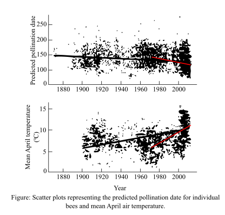
Introduction:
The scientists took 10 bee species and observed their pollination trends across North America. The trends between the pollination time by individual bee species and the flowering of plants during spring season was observed. These trends were also correlated with the mean air temperature of April (spring season occurs in North America during the April month). All these trends were observed for about 13 years.
Want to see the full answer?
Check out a sample textbook solution
Chapter 55 Solutions
Life: The Science of Biology


- Indicate the average direction of change (increase, decrease, or no change) observed between 1850 and 2015 for the following labelled components of the figure: A Incoming solar radiation: C Temperature of lower atmosphere: D Water vapor: F Sea ice area: G Ocean pH: K Sea level: L Ocean heat content:arrow_forwardData set 1 Date of peak cherry-blossom bloom, Kyoto, Japan May 1st Trend Apr 14th Apr 1st 2021 Mar 26th Mar 25th 800 1000 1200 1400 1600 1800 2020 Year Source: Yasuyuki Aono, Osaka Prefecture University The Economist Data set 2 Cherry blossoms peak bloom dates and March temperatures over time (1921-2011) 60 4/29 55 4/19 50 4/9- 45 以30 40 3/20 -Peak bloom date 35 -March temperature 3/10 30 1919 1939 1959 1979 1999 Year MAY 15 tv MacBook Air 000 000 DII DD Bloom date Temperaturearrow_forwardWhich of the following statements explains why temperature is considered a reliable metric to investigate climate change? Select all that apply: a. changes in other aspects of climate, such as precipitation or sea level, are a response to the temperature change b. there is a long-term global database for temperature c. temperature has been measured directly for millennia d. global temperature measurements include weather variabilityarrow_forward
- The graph shows that the atmosphere is currently warmer than it has been in Global Mean Temperature over Land & Ocean 0.6 0.4 0.2 0.0 -0.2 -0.4 -0.6 L 1 1940 1920 1960 anomaly ("C) relative to 1961-1990 1880 1900 O 100 years O 1,000 years O 120 years O 1,200 years year ↓ L 1980 2000arrow_forwardHere is some data about sea level rise in the Chesapeake Bay. The data shows the change in sea level over time. Notice that there are four sea level measurements per year because they are done during each season (fall, winter, summer, and spring). Sea Level Rise Year 0.5 mm 1980 0.4 mm 1980 0.4 mm 1980 0.2 mm 1980 Average 0.6 mm 1990 0.4 mm 1990 0.8 mm 1990 0.5 mm 1990 Average 0.5 mm 2000 0.6 mm 2000 0.9 mm 2000 0.8 mm 2000 Average 0.9 2010 0.8 2010 1.0 2010 1.3 2010 Average Calculate the average sea level rise for each year and fill in the table above. Now create an Excel graph (or use some graphing software) to portray the data from the table above. Insert the graph below. According to the data how is the sea level rise changing over time? Make a prediction for the 2020 measurements. What do you expect to see…arrow_forwardWhich of the following patterns of cars parked along a street is an example of uniform dispersion? (a) five cars parked next to one another in the middle, leaving two empty spaces at one end and three empty spaces at theother end (b) five cars parked in this pattern: car, empty space, car, empty space, and so on (c) five cars parked in no discernible pattern, sometimes having empty spaces on each side and sometimes parked next to another cararrow_forward
- In this graph, from what day to what day would be considered the lag phase, exponential phase, and if applicable, the stationary phase?arrow_forwardData set 1 Date of peak cherry-blossom bloom, Kyoto, Japan May 1st Trend Apr 14th Apr 1st 2021 Mar 26th Mar 25th 800 1000 1200 1400 1600 1800 2020 Year Source: Yasuyuki Aono, Osaka Prefecture University The Economist Data set 2 Cherry blossoms peak bloom dates and March temperatures over time (1921-2011) 4/29 - 60 55 4/19 50 4/9- 45 3/30 - 40 3/20 Peak bloom dote 35 -March temperature 3/10 30 1919 1939 1959 1979 1999 Year Prompt- What is the effect of global warming on the blooming of cherry trees in Japan and Washington DC? Write your evidence section including the following: * Description of the change in blooming times in Japan including quantitative data (numbers) from the graph. * Description of the change in blooming times in Washington DC including quantitative data (numbers) from the graph. MAY 15 ottv MacBook Air Bloom date emperaturearrow_forwardA study examined the effects of artificial soil warming of 2.5°, 5.0° and 7.5°C. compared to reference conditions (REF), on the decomposition rates of two tree species, American beech and sugar maple. What can you conclude from the findings given in Fig. 4 (above)?arrow_forward
- Which of the following statements about atmospheric carbon dioxide levels is correct? For about 800,000 years prior to human influence it varied between 180 and 300 ppm and is now above 410 ppm. For about 800,000 years prior to human influence it never exceeded 200 ppm. Its rate of increase in the past century is greater than any seen in the ice core record. Both 1 & 3arrow_forwardThe graphs below represent changes in atmospheric carbon dioxide concentration and Antarctic temperature over the past 800,000 years. Which of the following statements accurately explains the trends in the concentration of atmospheric carbon dioxide from 200,000 years to the present? * 400 350 8 4 300 250 8- 200 -12 800,000 150 600,000 400,000 200,000 Years Before Present Atmospheric carbon dioxide concentrations have remained constant between 200,000 years ago until 50,000 years ago, after which they declined steadily. Atmospheric carbon dioxide concentrations increased exponentially until reaching a carrying capacity of 400ppm. Atmospheric carbon dioxide concentrations have risen and fallen between 150ppm and 250ppm until rising exponentially in recent years. Atmospheric carbon dioxide concentrations have risen and fallen between 175ppm and 330ppm. Temperature (°C) Concentration (ppm)arrow_forwardWhat is the relationship between changes in cone production and changes in growing season temperatures?Why might this relationship exist (provide 1–2 potential explanations)arrow_forward
 Case Studies In Health Information ManagementBiologyISBN:9781337676908Author:SCHNERINGPublisher:Cengage