Videos
To graph: The
Explanation of Solution
Given information:
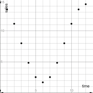
The data is mentioned below.
Graph:
The scatter plot of the data is mentioned below in which x axis represent the time of the months and y axis represent the average sales of the outerwear manufacturer.
The scatter plot is plotted in the real number line.
Interpretation:
Since the scatter plot is made as according of the data mentioned above.
Therefore the nature of the scatter plot is first decreasing and then increasing which shows that there is no relationship of the scatter plot.
Chapter 4 Solutions
EBK PRECALCULUS W/LIMITS


 Calculus: Early TranscendentalsCalculusISBN:9781285741550Author:James StewartPublisher:Cengage Learning
 Thomas' Calculus (14th Edition)CalculusISBN:9780134438986Author:Joel R. Hass, Christopher E. Heil, Maurice D. WeirPublisher:PEARSON
 Calculus: Early Transcendentals (3rd Edition)CalculusISBN:9780134763644Author:William L. Briggs, Lyle Cochran, Bernard Gillett, Eric SchulzPublisher:PEARSON
 Calculus: Early TranscendentalsCalculusISBN:9781319050740Author:Jon Rogawski, Colin Adams, Robert FranzosaPublisher:W. H. Freeman
 Calculus: Early Transcendental FunctionsCalculusISBN:9781337552516Author:Ron Larson, Bruce H. EdwardsPublisher:Cengage Learning