
Introduction To Statistics And Data Analysis
6th Edition
ISBN: 9781337793612
Author: PECK, Roxy.
Publisher: Cengage Learning,
expand_more
expand_more
format_list_bulleted
Concept explainers
Videos
Textbook Question
Chapter 3.5, Problem 50E
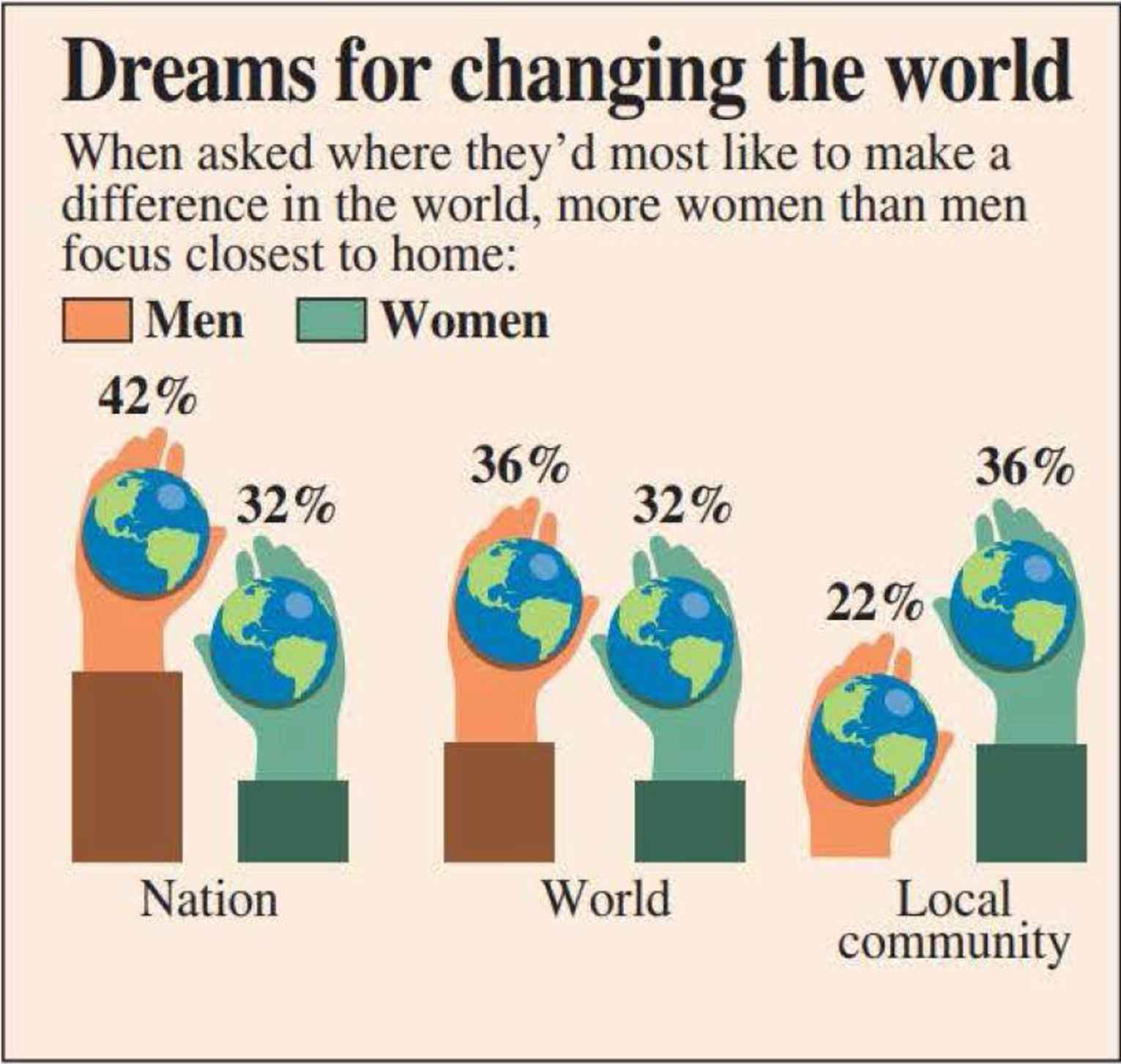
The figure at the top right of the next page is similar to one that appeared in USA TODAY (August 5, 2008). This graph is a modified comparative bar chart. Most likely, the modifications (incorporating hands and the earth) were made to try to make a display that readers would find more interesting.
- a. Use the information in the USA TODAY graph to construct a traditional comparative bar chart.
- b. Explain why the modifications made in the USA TODAY graph may make interpretation more difficult than with the traditional comparative bar chart.
Expert Solution & Answer

Trending nowThis is a popular solution!

Students have asked these similar questions
What is the importance of using pie/bar charts or graph when representing data?
Suppose you need to summarize ordinal data in a bar graph. How would you arrange the categories of data on the horizontal axis? Is it possible to make the order of the data apparent in a pie chart?
Give a brief analysis of the data found in the bar graph and pie chart attached.
Chapter 3 Solutions
Introduction To Statistics And Data Analysis
Ch. 3.1 - Each person in a nationally representative sample...Ch. 3.1 - The graphical display on the next page is similar...Ch. 3.1 - The survey referenced in the previous exercise was...Ch. 3.1 - The National Confectioners Association asked 1006...Ch. 3.1 - College student attitudes about e-books were...Ch. 3.1 - The Center for Science in the Public Interest...Ch. 3.1 - Using the data given in the previous exercise,...Ch. 3.1 - The article Housework around the World (USA TODAY,...Ch. 3.1 - The authors of the report Findings from the 2009...Ch. 3.1 - The survey on student attitude toward e-books...
Ch. 3.1 - During 2017, Gallup conducted a survey of adult...Ch. 3.1 - An article about college loans (New Rules Would...Ch. 3.1 - The report Findings From the 2014 College Senior...Ch. 3.2 - The National Center for Health Statistics provided...Ch. 3.2 - The paper State-Level Cancer Mortality...Ch. 3.2 - The accompanying data on seat belt use for each of...Ch. 3.2 - The previous exercise gave data on seat belt use...Ch. 3.2 - The U.S. Department of Health and Human Services...Ch. 3.2 - The article Economy Low, Generosity High (USA...Ch. 3.2 - The U.S. gasoline tax per gallon data for each of...Ch. 3.2 - A report from Texas Transportation Institute...Ch. 3.2 - The percentage of teens not in school or working...Ch. 3.3 - The data in the accompanying table are from the...Ch. 3.3 - The accompanying data on annual maximum wind speed...Ch. 3.3 - The accompanying relative frequency table is based...Ch. 3.3 - The data in the accompanying table represents the...Ch. 3.3 - Construct a histogram for the data in the previous...Ch. 3.3 - The following two relative frequency distributions...Ch. 3.3 - U.S. Census data for San Luis Obispo County,...Ch. 3.3 - Use the commute time data given in the previous...Ch. 3.3 - The report Trends in College Pricing 2012...Ch. 3.3 - An exam is given to students in an introductory...Ch. 3.3 - The accompanying frequency distribution summarizes...Ch. 3.3 - Example 3.19 used annual rainfall data for...Ch. 3.3 - Use the relative frequency distribution...Ch. 3.3 - Prob. 37ECh. 3.3 - Use the cumulative relative frequencies given in...Ch. 3.3 - Using the five class intervals 100 to 120, 120 to...Ch. 3.4 - The accompanying table gives data from a survey of...Ch. 3.4 - Consumer Reports Health (consumerreports.org) gave...Ch. 3.4 - Consumer Reports rated 29 fitness trackers (such...Ch. 3.4 - Consumer Reports (consumerreports.org) rated 37...Ch. 3.4 - The Solid Waste Management section of the...Ch. 3.4 - The report Daily Cigarette Use: Indicators on...Ch. 3.4 - The accompanying time series plot of movie box...Ch. 3.5 - The accompanying comparative bar chart is similar...Ch. 3.5 - The figure at the top left of the next page is...Ch. 3.5 - The figure at the top right of the next page is...Ch. 3.5 - The two graphical displays below are similar to...Ch. 3.5 - The following graphical display is similar to one...Ch. 3.5 - Explain why the following graphical display...Ch. 3 - Each year, The Princeton Review conducts surveys...Ch. 3 - Prob. 55CRCh. 3 - Prob. 56CRCh. 3 - Prob. 57CRCh. 3 - Prob. 58CRCh. 3 - Does the size of a transplanted organ matter? A...Ch. 3 - Prob. 60CRCh. 3 - The article Tobacco and Alcohol Use in G-Rated...Ch. 3 - Prob. 62CRCh. 3 - Prob. 63CRCh. 3 - Many nutritional experts have expressed concern...Ch. 3 - Americium 241 (241Am) is a radioactive material...Ch. 3 - Does eating broccoli reduce the risk of prostate...Ch. 3 - An article that appeared in USA TODAY (August 11,...Ch. 3 - Sometimes samples are composed entirely of...Ch. 3 - Prob. 4CRECh. 3 - More than half of Californias doctors say they are...Ch. 3 - Based on observing more than 400 drivers in the...Ch. 3 - An article from the Associated Press (May 14,...Ch. 3 - Prob. 8CRECh. 3 - Prob. 9CRECh. 3 - Prob. 10CRECh. 3 - The article Determination of Most Representative...Ch. 3 - The paper Lessons from Pacemaker Implantations...Ch. 3 - How does the speed of a runner vary over the...Ch. 3 - Prob. 14CRECh. 3 - One factor in the development of tennis elbow, a...Ch. 3 - An article that appeared in USA TODAY (September...
Additional Math Textbook Solutions
Find more solutions based on key concepts
Ten equally qualified marketing assistants are candidates for promotion to associate buyer; seven are men and t...
An Introduction to Mathematical Statistics and Its Applications (6th Edition)
z Scores. In Exercises 5-8, express all z scores with two decimal places.
8. Plastic Waste Data Set 31 “Garbage...
Elementary Statistics Using Excel (6th Edition)
1. Each of the following processes involves sampling from a population. Define the population, and state whethe...
Statistics for Engineers and Scientists
UW Student survey In a University of Wisconsin (UW) study about alcohol abuse among students, 100 of the 40,858...
Statistics: The Art and Science of Learning from Data (4th Edition)
How much time do Americans living in or near cities spend waiting in traffic, and how much does waiting in traf...
Business Statistics: A First Course (7th Edition)
c
Solve.
70. Copy Center Account. Rachel’s copy-center bill for July was $327. She made a payment of $200 and t...
Developmental Mathematics (9th Edition)
Knowledge Booster


Learn more about
Need a deep-dive on the concept behind this application? Look no further. Learn more about this topic, statistics and related others by exploring similar questions and additional content below.Similar questions
- Interpret the table following the suggested guidlines.arrow_forwardDraw the correct bar graph of obesity rates for Maine, Florida, Mississippi, Colorado, and Wisconsin. Would you please explain for understanding?arrow_forwardWhich statement about the choir members is supported by the data in the bar grapharrow_forward
- What data are best displayed on a circle graph? On a bar graph?arrow_forwardWhich statement accurately reflects qualitative and quantitative data? a.Height is qualitative and favorite color is qualitative. b.Height is qualitative and favorite color is quantitative. c.Height is quantitative and favorite color is quantitative. d.Height is quantitative and favorite color is qualitative.arrow_forwardplease interpret the bar grapharrow_forward
- explain WHY this pie chart needs improving and HOW you would improve it.arrow_forwardThe speed, in miles per hour, of Mario's serves during tennis practice is shown in the stem-and-leaf plot below. a. What is the range of the speeds, in miles per hour, of Mario's tennis serves? Show or explain how you got your answer. b.What is the mode of the speeds, in miles per hour, of Mario's tennis serves? Show or explain how you got your answer. c.What is the median speed, in miles per hour, of Mario's tennis serves? Show or explain how you got your answer. d. The speed of one additional tennis serve will be added to Mario's stem-and-leaf plot. What is the greatest amount, in miles per hour, the median speed can change? Show or explain how you got your answer.arrow_forwardWhat type of relationship is indicated in the scatterplot7arrow_forward
- identify which data sets you would display with a bar graph and which you would display with a histogramarrow_forwardRoman, a health data officer, was tasked to create a report describing the height of all the children ages 12-15 years in a small town in Rome. He measured the height of all the 37 children (ages 12-15 years) in that small town. Create a table showing the number and percentage of children ages 12 to 15 years according to sex.arrow_forwardWhat is the main advantage of using a circle graph over a bar graph? It is easier to read specific data points on a circle graph It is easier to see the relationship between the parts and the whole It is easier to see how the parts compare to one another It is easier to distort data with a circle grapharrow_forward
arrow_back_ios
SEE MORE QUESTIONS
arrow_forward_ios
Recommended textbooks for you
 Holt Mcdougal Larson Pre-algebra: Student Edition...AlgebraISBN:9780547587776Author:HOLT MCDOUGALPublisher:HOLT MCDOUGAL
 Elementary Geometry for College StudentsGeometryISBN:9781285195698Author:Daniel C. Alexander, Geralyn M. KoeberleinPublisher:Cengage Learning
Holt Mcdougal Larson Pre-algebra: Student Edition...
Algebra
ISBN:9780547587776
Author:HOLT MCDOUGAL
Publisher:HOLT MCDOUGAL
Elementary Geometry for College Students
Geometry
ISBN:9781285195698
Author:Daniel C. Alexander, Geralyn M. Koeberlein
Publisher:Cengage Learning
Finding the length of an arc; Author: Maths Genie;https://www.youtube.com/watch?v=fWGPf5peCc8;License: Standard YouTube License, CC-BY
Circles, Angle Measures, Arcs, Central & Inscribed Angles, Tangents, Secants & Chords - Geometry; Author: The Organic Chemistry Tutor;https://www.youtube.com/watch?v=nd46bA9DKE0;License: Standard Youtube License