Number of College Faculty The number of faculty listed for a sample of private colleges that offer only bachelor’s degrees is listed below. Use these data to construct a frequency distribution with 7 classes, a histogram, a frequency

A grouped frequency distribution with 7 classes and draw a histogram, frequency polygon, and ogive; the explanation of these shapes and calculate the proportions of schools that have 180 or more faculty.
Answer to Problem 4E
Output using EXCEL software is given below:
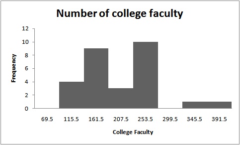
Histogram:

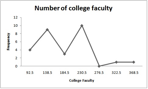
Frequency polygon:

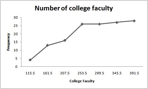
Ogive:

The proportion of schools that has 180 or more faculty is 0.448.
Explanation of Solution
Given info:
The data shows the number of college faculty listed in the table is given below:
| 165 | 221 | 218 | 206 | 138 | 135 | 224 | 204 |
| 70 | 210 | 207 | 154 | 155 | 82 | 120 | 116 |
| 176 | 162 | 225 | 214 | 93 | 389 | 77 | 135 |
| 221 | 161 | 128 | 310 |
Calculation:
The class boundaries for any class are given by:
Where,
The grouped frequency distribution is as follows:
| Class limit | Class boundaries | Tally | Frequency |
| 70-115 | 69.5-115.5 |
|
4 |
| 116-161 | 115.5-161.5 |
|
9 |
| 162-207 | 161.5-207.5 |
|
3 |
| 208-253 | 207.5-253.5 |
|
10 |
| 254-299 | 253.5-299.5 | 0 | |
| 300-345 | 299.5-345.5 | | | 1 |
| 346-391 | 345.5-391.5 | | | 1 |
| Total | 28 |
The midpoint of class boundaries is obtained by adding lower and upper limit and dividing by 2.
The relative frequency is the ration of a class frequency to the total frequency. Cumulative relative frequency can also defined as the sum of all previous frequencies up to the current point.
| Class boundaries | Mid point | Frequency | Cumulative frequency |
| 69.5-115.5 | 92.5 | 4 | 4 |
| 115.5-161.5 | 138.5 | 9 | 13 |
| 161.5-207.5 | 184.5 | 3 | 16 |
| 207.5-253.5 | 230.5 | 10 | 26 |
| 253.5-299.5 | 276.5 | 0 | 26 |
| 299.5-345.5 | 322.5 | 1 | 27 |
| 345.5-391.5 | 368.5 | 1 | 28 |
The histogram is a graph that displays the data by using contiguous vertical bars of various heights to represent the frequencies of the classes.
| Upper Limit | Frequency |
| 69.5 | 0 |
| 115.5 | 4 |
| 161.5 | 9 |
| 207.5 | 3 |
| 253.5 | 10 |
| 299.5 | 0 |
| 345.5 | 1 |
| 391.5 | 1 |
Histogram:
Software procedure:
Step-by-step procedure to construct the histogram using EXCEL software is given below:
- Press [Ctrl]-N for a new workbook.
- Enter the data in column A, one number per cell.
- Enter the upper boundaries into column B.
- From the toolbar, select the Data tab, then select Data Analysis.
- In Data Analysis, select Histogram and click [OK].
- In the Histogram dialog box, select relative column in the Input Range box and select upper limit column in the Bin Range box.
- Select New Worksheet Ply and Chart Output. Click [OK].
The distribution is slightly symmetric as the histogram shows that majority of the data value fall around the mean of the data. And the frequency is maximum at 253.5 and minimum at 391.5.
Frequency polygon:
Software procedure:
Frequency polygons are a graphical device for understanding the shapes of distributions. They serve the same purpose as histograms, but are especially helpful for comparing sets of data.
Step-by-step procedure to construct the frequency polygon using EXCEL software is given below:
- Press [CTRL]-N for a new notebook.
- Enter the midpoints of the data into column A and the frequencies into column B including labels.
- Press and hold the left mouse button, and drag over the Frequencies (including the label) from column B.
- Select the Insert tab from the toolbar and the Line Chart option.
- Select the 2-D line chart type.
Ogive:
Software procedure:
Step-by-step procedure to construct the ogive using EXCEL software is given below:
- Create an ogive, use the upper class boundaries (horizontal axis) and cumulative frequencies (vertical axis) from the frequency distribution.
- Type the upper class boundaries (including a class with frequency 0 before the lowest class to anchor the graph to the horizontal axis) and
- Corresponding cumulative frequencies into adjacent columns of an Excel worksheet.
- Press and hold the left mouse button, and drag over the Cumulative Frequencies from column B.
- Select Line Chart, then the 2-D Line option.
The points plotted are the upper class limit and the corresponding cumulative frequency.
The observations are based on number of faculty is greater or equal to 180 given as:
| 224 | 204 | 210 | 207 | 225 | 214 | 389 | 221 | 310 |
The sum of the above observations is 2204.
The total observations for number of college faculty are given as:
| 165 | 221 | 218 | 206 | 138 | 135 | 224 | 204 |
| 70 | 210 | 207 | 154 | 155 | 82 | 120 | 116 |
| 176 | 162 | 225 | 214 | 93 | 389 | 77 | 135 |
| 221 | 161 | 128 | 310 |
The sum of all above observations is 4916.
The proportion is calculated by dividing 2204 with 4916, that is,
The value 0.448 is the proportion of schools that has 180 or more faculty
Want to see more full solutions like this?
Chapter 2 Solutions
Elementary Statistics: A Step By Step Approach
- There are four white, fourteen blue and five green marbles in a bag. A marble is selected from the bag without looking. Find the odds of the following: The odds against selecting a green marble. The odds in favour of not selecting a green marble The odds in favor of the marble selected being either a white or a blue marble. What is true about the above odds? Explainarrow_forwardPlease show as much work as possible to clearly show the steps you used to find each solution. If you plan to use a calculator, please be sure to clearly indicate your strategy. 1. The probability of a soccer game in a particular league going into overtime is 0.125. Find the following: a. The odds in favour of a game going into overtime. b. The odds in favour of a game not going into overtime. c. If the teams in the league play 100 games in a season, about how many games would you expect to go into overtime?arrow_forwardexplain the importance of the Hypothesis test in a business setting, and give an example of a situation where it is helpful in business decision making.arrow_forward
- A college wants to estimate what students typically spend on textbooks. A report fromthe college bookstore observes that textbooks range in price from $22 to $186. Toobtain a 95% confidence level for a confidence interval estimate to plus or minus $10,how many students should the college survey? (We may estimate the populationstandard deviation as (range) ÷ 4.)arrow_forwardIn a study of how students give directions, forty volunteers were given the task ofexplaining to another person how to reach a destination. Researchers measured thefollowing five aspects of the subjects’ direction-giving behavior:• whether a map was available or if directions were given from memory without a map,• the gender of the direction-giver,• the distances given as part of the directions,• the number of times directions such as “north” or “left” were used,• the frequency of errors in directions. Identify each of the variables in this study, and whether each is quantitative orqualitative. For each quantitative variable, state whether it is discrete or continuous. Was this an observational study or an experimental study? Explain your answer.arrow_forwardexplain the difference between the confident interval and the confident level. provide an example to show how to correctly interpret a confidence interval.arrow_forward
- Sketch to scale the orbit of Earth about the sun. Graph Icarus’ orbit on the same set of axesWhile the sun is the center of Earth’s orbit, it is a focus of Icarus’ orbit. There aretwo points of intersection on the graph. Based on the graph, what is the approximate distance between the two points of intersection (in AU)?arrow_forwardThe diameters of ball bearings are distributed normally. The mean diameter is 67 millimeters and the standard deviation is 3 millimeters. Find the probability that the diameter of a selected bearing is greater than 63 millimeters. Round to four decimal places.arrow_forwardSuppose you like to keep a jar of change on your desk. Currently, the jar contains the following: 22 Pennies 27 Dimes 9 Nickels 30 Quarters What is the probability that you reach into the jar and randomly grab a penny and then, without replacement, a dime? Express as a fraction or a decimal number rounded to four decimal places.arrow_forward
- A box contains 14 large marbles and 10 small marbles. Each marble is either green or white. 9 of the large marbles are green, and 4 of the small marbles are white. If a marble is randomly selected from the box, what is the probability that it is small or white? Express as a fraction or a decimal number rounded to four decimal places.arrow_forwardCan I get help with this step please? At a shooting range, instructors can determine if a shooter is consistently missing the target because of the gun sight or because of the shooter's ability. If a gun's sight is off, the variance of the distances between the shots and the center of the shot pattern will be small (even if the shots are not in the center of the target). A student claims that it is the sight that is off, not his aim, and wants the instructor to confirm his claim. If a skilled shooter fires a gun at a target multiple times, the distances between the shots and the center of the shot pattern, measured in centimeters (cm), will have a variance of less than 0.33. After the student shoots 28 shots at the target, the instructor calculates that the distances between his shots and the center of the shot pattern, measured in cm, have a variance of 0.25. Does this evidence support the student's claim that the gun's sight is off? Use a 0.025 level of significance. Assume that the…arrow_forwardThe National Academy of Science reported that 38% of research in mathematics is published by US authors. The mathematics chairperson of a prestigious university wishes to test the claim that this percentage is no longer 38%. He has no indication of whether the percentage has increased or decreased since that time. He surveys a simple random sample of 279 recent articles published by reputable mathematics research journals and finds that 123 of these articles have US authors. Does this evidence support the mathematics chairperson's claim that the percentage is no longer 38 % ? Use a 0.02 level of significance. Compute the value of the test statistic. Round to two decimal places.arrow_forward
 Glencoe Algebra 1, Student Edition, 9780079039897...AlgebraISBN:9780079039897Author:CarterPublisher:McGraw Hill
 Holt Mcdougal Larson Pre-algebra: Student Edition...AlgebraISBN:9780547587776Author:HOLT MCDOUGALPublisher:HOLT MCDOUGAL
 Big Ideas Math A Bridge To Success Algebra 1: Stu...AlgebraISBN:9781680331141Author:HOUGHTON MIFFLIN HARCOURTPublisher:Houghton Mifflin Harcourt


