The question requires us to draw a graph representing the market before quota and after quota and label the
Explanation of Solution
The following graph represents the supply-demand diagram with effective and ineffective quotas:
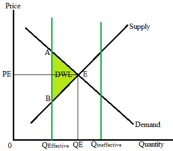
The above graph is the correctly-labeled supply-demand diagram where the x-axis represents the quantity level and the y-axis represents the
Point E is the equilibrium state where demand equals supply. At equilibrium, PE is the equilibrium price, and QE is the equilibrium quantity.
The vertical line left to the equilibrium quantity represents the effective quota at the Qeffective quantity level.
The vertical line right to the equilibrium quantity represents the quota at the Qineffective quantity level, which is ineffective in nature.
The colored triangle ABE shows the deadweight loss due to the quota implementation in the market.
Chapter 9 Solutions
Krugman's Economics For The Ap® Course


 Principles of Economics (12th Edition)EconomicsISBN:9780134078779Author:Karl E. Case, Ray C. Fair, Sharon E. OsterPublisher:PEARSON
 Engineering Economy (17th Edition)EconomicsISBN:9780134870069Author:William G. Sullivan, Elin M. Wicks, C. Patrick KoellingPublisher:PEARSON
 Principles of Economics (MindTap Course List)EconomicsISBN:9781305585126Author:N. Gregory MankiwPublisher:Cengage Learning
 Managerial Economics: A Problem Solving ApproachEconomicsISBN:9781337106665Author:Luke M. Froeb, Brian T. McCann, Michael R. Ward, Mike ShorPublisher:Cengage Learning
 Managerial Economics & Business Strategy (Mcgraw-...EconomicsISBN:9781259290619Author:Michael Baye, Jeff PrincePublisher:McGraw-Hill Education