
a.
To construct: A plot using the distribution of neuronal response to a pure tone and find the numerical summary. Also check whether there outliers exist or not, if yes then again find the numerical summary by omitting it and explain their influence.
a.
Explanation of Solution
Given:
The dataset:
| Neuron | Tone | Call | Neuron | Tone | Call |
| 1 | 474 | 500 | 20 | 100 | 118 |
| 2 | 256 | 138 | 21 | 74 | 62 |
| 3 | 241 | 485 | 22 | 72 | 112 |
| 4 | 226 | 338 | 23 | 20 | 193 |
| 5 | 185 | 194 | 24 | 21 | 129 |
| 6 | 174 | 159 | 25 | 26 | 135 |
| 7 | 176 | 341 | 26 | 71 | 134 |
| 8 | 168 | 85 | 27 | 68 | 65 |
| 9 | 161 | 303 | 28 | 59 | 182 |
| 10 | 150 | 208 | 29 | 59 | 97 |
| 11 | 19 | 66 | 30 | 57 | 318 |
| 12 | 20 | 54 | 31 | 56 | 201 |
| 13 | 35 | 103 | 32 | 47 | 279 |
| 14 | 145 | 42 | 33 | 46 | 62 |
| 15 | 141 | 241 | 34 | 41 | 84 |
| 16 | 129 | 194 | 35 | 26 | 203 |
| 17 | 113 | 123 | 36 | 28 | 192 |
| 18 | 112 | 182 | 37 | 31 | 70 |
| 19 | 102 | 141 |
Formula used:
The formula to compute the
Graph:
The
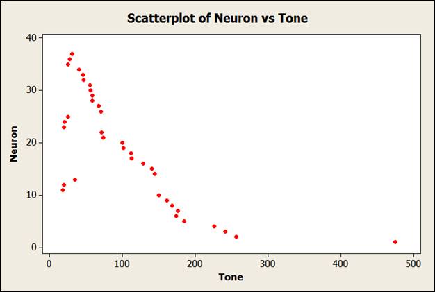
Interpretation:
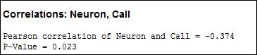
From the above scatter plot, it is clear that the value 474 is an outlier because it is far distant from the other values.
Calculation:
The numerical summary is:
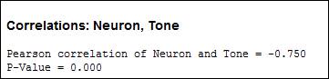
After removal of outlier, the value of the correlation is:
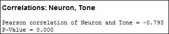
From above output, it is clear that omission of outlier has led the reduction in the value of correlation between the two variables
b.
To construct: A plot using the distribution of neuronal response to a monkey call and find the numerical summary. Also check whether there outliers exist or not, if yes then again find the numerical summary by omitting it and explain their influence.
b.
Explanation of Solution
Graph:
The scatter plot could be constructed as:
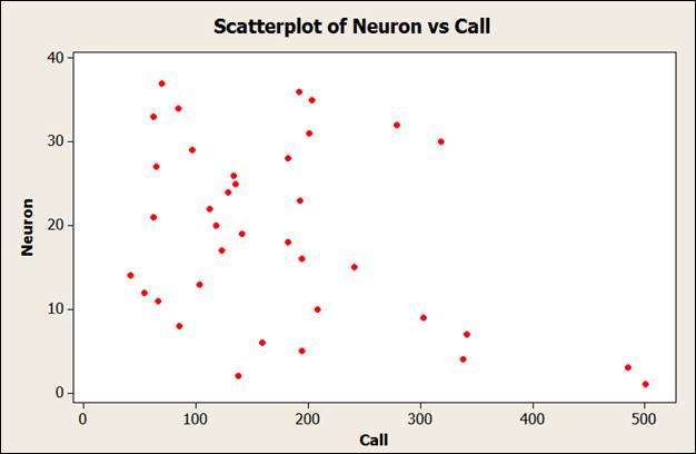
Interpretation:
From the above scatter plot, it is clear that the values 484 and 500 are outlier because they are far distant from the other values.
Calculation:
The numerical summary is:
After removal of outlier, the value of the correlation is:
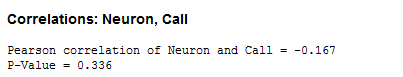
From above output, it is clear that omission of outlier has led increase in the value of correlation between the two variables
c.
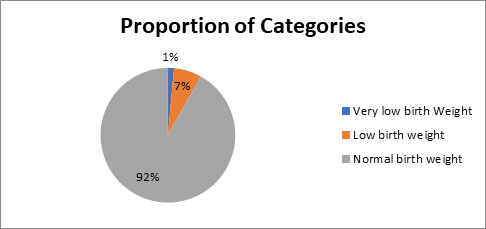
To construct the pie chart or bar chart to show the proportion of given categories.
c.
Explanation of Solution
Given:
The categories:
Very low birth weight: Less than 1500 grams
Low birth weight: Less than 2500 grams
Normal birth weight: More than 2500 grams
Calculation:
Count of each category:
| Category | Frequency | Proportion |
| Very low birth Weight | 57841 | 0.0144768 |
| Low birth weight | 267722 | 0.0670072 |
| Normal birth weight | 3669859 | 0.918516 |
Graph:
d.
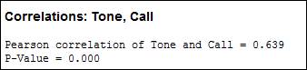
To check: whether there any relationship exists between the variables call and tone response by constructing scatter plot and explain it. Also, compute the numerical summary, if possible.
d.
Explanation of Solution
Graph:
The scatter plot could be constructed as:
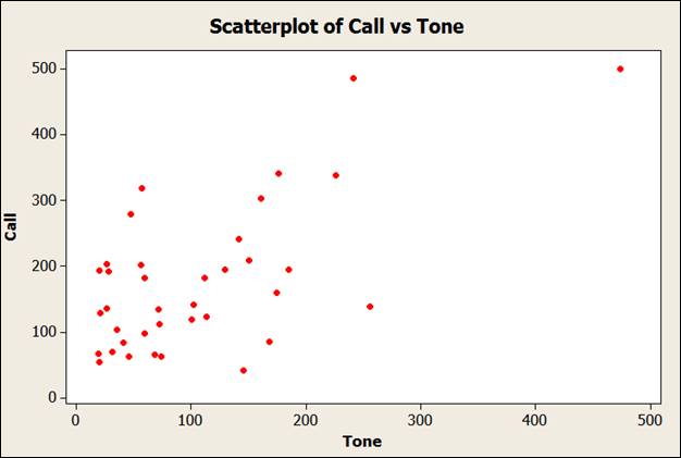
Interpretation:
The above scatter plot shows that there is a
Calculation:
The correlation between the two variables can be calculated as:
Want to see more full solutions like this?
Chapter 8 Solutions
Practice of Statistics in the Life Sciences

 MATLAB: An Introduction with ApplicationsStatisticsISBN:9781119256830Author:Amos GilatPublisher:John Wiley & Sons Inc
 Probability and Statistics for Engineering and th...StatisticsISBN:9781305251809Author:Jay L. DevorePublisher:Cengage Learning
 Statistics for The Behavioral Sciences (MindTap C...StatisticsISBN:9781305504912Author:Frederick J Gravetter, Larry B. WallnauPublisher:Cengage Learning
 Elementary Statistics: Picturing the World (7th E...StatisticsISBN:9780134683416Author:Ron Larson, Betsy FarberPublisher:PEARSON
 The Basic Practice of StatisticsStatisticsISBN:9781319042578Author:David S. Moore, William I. Notz, Michael A. FlignerPublisher:W. H. Freeman
 Introduction to the Practice of StatisticsStatisticsISBN:9781319013387Author:David S. Moore, George P. McCabe, Bruce A. CraigPublisher:W. H. Freeman