Derivation of the market
Explanation of Solution
The market demand curve can be derived by adding each individual’s quantity demand at a different price. It can be represented as follows:
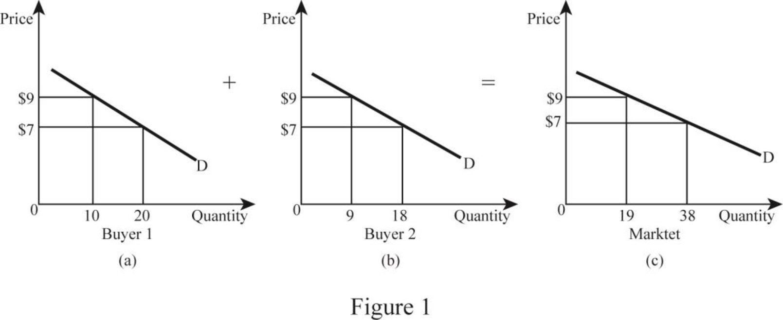
In Figure 1, both panels (a) and (b) indicate the individual demand curve of Buyer 1 and Buyer 2, respectively, where the horizontal axis represents quantity demanded and the vertical axis represents the price of the good. In the figure, Buyer 1 demanded 10 units and Buyer 2 demanded 9 units at $9. Therefore, the total quantity demanded at $9 is 19 units. Similarly, Buyer 1 demanded 20 units and Buyer 2 demanded 18 units at $7. Hence, the total quantity demanded at $7 is 38 units. In Panel (c), the vertical axis represents the total quantity demanded in the market and the vertical axis represents price. By plotting each individual’s quantity demand at different prices creates a market demand curve.
Demand curve: A demand curve shows the level of quantity demanded at different price levels. Since there is a negative relationship between the price and the quantity, the demand curve slopes downward.
Want to see more full solutions like this?
Chapter 3 Solutions
Macroeconomics (Book Only)

- Explain the law of demand. Why does a demand curve slope downward? How is a market demand curve derived from individual demand curves?arrow_forwardFor each question,start with a supply and demand graph of the market for tennis rackets. What happens to supply or demand in each scenario? Explain why and show on graph labeling the new equilibrium point.arrow_forwardWhat would happen to a specific demand curve if one of the demand factors changed? Give an example of demand, and use properly labelled graphs to show your instances.arrow_forward
- How does the demand curve look like? Graph it.arrow_forwardDavid-Michael is conducting an experiment, charging different prices for the same products at different stores and measuring sales. With this information, he will construct a demand curve. How can David-Michael use this information?arrow_forwardThe price of a gallon of gasoline has been rising in the last few weeks. Using the model of supply and demand, explain how this could happenarrow_forward
- THE PRICE OF DOMINO’S PIZZAS HAS RECENTLY INCREASED DUE TO A EFFORT TO INCREASE PROFITS. AS A RESULT, WHAT WILL HAPPEN TO THE DEMAND FOR PIZZA FROM PIZZA HUT? IN WHICH DIRECTION WILL THE DEMAND CURVE SHIFT?arrow_forwardHow does a supply curve differ from a demand curve and at what point do they intersect?arrow_forwardHow is Consumer demand for products quite different from demand in the business market?arrow_forward
- Draw a graph to analyze the market for agricultural products (food). Label your price and quantity axes properly. In your graph, draw a supply curve for agricultural products (food) that obeys the law of supply. Label (S). In the same graph, draw a demand curve for food that obeys the law of demand. Label (D). Identify the market equilibrium point in your graph and label (E). Also, label the equilibrium price (PE) and the Equilibrium quantity (QE): 1. The federal government instituted acreage restriction programs in an attempt to eliminate the surpluses resulting from the price support program. Using the graph above, explain and illustrate how acreage restrictions, if effective might reduce or eliminate food surpluses. Label and explain clearly.arrow_forwardDraw a graph to analyze the market for agricultural products (food). Label your price and quantity axes properly. In your graph, draw a supply curve for agricultural products (food) that obeys the law of supply. Label (S). In the same graph, draw a demand curve for food that obeys the law of demand. Label (D). Identify the market equilibrium point in your graph and label (E). Also, label the equilibrium price (PE) and the Equilibrium quantity (QE): 1. Using supply/demand analysis, explain why food prices declined in the United States in the 1920s. Use your above graph to illustrate the change in the market equilibrium price. Clearly label the original and new equilibrium price and explain your graphical analysis in words.arrow_forwardDraw a graph to analyze the market for agricultural products (food). Label your price and quantity axes properly. In your graph, draw a supply curve for agricultural products (food) that obeys the law of supply. Label (S). In the same graph, draw a demand curve for food that obeys the law of demand. Label (D). Identify the market equilibrium point in your graph and label (E). Also, label the equilibrium price (PE) and the Equilibrium quantity (QE): 1. In response to farmers' outcries about declining food prices, the federal government instituted a farm price support program. Use the graph above to illustrate why farm price supports created surpluses of many agricultural products. Explain your graph in words and clearly identify the surplus in your graph.arrow_forward

 Economics (MindTap Course List)EconomicsISBN:9781337617383Author:Roger A. ArnoldPublisher:Cengage Learning
 Economics Today and Tomorrow, Student EditionEconomicsISBN:9780078747663Author:McGraw-HillPublisher:Glencoe/McGraw-Hill School Pub Co