Write a program to analyze the cooling of a cup of coffee. Start by asking the user to enter a matrix in the format [a, b; c, d]. The matrix win contain two columns; the first is time in minutes and the second is temperature in degrees Celsius. These pairs of values indicate the actual temperatures of the coffee at the specified times. If the matrix entered does not have at least two rows or does not have exactly two columns, warn the user and ask them to enter a matrix in the correct format until they do it correctly. Next ask the user to enter the room temperature [°C].
Create a table of output showing the time in hours and toe temperature above room temperature m degrees Fahrenheit.
Time must be shown to two decimal places; temperature should be shown as an integer.
- The output statement must be written such that the number of entries in toe matrix could change and the table would still be created correctly
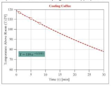
Using the data entered, create a graph with an exponential trendline to project the temperature above room temperature at 30 minutes on a graph.
- The axis limits, grid, axis labels, and title must match exactly to the graph shown. The title is shown in bold, red letters, size 20. Time should be in minutes and temperature above room temperature should be degrees Fahrenheit.
- The markers are open red circles, size 16.
- The line is red dashed format, line width 2.
- Background color on the trendline text is green; font sue is 16.
- The background on the graph is white.
Example:
Enter a matrix of form [a, b; c, d] for time [min], temperature [deg C] of a cup of coffee.
[1, 91; 5, 87.5, 8, 84.9];
Enter the temperature of the room [deg C]: 26
| Time (t) [h] | Temp above Room (T) [deg F] |
| 0.02 | 117 |
| 0.08 | 111 |
| 0.13 | 106 |
After the table and graph have been produced, use a menu to ask users if they wish to analyze another set of data, and either repeat or terminate the program as appropriate.
Want to see the full answer?
Check out a sample textbook solution
Chapter 19 Solutions
Thinking Like an Engineer: An Active Learning Approach (4th Edition)
- need help understanding?arrow_forward%94 KB/S Find : 1. dynamic load on each bearing due to the out-of-balance couple; and 2. kinetic energy of the complete assembly. [Ans. 6.12 kg: 8.7 N-m] L 2. 3. 4. 5. 1. 2. 5. DO YOU KNOW? Why is balancing of rotating parts necessary for high speed engines? Explain clearly the terms "static balancing' and 'dynamic balancing'. State the necessary conditions to achieve them. Discuss how a single revolving mass is balanced by two masses revolving in different planes. Chapter 21: Balancing of Rotating Masses .857 Explain the method of balancing of different masses revolving in the same plane. How the different masses rotating in different planes are balanced? OBJECTIVE TYPE QUESTIONS The balancing of rotating and reciprocating parts of an engine is necessary when it runs at (a) slow speed (b) medium speed (c) high speed A disturbing mass, attached to a rotating shaft may be balanced by a single mass m, attached in the same plane of rotation as that of my such that (a) (b) F For static…arrow_forwardProvide a real-world usage example of the following: Straightness Circularity Parallelism What specific tools, jigs, and other devices are used to control the examples you provided?arrow_forward
- 856 Theory of Machines 5. A shaft carries five masses A, B, C, D and E which revolve at the same radius in planes which are equidistant from one another. The magnitude of the masses in planes A, C and D are 50 kg, 40 kg and 80 kg respectively. The angle between A and C is 90° and that between C and D is 135° Determine the magnitude of the masses in planes B and E and their positions to put the shaft in complete rotating balance. [Ans. 12 kg, 15 kg; 130° and 24° from mass A in anticlockwise direction]arrow_forward2. 3. 4. clockwise from Four masses A, B, C and D revolve at equal radii and are equally spaced along a shaft. The mass B is 7 kg and the radii of C and D make angles of 90° and 240° respectively with the radius of B. Find the magnitude of the masses A, C and D and the angular position of A so that the system may be completely balanced. [Ans. 5 kg: 6 kg; 4.67 kg; 205° from mass B in anticlockwise direction] A rotating shaft carries four masses A, B, C and D which are radially attached to it. The mass centres are 30 mm, 38 mm, 40 mm and 35 mm respectively from the axis of rotation. The masses A, C and D are 7.5 kg. 5 kg and 4 kg respectively. The axial distances between the planes of rotation of A and B is 400 mm and between B and C is 500 mm. The masses A and C are at right angles to each other. Find for a complete balance, 1. the angles between the masses B and D from mass A, 2. the axial distance between the planes of rotation of C and D. 3. the magnitude of mass B. [Ans. 162.5%,…arrow_forward1. Four masses A, B, C and D are attached to a shaft and revolve in the same plane. The masses are 12 kg. 10 kg. 18 kg and 15 kg respectively and their radii of rotations are 40 mm, 50 mm, 60 mm and 30 mm. The angular position of the masses B, C and D are 60°, 135° and 270 from the mass A. Find the magnitude and position of the balancing mass at a radius of 100 mm. [Ans. 7.56 kg: 87 clockwise from A]arrow_forward
- 3. The structure in Figure 3 is loaded by a horizontal force P = 2.4 kN at C. The roller at E is frictionless. Find the axial force N, the shear force V and the bending moment M at a section just above the pin B in the member ABC and illustrate their directions on a sketch of the segment AB. B P D A 65° 65° E all dimensions in meters Figure 3arrow_forward4. The distributed load in Figure 4 varies linearly from 3wo per unit length at A to wo per unit length at B and the beam is built in at A. Find expressions for the shear force V and the bending moment M as functions of x. 3W0 Wo A L Figure 4 2 Barrow_forward1. The beam AB in Figure 1 is subjected to a uniformly distributed load wo = 100 N/m. Find the axial force N, the shear force V and the bending moment M at the point D which is midway between A and B and illustrate their directions on a sketch of the segment DB. wo per unit length A D' B all dimensions in metersarrow_forward
- 5. Find the shear force V and the bending moment M for the beam of Figure 5 as functions of the distance x from A. Hence find the location and magnitude of the maximum bending moment. w(x) = wox L x L Figure 5 Barrow_forwardDry atmospheric air enters an adiabatic compressor at a 20°C, 1 atm and a mass flow rate of 0.3kg/s. The air is compressed to 1 MPa. The exhaust temperature of the air is 70 degrees hottercompared to the exhaust of an isentropic compression.Determine,a. The exhaust temperature of the air (°C)b. The volumetric flow rate (L/s) at the inlet and exhaust of the compressorc. The power required to accomplish the compression (kW)d. The isentropic efficiency of the compressore. An accounting of the exergy entering the compressor (complete Table P3.9) assuming that thedead state is the same as State 1 (dry atmospheric air)f. The exergetic efficiency of the compressorarrow_forwardA heat pump is operating between a low temperature reservoir of 270 K and a high temperaturereservoir of 340 K. The heat pump receives heat at 255 K from the low temperature reservoir andrejects heat at 355 K to the high temperature reservoir. The heating coefficient of performance ofthe heat pump is 3.2. The heat transfer rate from the low temperature reservoir is 30 kW. The deadstate temperature is 270 K. Determine,a. Power input to the heat pump (kW)b. Heat transfer rate to the high-temperature reservoir (kW)c. Exergy destruction rate associated with the low temperature heat transfer (kW)d. Exergy destruction rate of the heat pump (kW)e. Exergy destruction rate associated with the high temperature heat transfer (kW)f. Exergetic efficiency of the heat pump itselfarrow_forward
 Elements Of ElectromagneticsMechanical EngineeringISBN:9780190698614Author:Sadiku, Matthew N. O.Publisher:Oxford University Press
 Mechanics of Materials (10th Edition)Mechanical EngineeringISBN:9780134319650Author:Russell C. HibbelerPublisher:PEARSON
 Thermodynamics: An Engineering ApproachMechanical EngineeringISBN:9781259822674Author:Yunus A. Cengel Dr., Michael A. BolesPublisher:McGraw-Hill Education
 Control Systems EngineeringMechanical EngineeringISBN:9781118170519Author:Norman S. NisePublisher:WILEY
 Mechanics of Materials (MindTap Course List)Mechanical EngineeringISBN:9781337093347Author:Barry J. Goodno, James M. GerePublisher:Cengage Learning
 Engineering Mechanics: StaticsMechanical EngineeringISBN:9781118807330Author:James L. Meriam, L. G. Kraige, J. N. BoltonPublisher:WILEY


