ENGR.ECONOMIC ANALYSIS
14th Edition
ISBN: 9780190931919
Author: NEWNAN
Publisher: Oxford University Press
expand_more
expand_more
format_list_bulleted
Question

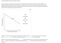
Transcribed Image Text:The following diagram shows the market demand for copper.
Use the orange points (square symbol) to plot the initial short-run industry supply curve when there are 20 firms in the market. (Hint: You can
disregard the portion of the supply curve that corresponds to prices where there is no output since this is the industry supply curve.) Next, use the
purple points (diamond symbol) to plot the short-run industry supply curve when there are 40 firms. Finally, use the green points (triangle symbol) to
plot the short-run industry supply curve when there are 60 firms.
(?
80
72
Supply (20 firms)
64
56
Demand
48
Supply (40 firms)
40
32
Supply (60 firms)
24
16
8
120
240
360
480
600
720
840
960
1080 1200
QUANTITY (Thousands of pounds)
If there were 20 firms in this market, the short-run equilibrium price of copper would be $
per pound. At that price, firms in this industry
would
Therefore, in the long run, firms would
the copper market.
Because you know that perfectly competitive firms earn
economic profit in the long run, you know the long-run equilibrium price must
be $
per pound. From the graph, you can see that this means there will be
firms operating in the copper industry in long-run
equilibrium.
PRICE (Dollars per pound)

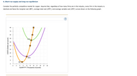
Transcribed Image Text:6. Short-run supply and long-run equilibrium
Consider the perfectly competitive market for copper. Assume that, regardless of how many firms are in the industry, every firm in the industry is
identical and faces the marginal cost (MC), average total cost (ATC), and average variable cost (AVC) curves shown on the following graph.
80
72
64
56
ATC
48
40
32
24
16
AVC
MC O
+
3
9.
12
15
18
21
24
27
30
QUANTITY (Thousands of pounds)
COSTS (Dollars per pound)
Expert Solution
This question has been solved!
Explore an expertly crafted, step-by-step solution for a thorough understanding of key concepts.
This is a popular solution
Trending nowThis is a popular solution!
Step by stepSolved in 2 steps with 1 images

Knowledge Booster
Learn more about
Need a deep-dive on the concept behind this application? Look no further. Learn more about this topic, economics and related others by exploring similar questions and additional content below.Similar questions
- The first graph depicts the industry supply and demand for yoga classes. Assume that the market is initially in equilibrium at the intersection of lines D and S. The second graph is the cost information for a single firm in this perfectly competitive industry. Assume there is an increase in the industry demand for yoga classes and the industry demand curve moves from D to D1. Furthermore, assume this is a constant cost industry. Shift the supply (S) curve to the correct positions to reflect long-run equilibrium in this constant cost industry. Next, use the interactive line to trace out the long-run industry supply curve (LRIS) for this industry. Price per class Yoga Industry Supply and Demand Short-run marginal cost Long-run average cost Short-run average cost S Price=Marginal revenue DRIS D1 Quantity of classes Quantity of classes Price ($)arrow_forwardBy how much would the market price of abortions and the number of abortions change if a lump-sum tax is assessed on abortion clinics that raises their minimum average cost by 10%? On the graph to the right, show the new long-run equilibrium price. 1.) Use the line drawing tool to draw the new demand curve and label the line d². 2.) Use the 3-point curved line drawing tool to draw the new average cost curve and label the curve AC². Carefully follow the instructions above, and only draw the required objects. Using the price elasticity of demand information from the "Abortion Market" application, calculate the decrease in the number of abortions from the lump sum tax. Abortions will decrease by as little as percent or by as much as percent. (round your answers to one decimal place) C Price/cost per abortion 490- 470- 450- 430- 410- 390- 370- 350- 330- 310- 290- 270- 250+ 100 AC2 d2 1 AC¹ P = MR 150 200 250 300 350 400 450 500 Abortions per year Q Narrow_forwardJust the bolded one please Using the above graph, The minimum level of output this firm would produce is 12 units. The firm's total fixed costs is $56. (Do NOT enter the '$' in your response; enter only the whole dollar amount, NOT cents.) The profit maximizing output level for this firm is 14 units. The economic profit that this firm is earning is $Blank 4. (Do NOT enter the '$' in your response; enter only the whole dollar amount, NOT cents.) If this profit level is typical of the industry that the firm is operating in, what do you expect to happen? Blank 5arrow_forward
- Please diagram the revenue and profit situation (which would also include the cost curves) for a producer of a highly elastic (but not perfectly elastic) good of your choice (a restaurant, boutique clothing store, etc.). Under what circumstances would it make sense for them to raise their price? While profit maximization is the main goal for most firms (and one which you should be able to represent on a diagram), you may wish to consider alternative goals depending upon the business you have chosen.arrow_forward9 Consider the competitive market for titanium. Assume that, regardless of how many firms are in the industry, ever n in the industry is identical and faces the marginal cost (MC), average total cost (ATC), and average variable cost (AVC) curves shown on the following graph. Esc 78°F Sunny 100 COSTS (Dollars per pound) 90 80 70 60 4 50 + 40 + 30 20 10 0 MC O 05 F2 ATC AVC F3 0 10 15 20 25 30 35 40 QUANTITY (Thousands of pounds) 0+ ☐ F4 45 50 F5 H M OL F6 M (?) F7 10 F8 At ( F9 F10 F11 F12 2 Fnarrow_forwardIllustrate to the right, a graph showing a company being profitable in a competitive market in the Long Run selling its product at Market Price (MP*) based on its Average Variable Cost (AVC) and Average Total Cost (ATC) and Marginal Cost (MC). Identify each key point on the graph. Observe the Short - Run Loss information illustrated in the graph to the right. With respect to Price (P*"), Average Variable Cost (AVC), Average Total Cost (ATC), Marginal Revenue (MR), and Marginal Cost (MC), what assumption would you make if the firm was selling its product at P What would happen if this were to continue in the long run? Is there a Shut Down point? ** ? Notice that MR = Parrow_forward
- the orange square points on the marginal cost curve from low to high(16,12) (24,20),(30,36),(32,44),(34,52),(38,72)arrow_forwardLesson 5.4 - Industry Adjustments to Increases in Demand 1. In a/an industry, an increase in demand will result in a new equilibrium price equal to the original equilibrium price (before demand increased). This results in a long-run supply curve that is 2. In a/an industry, an increase in demand will result in a new equilibrium price higher than the original equilibrium price (before demand increased). This results in a long-run supply curve that is sloping. 3. In a/an. industry, an increase in demand will result in a new equilibrium price lower than the original equilibrium price (before demand increased). This results in a long-run supply curve that is sloping.arrow_forwardQ4) Answer the following, providing a graphical illustration along with your answer where necessary: a) What is the profit maximising condition? b) Explain what is meant by abnormal profit? What is the adjustment process from short-run abnormal profit to long-run equilibrium in a perfectly competitive market? c) Please find below Pricing options for firm A and B, along with individual payoffs (Firm A's payoff/Firm B's payoff) Firm A Price £2 Price £1 Assume you are the pricing manager at Firm A; i) ii) Price £2 £10,000/£10,000 £12,000/£5,000 Firm B Price £1 £5,000/£12,000 £6,000/£6,000 What is your payoff for a 'maximin' strategy? What is your payoff for a 'maximax' strategy? Does a dominant strategy exist within this prisoners' dilemma?arrow_forward
- Give an explanation to the answer and ensure all the steps are shown.arrow_forward1) If a firm in a purely competitive industry is confronted with an equilibrium price of $5, its marginal revenue: 2) A firm that is motivated by self interest should 3) If price is above the equilibrium level, competition among sellers to reduce the resulting 4) Camille's Creations and Julia's Jewels both sell beads in a competitive market. If at the market price of $5, both are running out of beads to sell (they can't keep up with the quantity demanded at that price), then we would expect both Camille's and Julia's to 5) Since their introduction, prices of DVD players have fallen and the quantity purchased has increased. This statement 6) In a market economy the distribution of output will be determined primarily by 7) In a competitive market economy firms will select the least-cost production technique because 8) Suppose that the price of peanuts falls from $3 to $2 per bushel and that, as a result, the total revenue received by peanut…arrow_forwardThe Invisible Hand Principle states that individuals' independent efforts to maximize their gains will generally be beneficial for society and result in the socially optimal allocation of resources (Need help? Read chapter 4.6 of the textbook, here: https://playconomics.com/textbooks/view/playconomics4-2019t3/part2/ch4/s6) in any type of market. particularly in the short run. if the market is perfectly competitive. if firms are free to enter but not to exit the market. None of these.arrow_forward
arrow_back_ios
SEE MORE QUESTIONS
arrow_forward_ios
Recommended textbooks for you

 Principles of Economics (12th Edition)EconomicsISBN:9780134078779Author:Karl E. Case, Ray C. Fair, Sharon E. OsterPublisher:PEARSON
 Engineering Economy (17th Edition)EconomicsISBN:9780134870069Author:William G. Sullivan, Elin M. Wicks, C. Patrick KoellingPublisher:PEARSON
 Principles of Economics (MindTap Course List)EconomicsISBN:9781305585126Author:N. Gregory MankiwPublisher:Cengage Learning
 Managerial Economics: A Problem Solving ApproachEconomicsISBN:9781337106665Author:Luke M. Froeb, Brian T. McCann, Michael R. Ward, Mike ShorPublisher:Cengage Learning
 Managerial Economics & Business Strategy (Mcgraw-...EconomicsISBN:9781259290619Author:Michael Baye, Jeff PrincePublisher:McGraw-Hill Education


Principles of Economics (12th Edition)
Economics
ISBN:9780134078779
Author:Karl E. Case, Ray C. Fair, Sharon E. Oster
Publisher:PEARSON

Engineering Economy (17th Edition)
Economics
ISBN:9780134870069
Author:William G. Sullivan, Elin M. Wicks, C. Patrick Koelling
Publisher:PEARSON

Principles of Economics (MindTap Course List)
Economics
ISBN:9781305585126
Author:N. Gregory Mankiw
Publisher:Cengage Learning

Managerial Economics: A Problem Solving Approach
Economics
ISBN:9781337106665
Author:Luke M. Froeb, Brian T. McCann, Michael R. Ward, Mike Shor
Publisher:Cengage Learning

Managerial Economics & Business Strategy (Mcgraw-...
Economics
ISBN:9781259290619
Author:Michael Baye, Jeff Prince
Publisher:McGraw-Hill Education