
Related questions
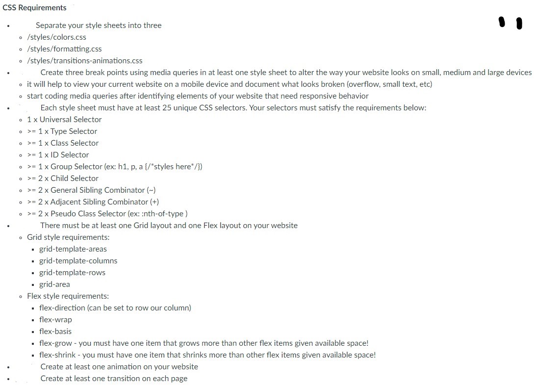
what I have so far I need help with seperading the style sheet into three files:
/styles/colors.css
/styles/formatting.css
/styles/transitions-animations.css
and anythe else I may have missed
<!DOCTYPE html>
<html>
<head>
<title>Home Page</title>
<link rel="stylesheet" href="style.css">
</head>
<body>
<!--Added main tag-->
<main>
<!--Added nav tag-->
<nav>
<a href="index.html">Home</a>
<a href="contact.html">Contact</a>
<a href="about.html">About</a>
</nav>
<h1>Welcome to my (about me) site</h1>
<picture>
<source media="(min-width:650px)" srcset="./images/me3-650.jpg">
<source media="(min-width:465px)" srcset="./images/me3-465.jpg">
<img src="./images/me3.JPG" alt="ME" style="width:auto;">
</picture>
<h3>HI there this is one of my favorite songs down below.</h3>
<iframe width="420" height="345"
src="https://www.bing.com/search?q=Nirvana%20-%20The%20Man%20Who%20Sold%20The %20World&pc=0TTE&ptag=C1N2A04173C0C08&form=CONBNT&conlogo=CT3210127&shtp=GetUrl&shid=38702244-8c35-477e-a042- 805b2b2d81bc&shtk=TmlydmFuYSAtIFRoZSBNYW4gV2hvIFNvbGQgVGhlIFdvcmxkIChNVFYgVW5wbHVnZ2VkKQ%3D %3D&shdk=UkVNQVNURVJFRCBJTiBIRCEgVGFrZW4gZnJvbSB0aGUgMjV0aCBBbm5pdmVyc2FyeSBFZGl0aW9ucyBvZiBOaXJ2YW5hIGI%3D&shhk=7xVtP%2FaZHQw%2B31lGYV%2F3cJukwLOZgUcFMDTYwdmuLsA %3D&shth=OVP.2ZxeDKLNemtX7dQ99X3ETQHgFo">
</iframe>
<footer>
<div class="foot">
<p>Author: Josiah McSweeney<br>
<p>Copyright Reserved</p>
</div>
</footer>
</main>
</body>
</html>
style.css:
*{
margin: 0;
padding: 0;
}
@media (min-width:1224px){
body{
background-color: darkblue;
color: white;
}
main{
display: grid;
grid-template-areas: "nav"
"h1"
"picture"
"h3"
"iframe"
"footer";
grid-template-columns: auto;
grid-template-rows: auto;
}
nav{
display: flex;
flex-direction: row;
justify-content: end;
background-color: lightcoral;
}
picture{
text-align: center;
}
nav>a{
padding: 10px;
margin: 10px;
}
main>h1, h3{
text-align: center;
}
iframe{
margin: auto;
}
footer{
position: fixed;
left: 0;
bottom: 0;
width: 100%;
background-color:antiquewhite;
color: black;
}
footer>.foot{
padding: 10px;
display: flex;
flex-direction: row;
justify-content: space-evenly;
}
.foot:nth-of-type(1) {
flex-shrink: 1;
}
.foot:nth-of-type(2) {
flex-grow: 1;
}
}
@media (min-width:726px){
body{
background-color: darkblue;
color: white;
}
main{
display: grid;
grid-template-areas: "nav"
"h1"
"picture"
"h3"
"iframe"
"footer";
grid-template-columns: auto;
grid-template-rows: auto;
}
nav{
display: flex;
flex-direction: row;
justify-content: end;
background-color: lightcoral;
}
picture{
text-align: center;
}
nav>a{
padding: 10px;
margin: 10px;
}
main>h1, h3{
text-align: center;
}
iframe{
margin: auto;
}
footer{
position: fixed;
left: 0;
bottom: 0;
width: 100%;
background-color:antiquewhite;
color: black;
}
footer>.foot{
padding: 10px;
display: flex;
flex-direction: row;
justify-content: space-evenly;
}
.foot:nth-of-type(1) {
flex-grow: 1;
}
.foot:nth-of-type(2) {
flex-shrink: 1;
}
}
@media (min-width:320px) and (max-width:726px){
body{
background-color: darkblue;
color: white;
}
main{
display: grid;
grid-template-areas: "nav"
"h1"
"picture"
"h3"
"iframe"
"footer";
grid-template-columns: auto;
grid-template-rows: auto;
}
nav{
display: flex;
flex-direction: row;
justify-content: center;
background-color: lightcoral;
}
picture{
text-align: center;
}
nav>a{
padding: 10px;
margin: 10px;
}
main>h1, h3{
font-size: 16px;
text-align: center;
}
iframe{
margin: auto;
width: 300px;
}
footer{
position: fixed;
left: 0;
bottom: 0;
width: 100%;
background-color:antiquewhite;
color: black;
}
footer>.foot{
padding: 10px;
display: flex;
flex-direction: column;
text-align: center;
}
}


Step by stepSolved in 5 steps with 4 images


- Complete the following webpage assignment. Assignment Instructions: Design a webpage to simulate a Blog. The website must have a banner image and a featured image with multiple resolutions to be active at different resolution breakpoints just as discussed in this lesson. Include a jQuery script in your project to further enhance the user experience. Use one of the CDN libraries. The script is up to your discretion though you must be able to justify its use. The blog page must be aesthetically pleasing and follow a traditional blog structure. It may help to look at the many WordPress templates available on the net.arrow_forwardHow can I make the text centered under the Yoga Classes heading? HTML- <!DOCTYPE html><html lang="en"><head><title>Path of Light Yoga Studio:: Classes</title><meta charset="utf-8"><link rel="stylesheet" href="yoga.css"></head><body><div id="wrapper"><header><h1>Path of Light Yoga Studio</h1></header><br><nav><a href="index.html">Home</a> <a href="classes.html">Classes</a> <a href="schedule.html">Schedules</a> <a href="contact.html">Contact Us</a></nav><main><div id="hero"> <img id="yogamat" src="yogamat.jpeg" alt="yogamat picture" width="80%" height="25%"><h2>Yoga Classes</h2> <h3>Gentle Hatha Yoga</h3> <p class="indent"> Intended for beginners and anyone wishing a grounded<br> foundation in the practice of yoga, this 60…arrow_forwardCreate a list that includes at least five advantages of using cascading style sheets (CSS).arrow_forward
- How can I make the text centered under the Yoga Classes heading? HTML- <!DOCTYPE html><html lang="en"><head><title>Path of Light Yoga Studio:: Classes</title><meta charset="utf-8"><link rel="stylesheet" href="yoga.css"></head><body><div id="wrapper"><header><h1>Path of Light Yoga Studio</h1></header><br><nav><a href="index.html">Home</a> <a href="classes.html">Classes</a> <a href="schedule.html">Schedules</a> <a href="contact.html">Contact Us</a></nav><main><div id="hero"> <img id="yogamat" src="yogamat.jpeg" alt="yogamat picture" width="80%" height="25%"><h2>Yoga Classes</h2> <h3>Gentle Hatha Yoga</h3> <p class="indent"> Intended for beginners and anyone wishing a grounded<br> foundation in the practice of yoga, this 60…arrow_forwardUse the given HTML documents to answer the following questions. <doctype html> <Html> <head> <title>Page Title</title> <style> .grid. Container { Display: grid; Grid-gap: 50px 100px ; Grid-template- columns: auto auto auto; Background-color: blue; Padding: 10px; } .grid-box { background-color: red; border: 1 px; padding: 20px; font-size: 30px } </style> </head> <body> <h1>book at my grid:<</h1> <div class “grid-container”> <div class “grid-box”>1</div> <div class “grid-box”>2</div> <div class “grid-box”>3</div> <div class “grid-box”>4</div> <div class “grid-box”>5</div> <div class “grid-box”>6</div> </div> </body> </html> What is the spacing of the grid row gap? 1px 30px 50px 100pxarrow_forward
- Computer Networking: A Top-Down Approach (7th Edi...Computer EngineeringISBN:9780133594140Author:James Kurose, Keith RossPublisher:PEARSON
 Computer Organization and Design MIPS Edition, Fi...Computer EngineeringISBN:9780124077263Author:David A. Patterson, John L. HennessyPublisher:Elsevier Science
 Network+ Guide to Networks (MindTap Course List)Computer EngineeringISBN:9781337569330Author:Jill West, Tamara Dean, Jean AndrewsPublisher:Cengage Learning
  Concepts of Database ManagementComputer EngineeringISBN:9781337093422Author:Joy L. Starks, Philip J. Pratt, Mary Z. LastPublisher:Cengage Learning
 Prelude to ProgrammingComputer EngineeringISBN:9780133750423Author:VENIT, StewartPublisher:Pearson Education
 Sc Business Data Communications and Networking, T...Computer EngineeringISBN:9781119368830Author:FITZGERALDPublisher:WILEY