
MATLAB: An Introduction with Applications
6th Edition
ISBN: 9781119256830
Author: Amos Gilat
Publisher: John Wiley & Sons Inc
expand_more
expand_more
format_list_bulleted
Related questions
Question

Transcribed Image Text:**Transcription for Educational Website:**
---
**Graph Explanation:**
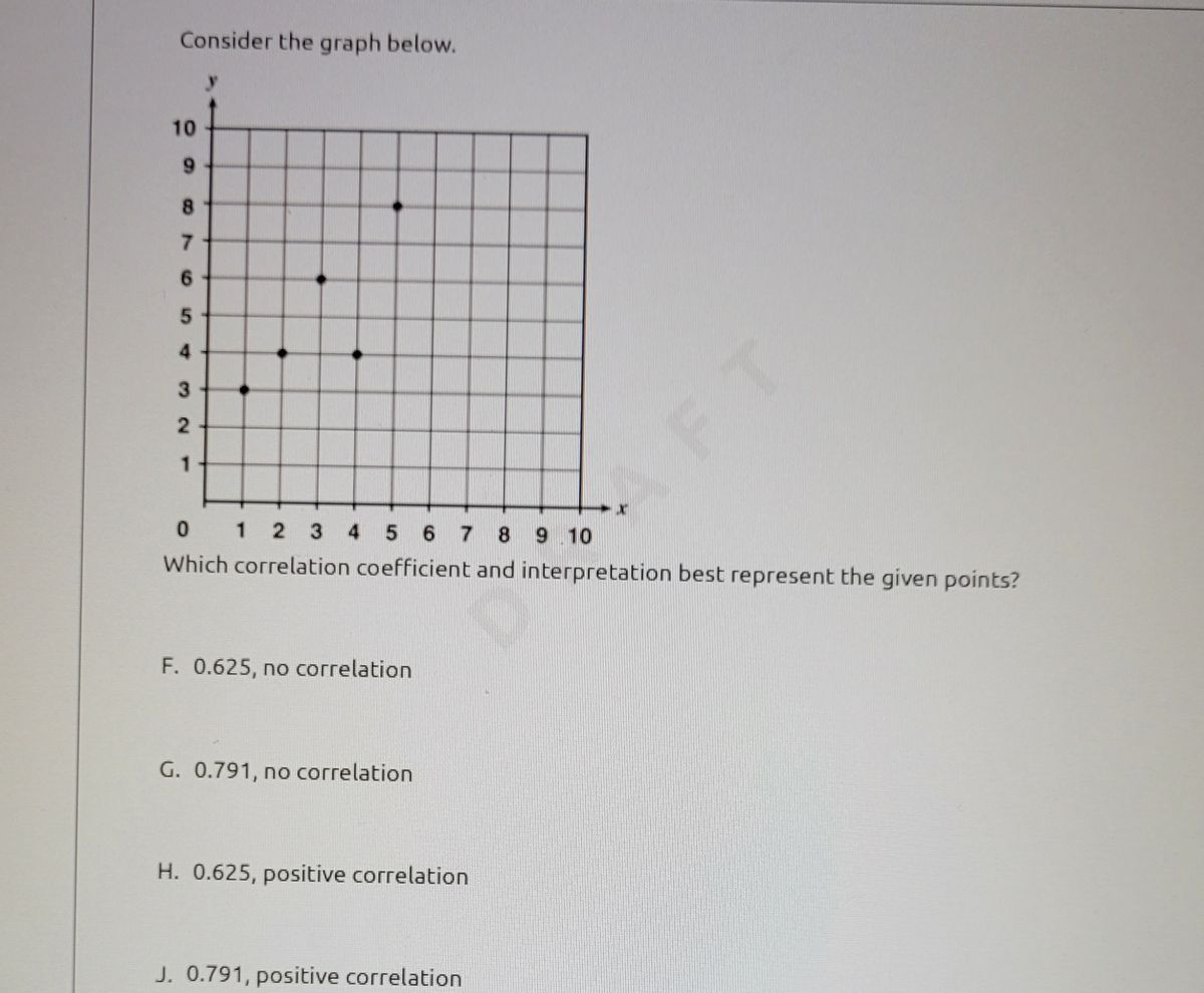
The graph above is a scatter plot displaying a set of points on a Cartesian coordinate system. The x-axis ranges from 0 to 10, and the y-axis extends from 0 to 10. The plotted points are as follows: (2, 3), (3, 5), (4, 7), and (6, 9). The aim is to determine which correlation coefficient and interpretation best represent the distribution of these points.
**Question:**
Which correlation coefficient and interpretation best represent the given points?
**Options:**
F. 0.625, no correlation
G. 0.791, no correlation
H. 0.625, positive correlation
J. 0.791, positive correlation
---
**Diagram Interpretation:**
The points plotted on the graph suggest a positive trend – as the x values increase, the y values also tend to increase. Thus, options H or J may reflect this correlation trend due to the presence of a positive relationship.
Expert Solution
This question has been solved!
Explore an expertly crafted, step-by-step solution for a thorough understanding of key concepts.

This is a popular solution

Trending nowThis is a popular solution!

Step by stepSolved in 2 steps

Knowledge Booster

Similar questions
- Match the correlation coefficients with their scatterplots. Select the letter of the scatterplot below which corre- sponds to the correlation coefficient. (Click on image for a larger view.) ? 1. r= 0.76 ? 2. r=-0.74 ? 3. r= 0.22 ? 4. r= -0.97 A B C Darrow_forwardMatch each correlation value with its interpretation A. large (strong) negative relationship B. small (weak) positive relationship C. large (strong) positive relationship select 1.r -0.8 select 2.r 0.1 select 3. r = 0.7 7,821 MAR 20 F3 F2 D00 F4 F5 F6 F7 $ % & 4 6 LA 00 %#3arrow_forwardHelp pleasearrow_forward
- Answer parts A-D pleasearrow_forwardUse the data values in the table below to calculate the correlation between the variables x and y.Submit the link through Canvas to either a photo of your work on paper or a link to a google sheet. x y 3 19.13 4 21.24 5 19.65 6 18.36 7 17.57 8 18.98 9 16.99 10 16.7 Give your answer to three decimal places. __?__arrow_forwardWhat kind of relationship is depicted in the following graph? 7 2 1 0 2 3 a. A positive linear correlation b. A nonlinear correlation c. No correlation Od. A negative linear correlation 6 9 10arrow_forward
- Use the data values in the table below to calculate the correlation between the variables x and y. Hint: Use your calculator to do this, you do not need to compute this by hand. y 4 19.34 5 19.35 6 20.86 7 24.57 8 23.08 9 23.89 10 28.6 Give your answer to three decimal places.arrow_forwardNeed the first 3arrow_forwardUse the data values in the table below to calculate the correlation between the variables x and y. Submit the link through Canvas to either a photo of your work on paper or a link to a google sheet. y 4 27.22 5 23.83 6 23.94 7 22.85 8 20.96 9 17.07 10 14.68 11 16.49 12 14.6 Give your answer to three decimal places.arrow_forward
- Use the data values in the table below to calculate the correlation between the variables x and y.Submit the link through Canvas to either a photo of your work on paper or a link to a google sheet. x y 5 15.3 6 20.06 7 21.42 8 24.18 9 28.64 10 31.5 11 31.86 Give your answer to three decimal places.arrow_forwardPlease show workarrow_forwardThe data below shows the selling price (in hundred thousands) and the list price (in hundred thousands) of homes sold. Construct a scatterplot, find the value of the linear correlation coefficient r, and P-value using a = 0.05. Is there sufficient evidence to conclude that there is a linear correlation between the two variables? Selling Price (x) List Price (y) H₁: p#0 400 412 Construct a scatterplot. Choose the correct graph below. 301 315 376 387 434 440 459 488 H₁ p > 0 477 480 319 324 352 368 417 434 330 341arrow_forward
arrow_back_ios
SEE MORE QUESTIONS
arrow_forward_ios
Recommended textbooks for you
- MATLAB: An Introduction with ApplicationsStatisticsISBN:9781119256830Author:Amos GilatPublisher:John Wiley & Sons Inc
 Probability and Statistics for Engineering and th...StatisticsISBN:9781305251809Author:Jay L. DevorePublisher:Cengage Learning
 Statistics for The Behavioral Sciences (MindTap C...StatisticsISBN:9781305504912Author:Frederick J Gravetter, Larry B. WallnauPublisher:Cengage Learning
  Elementary Statistics: Picturing the World (7th E...StatisticsISBN:9780134683416Author:Ron Larson, Betsy FarberPublisher:PEARSON
 The Basic Practice of StatisticsStatisticsISBN:9781319042578Author:David S. Moore, William I. Notz, Michael A. FlignerPublisher:W. H. Freeman
 Introduction to the Practice of StatisticsStatisticsISBN:9781319013387Author:David S. Moore, George P. McCabe, Bruce A. CraigPublisher:W. H. Freeman
MATLAB: An Introduction with Applications
Statistics
ISBN:9781119256830
Author:Amos Gilat
Publisher:John Wiley & Sons Inc
Probability and Statistics for Engineering and th...
Statistics
ISBN:9781305251809
Author:Jay L. Devore
Publisher:Cengage Learning
Statistics for The Behavioral Sciences (MindTap C...
Statistics
ISBN:9781305504912
Author:Frederick J Gravetter, Larry B. Wallnau
Publisher:Cengage Learning
Elementary Statistics: Picturing the World (7th E...
Statistics
ISBN:9780134683416
Author:Ron Larson, Betsy Farber
Publisher:PEARSON
The Basic Practice of Statistics
Statistics
ISBN:9781319042578
Author:David S. Moore, William I. Notz, Michael A. Fligner
Publisher:W. H. Freeman
Introduction to the Practice of Statistics
Statistics
ISBN:9781319013387
Author:David S. Moore, George P. McCabe, Bruce A. Craig
Publisher:W. H. Freeman