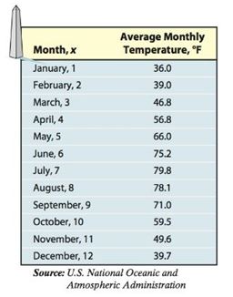
Monthly Temperature The data below represent the average monthly temperatures for Washington, D.C.
(a) Draw a
(b) Find a sinusoidal function of the for that models the data.
(c) Draw the sinusoidal function found in part on the scatter diagram.
(d) Use a graphing utility to find the sinusoidal function of best fit.
(e) Graph the sinusoidal function of best fit on a scatter diagram of the data.

Want to see the full answer?
Check out a sample textbook solution
Chapter 6 Solutions
Precalculus Enhanced with Graphing Utilities (7th Edition)
Additional Math Textbook Solutions
Calculus: Early Transcendentals (2nd Edition)
University Calculus: Early Transcendentals (4th Edition)
Algebra and Trigonometry (6th Edition)
College Algebra with Modeling & Visualization (5th Edition)
Basic Business Statistics, Student Value Edition
A Problem Solving Approach To Mathematics For Elementary School Teachers (13th Edition)
- sy = f(x) + + + + + + + + + X 3 4 5 7 8 9 The function of shown in the figure is continuous on the closed interval [0, 9] and differentiable on the open interval (0, 9). Which of the following points satisfies conclusions of both the Intermediate Value Theorem and the Mean Value Theorem for f on the closed interval [0, 9] ? (A A B B C Darrow_forward= Q6 What will be the allowable bearing capacity of sand having p = 37° and ydry 19 kN/m³ for (i) 1.5 m strip foundation (ii) 1.5 m x 1.5 m square footing and (iii)1.5m x 2m rectangular footing. The footings are placed at a depth of 1.5 m below ground level. Assume F, = 2.5. Use Terzaghi's equations. 0 Ne Na Ny 35 57.8 41.4 42.4 40 95.7 81.3 100.4arrow_forwardQ1 The SPT records versus depth are given in table below. Find qan for the raft 12% foundation with BxB-10x10m and depth of raft D-2m, the allowable settlement is 50mm. Elevation, m 0.5 2 2 6.5 9.5 13 18 25 No.of blows, N 11 15 29 32 30 44 0 estigate shear 12%arrow_forward
- Q2 A/ State the main field tests which may be carried out to investigate shear strength of a soil layer? B/ What are the main factors that affecting the spacing and number of boreholes for a given project? C/ Illustrate the causes of disturbance of Shelby tubes samples.arrow_forwarddw z = Find using direct dt If w = + x = (cost), y = (sint), z= substitution and chain rule methods.arrow_forwardSolve thisarrow_forward
- What are the correct answers for the second and third question on this page. I am on the Cartesian vectors unit in calculuarrow_forwardTrolley of the overhead crane moves along the bridge rail. The trolley position is measured from the center of the bridge rail (x = 0) is given by x(t) = 0.5t^3-6t^2+19.5t-14 : 0 <= t <= 3 min. The trolley moves from point A to B in the forward direction, B to C in the reverse direction and C to D again in the forward direction. CONTROL PANEL END TRUCK- RUNWAY BEAM- BRIDGE RAIL HOIST -TROLLEY TROLLEY BUMPER TROLLEY DRIVE LPENDANT TRACK -TROLLEY CONDUCTOR TRACK WIRE ROPE -HOOK BLOCK -BRIDGE DRIVE -END TRUCK BUMPER -RUNWAY RAIL TROLLEY END STOP -CONDUCTOR BAR PENDANT FESTOONING TROLLEY FESTOONING PENDANT CABLE PENDANT x(t)=0.5t^3-6t^2+19.5t-14 v(t)=1.5t^2-12t+19.5 a(t)=(dv(t))/dt=3t-12 Fig. T2.2: The overhead crane Total masses of the trolley, hook block, and the load attached to the hook block are 110 kg, 20 kg, and 150 kg. Damping coefficient, D, is 40 kg/s. What is the total amount of energy required from the trolley motor to move the system [Hint: Use Newton's 2nd law to obtain the…arrow_forwardCONTROL PANEL- BRIDGE RAIL HOIST -TROLLEY TROLLEY BUMPER -BRIDGE DRIVE END TRUCK- RUNWAY BEAM- END TRUCK BUMPER -RUNWAY RAIL TROLLEY DRIVE TROLLEY END STOP -CONDUCTOR BAR LPENDANT TRACK TROLLEY CONDUCTOR TRACK -WIRE ROPE PENDANT FESTOONING TROLLEY FESTOONING -PENDANT CABLE -HOOK BLOCK PENDANTarrow_forward
- chool Which of the following functions describes the graph of g(x)--2√9-x²+37 9 8 7 6 4 2 -10-9-8-7-6-5-4-3-2-1 1 -1 -2 -4 -6 10 9 8 B 5 4 3 3 6 -10-9-8-7-6-5-4-3-2-1 2 3 4 6 1 -2 4 -5 -6 -8 -9 -10 10 -10-9-8-7-6-5-4-3-2-1 9 8 Lessons Assessments 6 5 4 + 2 1 1 2 3 4 5 6 8 -1 2 4 -5 -B 8 10 10 9 8 7 6 5 4 3 2 1 -10-9-8-7-6-5-4-3-2-1 1 2 3 4 5 6 B 9 10 -1 -2 -3 -5arrow_forwardPlease sketch questions 1, 2 and 6arrow_forwardsolve questions 3, 4,5, 7, 8, and 9arrow_forward
- Algebra & Trigonometry with Analytic GeometryAlgebraISBN:9781133382119Author:SwokowskiPublisher:Cengage
 Trigonometry (MindTap Course List)TrigonometryISBN:9781305652224Author:Charles P. McKeague, Mark D. TurnerPublisher:Cengage Learning

