The graph that shows a profit-maximizing
Explanation of Solution
The following graph shows a perfectly competitive firm that is experiencing profit-maximizing while producing at its minimum average total cost.
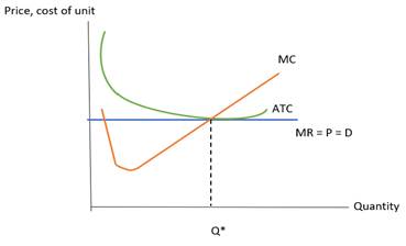
In this graph, the horizontal axis represents the quantity and the vertical axis shows the
The horizontal line in the mid of the graph shows demand, marginal revenue, and price which is labeled by MR = P = D. The marginal cost curve is in a swoosh shape which slopes upward and is labeled by MC on the graph.
The average total cost curve is in a U-shape which is labeled by ATC on the graph. Moreover, the quantity is determined on the graph where marginal cost and marginal revenue are equal (MC = MR).
At the level of output where profits are maximized, the average total cost falls to its lowest point.
Introduction: The market structure can be determined by a number of factors such as the number of buyers, sellers, competition, and barriers or freedom to enter or exit. Because perfectly competitive firms are forced to accept the
Chapter 58 Solutions
Krugman's Economics For The Ap® Course


 Principles of Economics (12th Edition)EconomicsISBN:9780134078779Author:Karl E. Case, Ray C. Fair, Sharon E. OsterPublisher:PEARSON
 Engineering Economy (17th Edition)EconomicsISBN:9780134870069Author:William G. Sullivan, Elin M. Wicks, C. Patrick KoellingPublisher:PEARSON
 Principles of Economics (MindTap Course List)EconomicsISBN:9781305585126Author:N. Gregory MankiwPublisher:Cengage Learning
 Managerial Economics: A Problem Solving ApproachEconomicsISBN:9781337106665Author:Luke M. Froeb, Brian T. McCann, Michael R. Ward, Mike ShorPublisher:Cengage Learning
 Managerial Economics & Business Strategy (Mcgraw-...EconomicsISBN:9781259290619Author:Michael Baye, Jeff PrincePublisher:McGraw-Hill Education