
Concept explainers
Videos
Sea Temperature To predict the effect of El Niño or La Niña events in the future, the National Oceanographic and Atmospheric Administration collects information about sea surface temperature (SST) and atmospheric conditions. They compare monthly temperature averages in the eastern equatorial Pacific Ocean to historical data and calculate the difference (the degree of anomaly) to determine if El Niño conditions, La Niña conditions, or neutral conditions are developing. El Niño is a rise in the average SST above 0.5°C. A decline of the same amount is La Niña. FIGURE 47.8 shows data for 42 years.
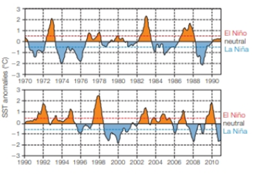
FIGURE 47.8 Sea surface temperature anomalies (difference from the historical mean) in the eastern equatorial Pacific Ocean. A rise above the dashed red line is an El Niño event, a decline below the blue line is La Niña
During a La Niña event, less rain than normal falls in the American West and Southwest. In the time interval shown, what was the longest interval without a La Niña event?
Want to see the full answer?
Check out a sample textbook solution
Chapter 47 Solutions
Biology: The Unity and Diversity of Life (MindTap Course List)
Additional Science Textbook Solutions
Principles of Anatomy and Physiology
Laboratory Manual for Holes Human Anatomy & Physiology Fetal Pig Version
Biological Science (6th Edition)
LooseLeaf for Integrated Principles of Zoology
BIOLOGY:THE ESSENTIALS (LL) W/CONNECT


- Which of the following statements about atmospheric carbon dioxide levels is correct? For about 800,000 years prior to human influence it varied between 180 and 300 ppm and is now above 410 ppm. For about 800,000 years prior to human influence it never exceeded 200 ppm. Its rate of increase in the past century is greater than any seen in the ice core record. Both 1 & 3arrow_forwardThe figure below shows the instrumental global surface temperature record since the late 19th centuries due to instrumental temperature record. Analyze the climate implication of the graph and 3 reasons for the trend in the graph.arrow_forwardThe warming trends discussed in the Case Study are most pronounced at the equator, where sunlight is most direct. What would you predict the effect of global warming to be nearer the poles, where temperatures are lower and there is less sunlight?arrow_forward
- Which of the following statements explains why temperature is considered a reliable metric to investigate climate change? Select all that apply: a. changes in other aspects of climate, such as precipitation or sea level, are a response to the temperature change b. there is a long-term global database for temperature c. temperature has been measured directly for millennia d. global temperature measurements include weather variabilityarrow_forwardCo2 & Temperature (1964 to 2008) 400 0.7 390 0.6 380 0.5 370 0.4 360 - + 0.3 350 + 0.2 340 + 0.1 330 320 -0.1 Temperature - CO2 (ppm) 310 -0.2 300 -0.3 1964 1968 1972 1976 1980 1984 1988 1992 1996 2000 2004 2008 Summarize the trend between carbon dioxide in the atmosphere and global temperatures shown by this graph. (Hint- ignore the smaller changes from year to year and focus on the overall trend from 1964 to 2008) stv Aa MacBook Air 888 DII DD F3 F4 FS F6 F7 F8 F9 F11 # & * 3 4 5 8 9 E R Y D F G H J K CIY BIN M Global Temperature Anomaly (C) V (wdd) Zarrow_forwardMajor climate models predict to occur during this century. a rise in the earth's mean surface temperature a decrease in the role of human activity in global temperature changes a decrease in global sea levels slowing temperature increases due to increased greenhouse gas emissions a sea level rise of 10 meters by 2020arrow_forward
- The three images below are snapshots of the atmospheric CO2 concentration in May, July, and September of a year. To interpret the CO2 concentration: blue/green/yellow indicates lower to medium CO2 concentrations and red/maroon/pink indicates medium-high to highest CO2 concentrations. Question: Which of the phenomena described below best explains why CO2 concentrations are lowest in the summer when compared to the spring or fallI/winter? 2006 / 05 / 09 NASA 2006 / 07 / 12 Canon Den ano n n Cat C m e NASA Global Medeling and Assinilten Offoe Cate ae 2006 / 11 / 13 Gobal Modeling and Assimiation Ofice NASA O Higher rates of plant and algae growth in summer lead to higher photosynthesis rates O Less fossil fuels are emitted by humans in the summer O More cars are driven by humans in the summer O Lower rates of plant and algae growth in summer lead to decreased rates of photosynthesisarrow_forwardThe following graph shows the average pH of the ocean over the last 20 million years of Earth's history. 8.4 8.3 8.2- 금 8.1 - 8.0 7.9 -15 -10 Time (millions of years before the present) Source: Acidification Model Source CO2SYS (Pierrot, Lewis and Wallace. 2006. Carbon Dioxide Information Analysis Center, ORNL, US DOE, Oak Ridge, TN, USA) What can be concluded from the graph? Select all that apply. -25 -20 0 5 Ocean acidity has been steadily increasing from 20 million years ago to the present time. Average ocean pH has fluctuated over the millennia from just over 8.0 to about 8.3. In the last 20 million years of Earth's history, the average pH has never gone below 8.0. Ocean acidity has been steadily decreasing from 20 million years ago to the present time.arrow_forwardThe Earth's climate has changed throughout history. Just in the last 650,000 years there have been seven cycles of glacial advance ar etreat, with the abrupt end of the last ice age about 7,000 years ago marking the beginning of the modern climate era and of human Civilization. Most of these climate changes are attributed to very small variations in Earth's orbit that change the amount of solar ene our planet receives. The current warming trend is of particular significance because most of it is very likely human-induced and proceeding at a very rapid rate not seen in the past 1,300 years. Earth-orbiting satellites and other technological advances have enabl- scientists to see the big picture, collecting many different types of information about our planet and its climate on a global scale. www.om Warming oceans Carbon dioxide levels continue to rise. The Greenland and Antarctic ice sheets have decreased in mass. Desertification has increased due to the rapid evaporation of freshwater…arrow_forward
- Since 1958, the levels of carbon dioxide in the earth's atmosphere increased from about 315 parts per million to about 400 ppm in 2017. During this time, the average global temperatures have increased as well. True Falsearrow_forwardLondon, England, is at the same latitude as Calgary in Canadas province of Alberta. However, the mean January temperature in London is 5.5C (42F), whereas in Calgary it is minus 10C (14F). Compare the locations of these two cities, and suggest a reason for this temperature difference.arrow_forwardPredictions of hydroclimatic change with global warming suggest that precipitation events are becoming/will become more extreme. In other words, heavy/flooding precipitation events will occur with greater frequency. Explain how the capacity of Earth’s atmosphere to hold water vapor changes as the atmosphere warms, such that heavier precipitation events could be triggered.arrow_forward
 Biology: The Unity and Diversity of Life (MindTap...BiologyISBN:9781305073951Author:Cecie Starr, Ralph Taggart, Christine Evers, Lisa StarrPublisher:Cengage Learning