a)
A graph that shows AD, LRAS, SRAS, equilibrium output, and aggregate price level while the economy is experiencing a recession.
a)
Explanation of Solution
The following graph shows AD, LRAS, SRAS, equilibrium output, and aggregate price level while the economy is experiencing a recession.
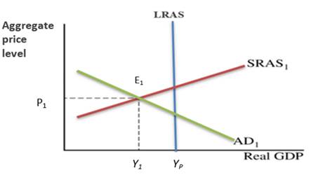
In the graph, the horizontal axis represents the real GDP and the vertical axis shows the aggregate price level. Here, the aggregate demand curve slopes downward and the SRAS curve slopes upward where the long-run
On the graph, the equilibrium is found at the point where the SRAS curve cuts the AD curve by labeling it E1.
Introduction: An economic downturn, or business cycle contraction, happens when this happens. Consumer spending declines sharply across the board, which is often when recessions begin.
b)
The effects of an increase in energy
b)
Explanation of Solution
The following graph represents the effects of an increase in energy prices on equilibrium:
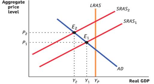
Here, the equilibrium aggregate price level and
Introduction: An economic downturn, or business cycle contraction, happens when this happens. Consumer spending declines sharply across the board, which is often when recessions begin.
c)
The effect of an increase in energy on
c)
Explanation of Solution
The increase in energy prices increases the unemployment rate and also rises the aggregate price level which will cause inflation. It happens because when the equilibrium is below the potential GDP, as in the AD/AS framework, unemployment is relatively high, and when it is reasonably close to the potential GDP, it is relatively low. And, the increasing aggregate price levels are often a sign that firms need to increase production to keep up with rising total demand.
Introduction: A global decentralized market for trading currencies is known as the foreign exchange market and for every currency, the foreign exchange rates are set by this market.
d)
Graph of foreign exchange market for U.S. dollars by showing the effect of increased U.S. energy prices on demand of U.S. dollars.
d)
Explanation of Solution
The following graph of the foreign exchange market for U.S. dollars shows the effect of increased U.S. energy prices on demand for U.S. dollars.
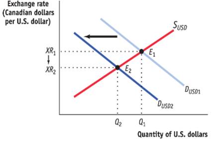
In the graph, the horizontal axis shows the quantity of U.S. dollars and the vertical axis represents the exchange rate of Canadian dollars as per U.S. dollar.
The demand curve (DUSD) for U.S. dollars would slope downward and the supply curve (SUSD) for U.S. dollars would slope upward.
Here, according to the graph, the equilibrium exchange rate and quantity of U.S. dollars are visible at the points on axes where the demand and supply curves intersect. The demand for U.S. dollars would increase as a result and the inflation in country United States would cause a decrease in the demand for export to country U which needs to be purchased in dollars of U.
Introduction: A global decentralized market for trading currencies is known as the foreign exchange market and for every currency, the foreign exchange rates are set by this market.
Chapter 45 Solutions
Krugman's Economics For The Ap® Course


 Principles of Economics (12th Edition)EconomicsISBN:9780134078779Author:Karl E. Case, Ray C. Fair, Sharon E. OsterPublisher:PEARSON
 Engineering Economy (17th Edition)EconomicsISBN:9780134870069Author:William G. Sullivan, Elin M. Wicks, C. Patrick KoellingPublisher:PEARSON
 Principles of Economics (MindTap Course List)EconomicsISBN:9781305585126Author:N. Gregory MankiwPublisher:Cengage Learning
 Managerial Economics: A Problem Solving ApproachEconomicsISBN:9781337106665Author:Luke M. Froeb, Brian T. McCann, Michael R. Ward, Mike ShorPublisher:Cengage Learning
 Managerial Economics & Business Strategy (Mcgraw-...EconomicsISBN:9781259290619Author:Michael Baye, Jeff PrincePublisher:McGraw-Hill Education