
MATLAB: An Introduction with Applications
6th Edition
ISBN: 9781119256830
Author: Amos Gilat
Publisher: John Wiley & Sons Inc
expand_more
expand_more
format_list_bulleted
Related questions
Question
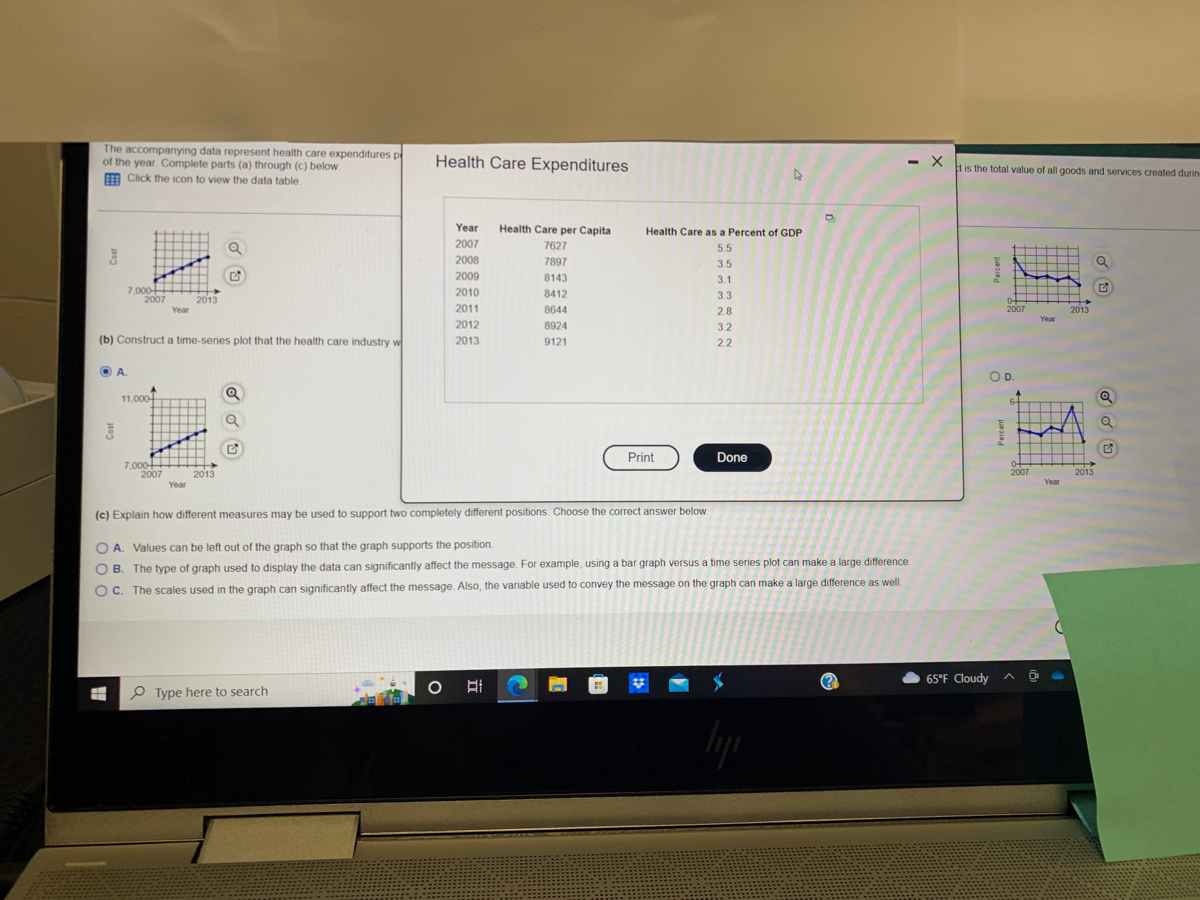

Transcribed Image Text:### Health Care Expenditures Educational Overview
#### Description
The accompanying data represent health care expenditures per capita and health care services as a percentage of GDP in a particular country from the years 2007 to 2013. GDP stands for Gross Domestic Product, which is the total value of all goods and services created during the year.
##### Data Table:
```
Year Health Care per Capita Health Care as a Percent of GDP
2007 7627 5.5
2008 7897 3.5
2009 8143 3.1
2010 8412 3.1
2011 8644 2.8
2012 8924 3.2
2013 9121 2.2
```
#### Tasks:
1. **Construct a time-series plot that the health care industry would use to support the position that health care has become more expensive over time. Refer to Graph A below.**
**Graph A Details:**
- X-axis: Year (from 2007 to 2013)
- Y-axis: Cost (in USD, ranging from 7,000 to 11,000)
- The plot shows a steady upward trend in health care costs per capita over the years.
2. **Construct a time-series plot that the health care industry would use to support the position that health care costs are decreasing as a percent of GDP. Refer to Graph D below.**
**Graph D Details:**
- X-axis: Year (from 2007 to 2013)
- Y-axis: Percent (ranging from 0 to 6)
- The plot indicates fluctuations but generally shows a downward drift in the percentage of GDP spent on health care over the years.
3. **Explain how different measures may be used to support two completely different positions.**
- **Option A:** Values can be left out of the graph so that the graph supports the position.
- **Option B (Correct):** The type of graph used to display the data can significantly affect the message. For example, using a bar graph versus a time series plot can make a large difference.
- **Option C:** The scales used in the graph can significantly affect the message. Also, the variable used to convey the message on the graph can make a large difference as

Transcribed Image Text:### Health Care Expenditures Analysis: 2007-2013
The accompanying data represent health care expenditures per capita (per person) as a percentage of the U.S. gross domestic product (GDP) from 2007 to 2013. Gross domestic product is the total value of all goods and services created during the course of the year. Complete parts (a) through (c) below.
#### (a) Construct a time-series plot that a politician would create to support the position that health care expenditures are increasing and must be slowed.
- **Option A**
- Description: A graph with a clear upward trend in health care expenditures from 2007 to 2013, indicating a consistent rise.
#### (b) Construct a time-series plot that the health care industry would create to refute the opinion of the politician.
- **Option B**
- Description: A graph showing fluctuations in health care expenditures over the years without a consistent upward trend, potentially showing periods of decrease from 2007 to 2013.
#### (c) Explain how different measures may be used to support two completely different positions.
- **Analysis:**
- Different graphical representations can be used to highlight specific aspects of the data. For instance, focusing on short-term fluctuations or specific years where expenses decreased could argue that expenditures are stable or decreasing. In contrast, emphasizing the long-term trend could support the argument that expenditures are on the rise. Visual presentation plays a crucial role in interpretation.
### Graphs and Diagrams Explained
The graphs provided show health care expenditures per capita on the vertical axis and the years from 2007 to 2013 on the horizontal axis. Each graph includes a time-series plot representing changes in expenditures over time.
- **Graph A:** Shows a steady increase in expenditures, likely used by politicians to argue for intervention.
- **Graph B:** Displays variable trends with ups and downs, likely employed by the health care industry to counter the argument for stringent control.
Understanding how data can be visualized to present different viewpoints is essential in data analysis, policy-making, and industry advocacy.
Expert Solution
This question has been solved!
Explore an expertly crafted, step-by-step solution for a thorough understanding of key concepts.

This is a popular solution

Trending nowThis is a popular solution!

Step by stepSolved in 2 steps with 2 images

Knowledge Booster

Similar questions
- The following data are the weights in kilograms of 53 third-graders. 27.4 21.2 21.3 20.5 18.3 17.9 20.8 22.8 23.5 24.5 19.9 20.3 22.1 17.0 23.5 24.5 20.7 20.6 21.9 16.9 19.7 20.2 21.5 21.7 23.5 21.8 19.3 22.1 23.1 19.0 23.5 25.1 20.5 25.8 22.0 19.3 19.3 18.5 20.8 21.9 18.0 20.2 24.9 17.3 19.6 20.5 22.4 23.9 18.9 25.5 25.0 22.6 24.5arrow_forwardA company has the following monthly sales for the past year. Plot the data points on a line graph and describe the results. Month Sales 1 145 2 146 3 145 4 150 5 148 6 150 7 156 8 160 9 158 10 153 11 152 12 154arrow_forwardPLEASE USE THE TABLE PROVIDED TO ANSWER THE QUESTION: John Doe Films is producing the next Batman movie. With the information available for Public Opinion and money Collected on Opening Day, what is the projected amount of money that will be collected if surveys indicate a public opinion of 8.5 for the new Batman movie? Can this projected amount of money be considered an accurate amount? Construct any plot(s)/graph(s) to support your answer.arrow_forward
- Year Percent of workers paid hourly rates 1979 61.2 1980 60.7 1981 61.3 1982 61.3 1983 61.8 1984 61.7 1985 61.8 1986 62.0 1987 62.7 1990 62.8 1992 62.9 The percent of female wage and salary workers who are paid hourly rates is given above for the years 1979-1992. a. Using "year" as the independent variable and "percent" as the dependent variable, make a scatter plot of the data. b. Does it appear from inspection that there is a relationship between the variables? c. Find the estimated percents for 1991 and 1988. d. Use the two points in part C to plot the least squares line on your graph from part A.arrow_forwardDoes this graph have trends and/or seasonality? What forecasting method is suitable for this data?arrow_forwardShelia's doctor is concerned that she may suffer from gestational diabetes (high blood glucose levels during pregnancy). There is variation both in the actual glucose level and in the blood test that measures the level. A patient is classified as having gestational diabetes if the glucose level is above 140 milligrams per deciliter one hour after a sugary drink is ingested. Shelia's measured glucose level one hour after ingesting the sugary drink varies according to the Normal distribution with mean 128 mg/dl and standard deviation 9 mg/dl. Let ? denote a patient's glucose level. (a) If measurements are made on four different days, find the level ? such that there is probability only 0.01 that the mean glucose level of four test results falls above ? for Shelia's glucose level distribution. What is the value of ??ANSWER: (b) If the mean result from the four tests is compared to the criterion 140 mg/dl, what is the probability that Shelia is diagnosed as having gestational…arrow_forward
- The amount of time adults spend watching television is closely monitored by firms because this helps to determine advertising pricing for commercials. Complete parts (a) through (d). C (a) Do you think the variable "weekly time spent watching television" would be normally distributed? If not, what shape would you expect the variable to have? A. The variable "weekly time spent watching television" is likely skewed right, not normally distributed. OB. The variable "weekly time spent watching television" is likely symmetric, but not normally distributed. O C. The variable "weekly time spent watching television" is likely skewed left, not normally distributed. O D. The variable "weekly time spent watching television" is likely normally distributed. O E. The variable "weekly time spent watching television" likely uniform, not normally distributed. (b) According to a certain survey, adults spend 2.45 hours per day watching television on a weekday. Assume that the standard deviation for "time…arrow_forwardFind a 96% confidence interval for Hg. Let µa = H1 - H2, where u, is the mean solar energy generated for the east-west highways and µ, is the mean solar energy generated for the north-south highways. (Round to one decimal place as needed.)arrow_forwardI am doing a persuasive speech on the increase in student loan debt. I want to use a graph that shows the increase over the decades from the 1970s to now which type of graph would be most appropriate for this type of data? A- a pie chart B- line graph C- bar grapharrow_forward
- Solve #3 with data shown.arrow_forwardDo the plots show any trend? If yes, is the trend,Why or why not?arrow_forwardTake a look at this reference sheet: http://bit.ly/2yGbKiB The scatter plot shows the number of hits and number of home runs for $$20 baseball players who had at least $$10 hits last season. The table shows the values for $$15 of those players. The model represented by y=0.15x−1.5 is graphed with the scatter plot. Player B was the player who most outperformed the prediction. How many hits did Player B have last season?arrow_forward
arrow_back_ios
SEE MORE QUESTIONS
arrow_forward_ios
Recommended textbooks for you
- MATLAB: An Introduction with ApplicationsStatisticsISBN:9781119256830Author:Amos GilatPublisher:John Wiley & Sons Inc
 Probability and Statistics for Engineering and th...StatisticsISBN:9781305251809Author:Jay L. DevorePublisher:Cengage Learning
 Statistics for The Behavioral Sciences (MindTap C...StatisticsISBN:9781305504912Author:Frederick J Gravetter, Larry B. WallnauPublisher:Cengage Learning
  Elementary Statistics: Picturing the World (7th E...StatisticsISBN:9780134683416Author:Ron Larson, Betsy FarberPublisher:PEARSON
 The Basic Practice of StatisticsStatisticsISBN:9781319042578Author:David S. Moore, William I. Notz, Michael A. FlignerPublisher:W. H. Freeman
 Introduction to the Practice of StatisticsStatisticsISBN:9781319013387Author:David S. Moore, George P. McCabe, Bruce A. CraigPublisher:W. H. Freeman
MATLAB: An Introduction with Applications
Statistics
ISBN:9781119256830
Author:Amos Gilat
Publisher:John Wiley & Sons Inc
Probability and Statistics for Engineering and th...
Statistics
ISBN:9781305251809
Author:Jay L. Devore
Publisher:Cengage Learning
Statistics for The Behavioral Sciences (MindTap C...
Statistics
ISBN:9781305504912
Author:Frederick J Gravetter, Larry B. Wallnau
Publisher:Cengage Learning
Elementary Statistics: Picturing the World (7th E...
Statistics
ISBN:9780134683416
Author:Ron Larson, Betsy Farber
Publisher:PEARSON
The Basic Practice of Statistics
Statistics
ISBN:9781319042578
Author:David S. Moore, William I. Notz, Michael A. Fligner
Publisher:W. H. Freeman
Introduction to the Practice of Statistics
Statistics
ISBN:9781319013387
Author:David S. Moore, George P. McCabe, Bruce A. Craig
Publisher:W. H. Freeman