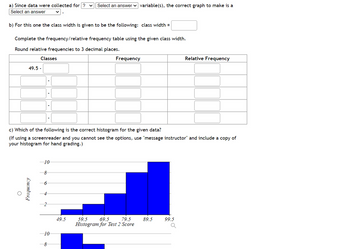
Students in a statistics class took their second test. The following are the scores they earned. Create a frequency distribution and histogram for the data using a lower class limit of 49.5 and a class width of 10. Describe the shape of the distribution.
| 98 |
| 82 |
| 87 |
| 79 |
| 71 |
| 79 |
| 76 |
| 69 |
| 64 |
| 66 |
| 60 |
| 64 |
| 63 |
| 62 |
| 60 |
| 53 |
| 50 |
| 56 |
| 59 |
| 51 |
| 57 |
| 55 |
| 56 |
| 56 |
| 55 |
a) Since data were collected for variable(s), the correct graph to make is a .
b) For this one the class width is given to be the following: class width =
Complete the frequency/relative frequency table using the given class width.
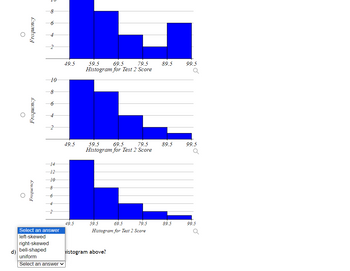
c) Which of the following is the correct histogram for the given data?
(If using a screenreader and you cannot see the options, use "message instructor" and include a copy of your histogram for hand grading.)
d) What shape is the histogram above?
Round relative frequencies to 3 decimal places.


Trending nowThis is a popular solution!
Step by stepSolved in 5 steps with 1 images

- Use the frequency distribution to create a histogram with single class values (a bar for 1, a bar for 2, etc.) that displays the data. Number of times fast food ordered number of students (frequency) 1 9 2 8 3 2 4 5 5 6 Total 30arrow_forwardStudents in a statistics class took their first test. The following are the scores they earned. Fill in the stem-and-leaf plot below use the tens place as the stem and the ones place as the leaf. Describe the shape of the distribution. 73 84 95 91 98 97 90 74 74 82 63 79 82 88 74 88 67 81 83 69 73 95 91 94 86 56 94 62 a) Data were collected for variable(s). Is it appropriate to make a stem-and-leaf plot for this type of data and number of variables? . b) Complete the stem-and-leaf plot below. You must put commas between the leaves. Stems Leaves 5 c) What shape is the stem-and-leaf plot above?arrow_forwardThe data represent the time, in minutes, spent reading a political blog in a day. Construct a frequency distribution using 5 classes. In the table, include the midpoints, relative frequencies, and cumulative frequencies. Which class has the greatest frequency and which has the least frequency? ... Class 38 0 25 16 32 39 13 38 24 30 15 15 7 21 27 10 34 0 Complete the table, starting with the lowest class limit. (Simplify your answers.) 19 23 Relative Cumulative Frequency Frequency Midpoint Frequencyarrow_forward
- Represent the following data on a stem and leaf plot.arrow_forwardRichard’s doctor had told him he needed to keep track of his blood sugar readings. Listed below are his 20 latest readings. He wanted to create a visual aid for himself in order to see how his blood sugar was doing. 75 125 110 82 178 209 150 130 120 142 90 98 107 163 135 129 147 152 110 100 A. Create a frequency distribution table for the given data set. B. Create a histogram for the data set. C. Describe the distribution of the data.arrow_forward435 507 448 435 463 440 448 413 432 458 473 465 428 472 439 a. Summarize the data on femur lengths in a frequency table. Use class intervals that start at 400 and have width 20. b. Add a column to your table from part (a) for the relative frequencies. c. Draw a histogram that represents your frequency table. (Use either frequency or relative frequency for the vertical axis.)arrow_forward
- The data represent the time, in minutes, spent reading a political blog in a day. Construct a frequency distribution using 5 classes. In the table, include the midpoints, relative frequencies, and cumulative frequencies. Which class has the greatest frequency and which has the least frequency? 20 22 29 2 3 19 19 4 10 20 29 13 25 17 28 22 4 13 0 9arrow_forwardd. Estimate the blood pressure of the student if his stress test score is 80, 60, and 85.arrow_forwardPlease give me answer immediately.arrow_forward
- Please help me answer in fullarrow_forwardWould enjoy the help. 4arrow_forwardUse the same scales to construct modified boxplots for the pulse rates of males and females from the accompanying data sets. Identify any outliers. Use the boxplots to compare the two data sets. Click the icon to view the data sets. Determine the boxplot for the men's pulse rate data. Choose the correct graph below. O A. O C. xx HE 40 50 60 70 80 90 100110 O C. What points are outliers? OA. 46 O B. 46, 89, 105 OC. 46, 48, 105 O D. 105 40 50 60 70 80 90 100110 -ידי xH Determine the boxplot for the women's boxplot data. Choose the correct graph below. O A. Q 40 50 60 70 80 90 100110 xH Q 40 50 60 70 80 90 100110 Q ✔ Q ✔ C O B. O D. O B. O D. 841x 40 50 60 70 80 90 100110 X 40 50 60 70 80 90 100110 40 50 60 70 80 90 100110 XX 40 50 60 70 80 90 100110 Q Q M Q Q ✔ Pulse rates for men and women Men's Pulse Rates 59 72 72 58 84 50 58 65 66 55 105 64 65 77 70 62 Women's Pulse Rates 76 70 74 83 59 67 65 72 74 89 85 78 56 80 60 46 70 59 70 75 66 68 66 72 77 78 97 74 62 81 54 74 77 79 89 95 59 98…arrow_forward
 MATLAB: An Introduction with ApplicationsStatisticsISBN:9781119256830Author:Amos GilatPublisher:John Wiley & Sons Inc
 Probability and Statistics for Engineering and th...StatisticsISBN:9781305251809Author:Jay L. DevorePublisher:Cengage Learning
 Statistics for The Behavioral Sciences (MindTap C...StatisticsISBN:9781305504912Author:Frederick J Gravetter, Larry B. WallnauPublisher:Cengage Learning
 Elementary Statistics: Picturing the World (7th E...StatisticsISBN:9780134683416Author:Ron Larson, Betsy FarberPublisher:PEARSON
 The Basic Practice of StatisticsStatisticsISBN:9781319042578Author:David S. Moore, William I. Notz, Michael A. FlignerPublisher:W. H. Freeman
 Introduction to the Practice of StatisticsStatisticsISBN:9781319013387Author:David S. Moore, George P. McCabe, Bruce A. CraigPublisher:W. H. Freeman


