
ENGR.ECONOMIC ANALYSIS
14th Edition
ISBN: 9780190931919
Author: NEWNAN
Publisher: Oxford University Press
expand_more
expand_more
format_list_bulleted
Question
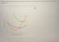
Transcribed Image Text:### Understanding Cost Curves in a Perfectly Competitive Market
Consider a perfectly competitive market for wheat in Denver. There are 80 firms in the industry, each of which has the cost curves shown on the following graph:
#### Graph Description:
The graph illustrates the cost curves for a typical firm in the wheat industry with the following components:
- **Axes**:
- The horizontal axis represents the **Output** measured in thousands of bushels, ranging from 0 to 50.
- The vertical axis represents **Cost** measured in cents per bushel, ranging from 0 to 100.
- **Curves**:
- **AVC (Average Variable Cost) Curve**: Depicted in purple, this curve initially decreases, reaching a minimum, and then increases as output rises, forming a U-shape.
- **ATC (Average Total Cost) Curve**: Shown in green, the ATC curve lies above the AVC curve and follows a similar U-shape pattern.
- **MC (Marginal Cost) Curve**: Represented in orange, the MC curve initially decreases, reaches a minimum point, and then sharply increases as the output expands. The MC curve intersects the ATC and AVC curves at their minimum points.
This graph illustrates important economic principles, such as cost minimization and optimal production levels within the context of a perfectly competitive market.
![The image presents a graph illustrating the demand curve within a market. The y-axis represents the price in cents per bushel, ranging from 0 to 100 cents. The x-axis indicates the quantity in thousands of bushels, spanning from 0 to 4000.
**Graph Details:**
- **Demand Curve:** A downward-sloping line from a higher price and lower quantity (top-left) to a lower price and higher quantity (bottom-right).
- **Legend:** On the right side, there are symbols for "Supply Curve" (orange line) and "Equilibrium" (cross symbol), though they are not depicted on the graph.
**Text at the Bottom:**
- "At the current short-run market price, firms will [dropdown] in the short run. In the long run, [dropdown] the market given the current market price."
This represents a typical demand graph used in economics to demonstrate how price and quantity demanded are inversely related.](https://content.bartleby.com/qna-images/question/37e2f913-30b2-4c8c-98d5-339163057ff1/0fe14654-5d97-4f93-8826-b6890826564b/55j6pxh_thumbnail.jpeg)
Transcribed Image Text:The image presents a graph illustrating the demand curve within a market. The y-axis represents the price in cents per bushel, ranging from 0 to 100 cents. The x-axis indicates the quantity in thousands of bushels, spanning from 0 to 4000.
**Graph Details:**
- **Demand Curve:** A downward-sloping line from a higher price and lower quantity (top-left) to a lower price and higher quantity (bottom-right).
- **Legend:** On the right side, there are symbols for "Supply Curve" (orange line) and "Equilibrium" (cross symbol), though they are not depicted on the graph.
**Text at the Bottom:**
- "At the current short-run market price, firms will [dropdown] in the short run. In the long run, [dropdown] the market given the current market price."
This represents a typical demand graph used in economics to demonstrate how price and quantity demanded are inversely related.
Expert Solution
This question has been solved!
Explore an expertly crafted, step-by-step solution for a thorough understanding of key concepts.
This is a popular solution
Trending nowThis is a popular solution!
Step by stepSolved in 2 steps with 2 images

Knowledge Booster
Similar questions
- one question, two picturesarrow_forwardConsider the perfectly competitive market for dress shirts. The following graph shows the marginal cost (MC), average total cost (ATC), and average variable cost (AVC) curves for a typical firm in the industry. 100 80 42.5, 60 ATC. 20 AVC 10 MO-O 10 15 20 25 30 35 40 50 QUANTITY (Thousands of shirts) For each price in the following table, use the graph to determine the number of shirts this firm would produce in order to maximize its profit. Assume that when the price is exactly equal to the average variable cost, the firm is indiſferent between producing zero shirts and the profit-maximizing quantity. Also, indicate whether the firm will produce, shut down, or be indifferent between the two in the short run. Lastly, determine whether it will make a profit, suffer a loss, or break even at each price. Price Quantity (Shirts) (Dollars per shirt) Produce or Shut Down? Profit or Loss? 10 20 32 40 50 60 On the following graph, use the orange points (square symbol) to plot points along the…arrow_forwardAmos McCoy is currently raising corn on his 100-acre farm and earning an accounting profit of $100 per acre. However, if he raised soybeans, he could earned an accounting profit of $200 per acre. Is he currently earning an economic profit?arrow_forward
- The following graph plots daily cost curves for a firm operating in the competitive market for demin overalls. Hint: Once you have positioned the rectangle on the graph, select a point to observe its coordinates. PRICE (Dollars per overalls) 50 10 10 5 0 MC 2 ATC 8 18 QUANTITY (Thousands of overallises per day) AVC 10 20 Profit or Loss In the short run, given a market price equal to $15 per overalls, the firm should produce a daily quantity of On the preceding graph, use the blue rectangle (circle symbols) to fill in the area that represents profit or loss of the firm given the market price of $15 and the quantity of production from your previous answer. Note: In the following question, enter a positive number regardless of whether the firm earns a profit or incurs a loss. The rectangular area represents a short-run thousand per day for the firm. $ overallses.arrow_forwardConsider the market for tilapia. Ripple Rock Fish Farms, a small family fishery in Ohio, and The Fishin’ Company, a large corporate supplier, are both producers of tilapia. The marginal cost curves for both firms are shown in the accompanying graph. a. Suppose the market price of tilapia is $2.50 per pound. Move point A to Ripple Rock’s quantity sold. Move point B to The Fishin’ Company’s quantity sold. b. How many pounds of tilapia do they collectively supply?________thousand pounds c. To achieve efficient production, The Fishin’ Company should supply _____ ("more", or "less", or "the same") it is currently producing, and Ripple Rock should supply __________ ("more", or "less", or "the same") it is currently producing.arrow_forwardplease correctly explain this and not copy paste.arrow_forward
- Why is the marginal revenue of a perfectly competitive firm equal the market price?arrow_forwardProblem 2.5 The cost function for Acme Laundry is TC(q) = 10 + 10q + q^2 so its marginalprod cost function is MC(q) = 10 + 2q where q is tons of laundry cleaned. Derive the firm's average cost and average variable cost curves. What q should the firm choose so as to maximize its profit if the market price is p? How much does it produce if the competitive market price is p = 50?arrow_forwardProblem 2.5 The cost function for Acme Laundry is TC(q) = 10 + 10q + q^2 so its marginal cost function is MC(q) = 10 + 2q where q is tons of laundry cleaned. Derive the firm's average cost and average variable cost curves. What q should the firm choose so as to maximize its profit if the market price is p? How much does it produce if the competitive market price is p = 50?arrow_forward
- Sketch a marginal cost curve for a firm that has constant marginal costs of production up to its capacity of 500 units but which cannot increase its output beyond that capacity PLEASEE SHOW THE CURVEarrow_forwardThe following graph plots the marginal cost (MC) curve, average total cost (ATC) curve, and average variable cost (AVC) curve for a firm operating in the competitive market for sun lamps.arrow_forwardThe accompanying graph depicts the cost curves of an individual firm in a perfectly (or purely) competitive industry.arrow_forward
arrow_back_ios
SEE MORE QUESTIONS
arrow_forward_ios
Recommended textbooks for you

 Principles of Economics (12th Edition)EconomicsISBN:9780134078779Author:Karl E. Case, Ray C. Fair, Sharon E. OsterPublisher:PEARSON
 Engineering Economy (17th Edition)EconomicsISBN:9780134870069Author:William G. Sullivan, Elin M. Wicks, C. Patrick KoellingPublisher:PEARSON
 Principles of Economics (MindTap Course List)EconomicsISBN:9781305585126Author:N. Gregory MankiwPublisher:Cengage Learning
 Managerial Economics: A Problem Solving ApproachEconomicsISBN:9781337106665Author:Luke M. Froeb, Brian T. McCann, Michael R. Ward, Mike ShorPublisher:Cengage Learning
 Managerial Economics & Business Strategy (Mcgraw-...EconomicsISBN:9781259290619Author:Michael Baye, Jeff PrincePublisher:McGraw-Hill Education


Principles of Economics (12th Edition)
Economics
ISBN:9780134078779
Author:Karl E. Case, Ray C. Fair, Sharon E. Oster
Publisher:PEARSON

Engineering Economy (17th Edition)
Economics
ISBN:9780134870069
Author:William G. Sullivan, Elin M. Wicks, C. Patrick Koelling
Publisher:PEARSON

Principles of Economics (MindTap Course List)
Economics
ISBN:9781305585126
Author:N. Gregory Mankiw
Publisher:Cengage Learning

Managerial Economics: A Problem Solving Approach
Economics
ISBN:9781337106665
Author:Luke M. Froeb, Brian T. McCann, Michael R. Ward, Mike Shor
Publisher:Cengage Learning

Managerial Economics & Business Strategy (Mcgraw-...
Economics
ISBN:9781259290619
Author:Michael Baye, Jeff Prince
Publisher:McGraw-Hill Education