
ENGR.ECONOMIC ANALYSIS
14th Edition
ISBN: 9780190931919
Author: NEWNAN
Publisher: Oxford University Press
expand_more
expand_more
format_list_bulleted
Question
fast please 19. Refer to the diagram to the right which shows cost and demand curves facing a typical firm in a
perfectly competitive industry.
constant−cost
If the market price is $20, what is the amount of the firm's profit?
Part 2
$5,400
$6,750
$8,100
$16,200
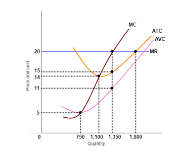
Transcribed Image Text:The image depicts a graph illustrating the relationship between price/cost and quantity for a firm, with various economic curves such as Marginal Cost (MC), Average Total Cost (ATC), Average Variable Cost (AVC), and the Marginal Revenue (MR) represented.
### Description of Graph Components:
**Axes:**
- **X-axis (Horizontal):** Represents Quantity, ranging from 0 to approximately 1,800 units.
- **Y-axis (Vertical):** Represents Price and Cost, ranging from 0 to 20.
**Curves:**
- **MC (Marginal Cost):** A positively sloped, red-colored line demonstrating the increase in cost with each additional unit produced.
- **ATC (Average Total Cost):** An upward-sloping orange line that shows the average cost per unit. This curve tends to decrease initially but rises as quantity increases.
- **AVC (Average Variable Cost):** This curve is slightly below the ATC, indicating variable costs per unit, also following an upward trend after decreasing initially.
- **MR (Marginal Revenue):** A horizontal pink line at the price level of $14, signifying the revenue gained from selling one more unit.
**Important Points and Lines:**
- **Price Line:** A constant horizontal blue line drawn at $20 showing the firm's product price level.
- **Intersection Points:**
- The MR cuts the MC curve at Quantity 1,100.
- The MC curve intersects the AVC at Quantity 1,350.
- The MC curve crosses ATC at Quantity 1,800.
**Observations:**
- For quantities below 1,100, the marginal cost is lower than both the price and marginal revenue, suggesting the production is profitable.
- At quantity 1,100, the profit-maximizing output is where MR = MC.
- Beyond quantities of 1,350, the costs begin to rise faster as indicated by MC climbing above AVC and ATC.
- At 1,800 units, the MC continues to rise above both ATC and AVC, indicating higher per-unit costs which may affect profitability.
This graph is typically used in microeconomics to illustrate cost structures and assist in decision-making for optimal production and pricing strategies.
Expert Solution
This question has been solved!
Explore an expertly crafted, step-by-step solution for a thorough understanding of key concepts.
This is a popular solution
Trending nowThis is a popular solution!
Step by stepSolved in 3 steps with 3 images

Knowledge Booster
Learn more about
Need a deep-dive on the concept behind this application? Look no further. Learn more about this topic, economics and related others by exploring similar questions and additional content below.Similar questions
- 1. Fill in this chart and explain why the firm earnsa profit no matter how many units they produce or the price they choose. 2. Using this data, how many units should this firm produce and what price should they chargeassuming they want to profit maximize.arrow_forwardUse Figure 11-5 to answer the following question(s). Cost and Revenue In long run equilibrium, this competitive firm will face a price of $6,200 units $10, 250 units $20, 300 units. $16, 300 units. $20 11 71 10 b 6 a Figure 11-5 טן MC MR ATC AVC 200 250 300 Quantity and produce 13arrow_forwardHow to sovle these? What's the right answer?arrow_forward
arrow_back_ios
arrow_forward_ios
Recommended textbooks for you

 Principles of Economics (12th Edition)EconomicsISBN:9780134078779Author:Karl E. Case, Ray C. Fair, Sharon E. OsterPublisher:PEARSON
 Engineering Economy (17th Edition)EconomicsISBN:9780134870069Author:William G. Sullivan, Elin M. Wicks, C. Patrick KoellingPublisher:PEARSON
 Principles of Economics (MindTap Course List)EconomicsISBN:9781305585126Author:N. Gregory MankiwPublisher:Cengage Learning
 Managerial Economics: A Problem Solving ApproachEconomicsISBN:9781337106665Author:Luke M. Froeb, Brian T. McCann, Michael R. Ward, Mike ShorPublisher:Cengage Learning
 Managerial Economics & Business Strategy (Mcgraw-...EconomicsISBN:9781259290619Author:Michael Baye, Jeff PrincePublisher:McGraw-Hill Education


Principles of Economics (12th Edition)
Economics
ISBN:9780134078779
Author:Karl E. Case, Ray C. Fair, Sharon E. Oster
Publisher:PEARSON

Engineering Economy (17th Edition)
Economics
ISBN:9780134870069
Author:William G. Sullivan, Elin M. Wicks, C. Patrick Koelling
Publisher:PEARSON

Principles of Economics (MindTap Course List)
Economics
ISBN:9781305585126
Author:N. Gregory Mankiw
Publisher:Cengage Learning

Managerial Economics: A Problem Solving Approach
Economics
ISBN:9781337106665
Author:Luke M. Froeb, Brian T. McCann, Michael R. Ward, Mike Shor
Publisher:Cengage Learning

Managerial Economics & Business Strategy (Mcgraw-...
Economics
ISBN:9781259290619
Author:Michael Baye, Jeff Prince
Publisher:McGraw-Hill Education