Concept explainers
Videos
Bone Density Test. In Exercises 1–4, assume that scores on a bone mineral density test are
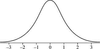
1. Bone Density Sketch a graph showing the shape of the distribution of bone density test scores.
To sketch: The graph showing the shape of the distribution of the bone mineral density test scores.
Answer to Problem 1CQQ
Explanation of Solution
Given info:
The bone density test scores follow a normal distribution with mean of 0 and standard deviation of 1.
Justification:
Here, the bone density test follows a normal distribution. Also, the graph of the normal distribution is bell shaped and is symmetric about the mean. Moreover, if the mean and standard deviation are 0 and 1, respectively, the distribution is known as standard normal distribution. Hence, the graph of the bone density test scores is bell-shaped
Want to see more full solutions like this?
Chapter 6 Solutions
Essentials of Statistics (6th Edition)


- Flight Arrivals Listed below are the arrival delay times (min) of randomly selected American Airlines flights that departed from JFK in New York bound for LAX in Los Angeles. Negative values correspond to flights that arrived early and ahead of the scheduled arrival time. Use these values for Exercises 1–4. Level of Measurement What is the level of measurement of these data (nominal, ordinal, interval, ratio)? Are the original unrounded arrival times continuous data or discrete data?arrow_forwardConstructing Normal Quantile Plots. In Exercises 17–20, use the given data values to identify the corresponding z scores that are used for a normal quantile plot, then identify the coordinates of each point in the normal quantile plot. Construct the normal quantile plot, then determine whether the data appear to be from a population with a normal distribution. Earthquake Depths A sample of depths (km) of earthquakes is obtained from Data Set 21 “Earthquakes” in Appendix B: 17.3, 7.0, 7.0, 7.0, 8.1, 6.8.arrow_forwardScenario: Does emotional intelligence change across the lifespan? A researcher conducts a longitudinal study by collecting data on the same people across 20 years. Emotional intelligence was quantified at ages 4, 14, 24, and 34 years of age. Emotional intelligence was quantified using the self-report Bar-On EQ-I, which ranges from 0 — 110, and is considered "scale" in nature. Assume data meets all assumptions for a parametric test. Question: As taught in 510/515, what is the most appropriate graph to illustrate this scenario?arrow_forward
- The geoemetric mean of 2, 4 & 8.arrow_forwarde) Normality of responses f) Transformation of dataarrow_forwardA researcher is conducting a study to examine the relationship between age and agility. She recruited a sample of 50 participants, ranging in age from 20 – 65 years old, and asked them to perform a series of agility tests. Afterward, participants were given an average agility score, which was then used in a correlation analysis against participant age. The results of the study are as follows [r(50) = -0.97, p < 0.001]. Identify the correct interpretation below. A. There is a non-significant, weak, negative correlation between age and agility, suggest that as age increases, agility decreases B. There is a statistically significant, strong, negative correlation between age and agility, suggesting that as age increases, agility decreases C. There is a non-significant, moderate, positive correlation between age and agility, suggesting that there is no relationship between these two variables D. There is a statistically significant, strong positive correlation between age and…arrow_forward
- Data about recent federal defense spending are given in the accompanying Statistical Abstract of the United States table. Here t denotes the time, in years, since 1990 and D denotes federal defense spending, in billions of dollars.arrow_forwardInterpreting a Histogram. In Exercises 5–8, answer the questions by referring to the following Minitab-generated histogram, which depicts the weights (grams) of all quarters listed in Data Set 29 “Coin Weights” in Appendix B. (Grams are actually units of mass and the values shown on the horizontal scale are rounded.) Relative Frequency Histogram How would the shape of the histogram change if the vertical scale uses relative frequencies expressed in percentages instead of the actual frequency counts as shown here?arrow_forward5.3 2.4 3.5 5.2 (Reference: Crime in the United States, Federal Bureau of Investigation.) Assume that the crime rate distribution is approximately normal in both regions. i, Use a calculator to verify that x 3.51, s, = 0.81, x, = 3.87, and 0.94. i/ Do the data indicate that the violent crime rate in the Rocky Mountain region is higher than that in New England? Use a = 0.01. %3D Medical: Hay Fever A random sample of n, = 16 communities in western Kansas gave the following information for people under 25 years of age. x,: Rate of hay fever per 1000 population for people under 25 120 128 92 123 112 93 86 06 125 95 125 122 88 L6 Arandom sample of n, = 14 regions in western Kansas gave the following information for people over 50 years old. x,: Rate of hay fever per 1000 population for people over 50 95 110 97 112 88 85 110 115 114 68 96 (Reference: National Center for Health Statistics.) i. Use a calculator to verify that x 109.50, s, - 15.41, x2 - 99.36, and sh 11.57. ii. Assume that the…arrow_forward
 Algebra & Trigonometry with Analytic GeometryAlgebraISBN:9781133382119Author:SwokowskiPublisher:Cengage
 Glencoe Algebra 1, Student Edition, 9780079039897...AlgebraISBN:9780079039897Author:CarterPublisher:McGraw Hill
 Big Ideas Math A Bridge To Success Algebra 1: Stu...AlgebraISBN:9781680331141Author:HOUGHTON MIFFLIN HARCOURTPublisher:Houghton Mifflin Harcourt