Concept explainers
Videos
Agriculture: Apple Trees The following data represent trunk circumferences (in mm) for a random sample of 60 four-year-old apple trees at East Mailing Agriculture Research Station in England (Reference: S. C. Pearce. University of Kent at Canterbury). Note: These data are also available for download at the Companion sites for this text.
| 108 | 99 | 106 | 102 | 115 | 120 | 120 | 117 | 122 | 142 |
| 106 | 111 | 119 | 109 | 125 | 108 | 116 | 105 | 117 | 123 |
| 103 | 114 | 101 | 99 | 112 | 120 | 108 | 91 | 115 | 109 |
| 114 | 105 | 99 | 122 | 106 | 113 | 114 | 75 | 96 | 124 |
| 91 | 102 | 108 | 110 | 83 | 90 | 69 | 117 | 84 | 142 |
| 122 | 113 | 105 | 112 | 117 | 122 | 129 | 100 | 138 | 117 |
(a) Make a stem-and-leaf display of the tree circumference data.
(b) Make a frequency table with seven classes showing class limits, class boundaries, midpoints, frequencies, and relative frequencies.
(c) Draw a histogram.
(d) Draw a relative-frequency histogram.
(e) Identify the shape of the distribution.
(f) Draw an ogive.
(g) Interpretation How are the low frequencies shown in the histogram reflected in the steepness of the lines in the ogive?
(a)
To graph: A stem-and-leaf plot for the data of the tree circumference (mm).
Explanation of Solution
Graph: To construct stem-and-leaf plot by using the Minitab, the steps are as follows:
Step 1: Enter the data in C1.
Step 2: Go to Graph > Stem-and-Leaf plot and select ‘C1’ in Graph variable.
Step 3: Click on OK.
The stem-and-leaf plot for these data is obtained as:
| Stem-and-leaf of circum_(mm) N = 60 | ||
| 6 | 9 | |
| 7 | 5 | |
| 8 | 3 4 | |
| 9 | 0 1 1 6 9 9 9 | |
| 10 | 0 1 2 2 3 5 5 5 6 6 6 8 8 8 8 9 9 | |
| 11 | 0 1 2 2 3 3 4 4 4 5 5 6 7 7 7 7 7 9 | |
| 12 | 0 0 0 2 2 2 2 3 4 5 9 | |
| 13 | 8 | |
| 14 | 2 2 | |
Leaf Unit = 1
In above stem-and-leaf plot, the first stem 6 and leave 9 represent 69 mm
(b)
To find: The frequency table for the data..
Answer to Problem 15CR
Solution: The complete frequency table is as follows:
| class limits | class boundaries | midpoints | freq | relative freq | cumulative freq |
| 69-79 | 68.5-79.5 | 74 | 2 | 0.03 | 2 |
| 80-90 | 79.5-90.5 | 85 | 3 | 0.05 | 5 |
| 91-101 | 90.5-101.5 | 96 | 8 | 0.13 | 13 |
| 102-112 | 101.5-112.5 | 107 | 19 | 0.32 | 32 |
| 113-123 | 112.5-123.5 | 118 | 22 | 0.37 | 54 |
| 124-134 | 123.5-134.5 | 129 | 3 | 0.05 | 57 |
| 135-145 | 134.5-145.5 | 140 | 3 | 0.05 | 60 |
Explanation of Solution
Calculation: To find the class width for the whole data of 60 values, it is observed that largest value of the data set is 142 and the smallest value is 49 in the data. Using 7 classes, the class width calculated as follows:
The value is rounded up to the nearest whole number. Hence, the class width of the data set is 11. The class width for the data is 11 and the lowest data value (49) will be the lower class limit of the first class. Because the class width is 11, it must add 11 to the lowest class limit in the first class to find the lowest class limit in the second class. There are 7 desired classes. Hence, the class limits are 69-79, 80-90, 91-101, 102-112, 113-123, 124-134, and 135-145. Now, to find the class boundaries subtract 0.5 from lower limit of every class and add 0.5 to the upper limit of the every class interval. Hence, the class boundaries are 68.5-79.5, 79.5-90.5, 90.5-101.5, 101.5-112.5, 112.5-123.5, 123.5-134.5, and 134.5-145.5
Next, to find the midpoint of the class is calculated by using the formula,
Midpoint of first class is calculated as:
The frequencies for respective classes are 2, 3, 8, 19, 22, 3, and 3.
Relative frequency is calculated by using the formula
The frequency for first class is 2 and total frequencies are 60 so the relative frequency is
The calculated frequency table is as follows:
| class limits | class boundaries | midpoints | freq | relative freq | cumulative freq |
| 69-79 | 68.5-79.5 | 74 | 2 | 0.03 | 2 |
| 80-90 | 79.5-90.5 | 85 | 3 | 0.05 | |
| 91-101 | 90.5-101.5 | 96 | 8 | 0.13 | |
| 102-112 | 101.5-112.5 | 107 | 19 | 0.32 | |
| 113-123 | 112.5-123.5 | 118 | 22 | 0.37 | |
| 124-134 | 123.5-134.5 | 129 | 3 | 0.05 | |
| 135-145 | 134.5-145.5 | 140 | 3 | 0.05 |
Interpretation: Hence, the complete frequency table is as follows:
| class limits | class boundaries | midpoints | freq | relative freq | cumulative freq |
| 69-79 | 68.5-79.5 | 74 | 2 | 0.03 | 2 |
| 80-90 | 79.5-90.5 | 85 | 3 | 0.05 | 5 |
| 91-101 | 90.5-101.5 | 96 | 8 | 0.13 | 13 |
| 102-112 | 101.5-112.5 | 107 | 19 | 0.32 | 32 |
| 113-123 | 112.5-123.5 | 118 | 22 | 0.37 | 54 |
| 124-134 | 123.5-134.5 | 129 | 3 | 0.05 | 57 |
| 135-145 | 134.5-145.5 | 140 | 3 | 0.05 | 60 |
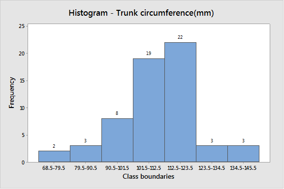
(c)
To graph: A histogram for the data of trunk circumference (mm).
Explanation of Solution
Graph: To construct the histogram by using the MINITAB, the steps are as follows:
Step 1: Enter the class boundaries in C1 and frequency in C2.
Step 2: Go to Graph > Histogram > Simple.
Step 3: Enter C1 in Graph variable then go to Data options > Frequency > C2.
Step 4: Click on OK.
The obtained histogram is as follows:
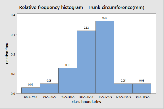
(d)
To graph: The relative frequency histogram for the data..
Explanation of Solution
Graph: To construct the histogram by using the MINITAB, the steps are as follows:
Step 1: Enter the class boundaries in C1 and relative frequency in C3.
Step 2: Go to Graph > Histogram > Simple.
Step 3: Enter C1 in Graph variable then go to Data options > relative frequency > C3.
Step 4: Click on OK.
The obtained relative frequency histogram is
(e)
The shape of the histogram of age distribution..
Answer to Problem 15CR
Solution: The shape of distribution is slightly skewed to the left.
Explanation of Solution
A
From above histogram, one class boundaries (112.5–123.5) have higher frequency 22 on right side and most of the data values fall on the right side of the graph. The data lean toward left side of the graph and also there is a tail on the left side.
Hence, the shape of distribution is skewed slightly left.
(f)
To graph: The Ogive graph for the data..
Explanation of Solution
Graph: To construct the Ogive by using the Excel, the steps are as follows:
Step 1: Enter the class boundaries and cumulative frequency.
Step 2: Select the data and go to Insert > chart > Line.
The obtained Ogive is as follows:
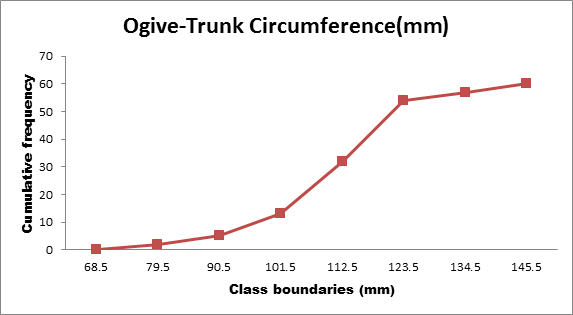
(g)
To explain: The low frequencies shown in the histogram are reflected in the steepness of the lines in the Ogive.
Answer to Problem 15CR
Solution: The low frequencies shown in the histogram are reflects that the data are not accumulating as rapidly as in the center part of the data range.
Explanation of Solution
It is observed that largest value of the data set is 142 and the smallest value is 69 in the data. Hence, the range of the data is 68 to 146, that is, the bulk of the data fall from 68 to 146. From above histogram, one class boundaries (112.5-123.5) have higher frequency 22 on right side. The three classes have low frequencies in the data.
The lines are flat at the beginning and at the end of the Ogive graph, just as the bars of the histogram are shorter. This reflects that in these locations the data are not accumulating as rapidly as in the center part of the data range.
Want to see more full solutions like this?
Chapter 2 Solutions
Understanding Basic Statistics


 Glencoe Algebra 1, Student Edition, 9780079039897...AlgebraISBN:9780079039897Author:CarterPublisher:McGraw Hill
 Holt Mcdougal Larson Pre-algebra: Student Edition...AlgebraISBN:9780547587776Author:HOLT MCDOUGALPublisher:HOLT MCDOUGAL