A First Course in Probability (10th Edition)
10th Edition
ISBN: 9780134753119
Author: Sheldon Ross
Publisher: PEARSON
expand_more
expand_more
format_list_bulleted
Question
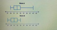
The numbers of customers entering each of two stores every hour were recorded. The results are shown. Which statement about the number of customers at the stores is not correct?

Transcribed Image Text:This image contains two box plots comparing data from Store A and Store B.
### Box Plot Explanation:
**Store A:**
- The minimum value is at approximately 28.
- The lower quartile is at 31.
- The median is around 33.
- The upper quartile is at approximately 37.
- The maximum value extends to about 43.
**Store B:**
- The minimum value is at approximately 28.
- The lower quartile is at 30.
- The median is around 33.
- The upper quartile is at approximately 35.
- The maximum value extends to about 41.
### Interpretation:
Each box plot displays the range of data for Stores A and B, indicating the distribution and spread of the dataset. The boxes represent the interquartile range (IQR), and the lines (whiskers) show the full data range. The median line inside the box highlights where the central 50% of the data is concentrated.

Transcribed Image Text:### Interpretation of Customer Data for Store Analysis
The image presents a list of statements related to customer activity at two hypothetical stores, labeled as Store A and Store B. It suggests analyzing the data based on certain statistical measures. Below are the statements for analysis:
1. **A. Store A had the higher median.**
- This suggests comparing the median number of customers between Store A and Store B to determine which store typically has more customers at the midpoint.
2. **B. Store A had the hour with the fewest customers.**
- This statement involves identifying which store had the least number of customers during a specific hour in the dataset.
3. **C. The typical number of customers for Store A was higher than for store B.**
- This compares the typical (average) customer numbers between the two stores.
4. **D. The spread of data for store A was greater than for store B.**
- This looks at the variability or range of the number of customers, indicating which store had more variability in customer numbers.
### Explanation
* **Median:** A measure of central tendency, indicating the middle value when the data is ordered.
* **Typical Number of Customers:** Usually refers to the mean or average number of customers.
* **Spread of Data:** Reflects the variability in the data, often measured by range, variance, or standard deviation.
The image does not contain any graphs or diagrams, only these statements. For a proper analysis, access to actual data would be necessary to verify these statements. This would involve calculations based on real customer data from the respective stores.
Expert Solution
This question has been solved!
Explore an expertly crafted, step-by-step solution for a thorough understanding of key concepts.
This is a popular solution
Trending nowThis is a popular solution!
Step by stepSolved in 2 steps with 1 images

Knowledge Booster
Similar questions
- Of the 137 students who took a mathematics exam, 57 correctly answered the first question, 65 correctly answered the second question, and 23 correctly answered both questions. How many students did not answer either of the two questions correctly? students did not answer either of the two questions correctly.arrow_forwardPart 1,2,3 & 4 please!arrow_forwardMr. Powers gave a coin to each of the 25 children who came to his door for a treat last Halloween. If the coins were nickles and dimes and he gave away a total of $1.45, how many received dimes and how many nickels?arrow_forward
- A member of the Student Council decided to conduct a room visit and asked the students for their club involvement. Out of 150 who were surveyed, 85 mentioned that they joined the Debate Club; 70 said that they signed up for the Cooking Club; and 50 joined both the Debate and Cooking Clubs. How many students joined the Debate or Cooking Club?arrow_forwardThe average age of the students in Class A is more than 11 years old. If ten out of the eleven students are 11 years old, which of the following could be the age of the remaining student?arrow_forwardMr. White collected data from his eighth grade class on whether they prefer the zoo or the museum. Based on the data collected, if the eighth grade has 90 girls and 78 boys, which statement is true?arrow_forward
- how many liked these?arrow_forwardThe newest cars have 12 different accessories and the buyer pays for each one separately. If a particular buyer wants to buy four accessories, how many different accessory packages will there be?arrow_forwardLast year a group of 48 students enrolled in Mathematic, French, and Physics. Some students were more successful than others: –32 passed French, 27 passed Physics, and 33 passed Mathematics; –26 passed French and Mathematics, 26 passed Physics and Mathematics, and 21 passed French and Physics; –21 passed French, Mathematics, and Physics. How many students passed one or more of the subject? Please write clearly thank you.arrow_forward
- The infamous Gillette ad has 1.55 million “dislikes” on YouTube, making it the 26th most disliked video on YouTube. If 1% of the people who disliked the video are male former Gillette customers who will now boycott Gillette, and if Gillette razors cost $30 for a pack of 10, and if a man uses 1 Gillette razor per day, and if a year has 365 days, how much money will Gillette lose per year?arrow_forwardDery?arrow_forwardMan.3 The ratio of boys to girls at Wells College is currently 3 to 7 . If there are 525 girls, how many boys are enrolled this year?arrow_forward
arrow_back_ios
SEE MORE QUESTIONS
arrow_forward_ios
Recommended textbooks for you
 A First Course in Probability (10th Edition)ProbabilityISBN:9780134753119Author:Sheldon RossPublisher:PEARSON

A First Course in Probability (10th Edition)
Probability
ISBN:9780134753119
Author:Sheldon Ross
Publisher:PEARSON
