Human Anatomy & Physiology (11th Edition)
11th Edition
ISBN: 9780134580999
Author: Elaine N. Marieb, Katja N. Hoehn
Publisher: PEARSON
expand_more
expand_more
format_list_bulleted
Related questions
Question
None

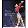
Transcribed Image Text:Scientific information is initially collected in a database and reported in a table format. The data can be very difficult to understand in this
form. The data below is an excerpt from Cell Metabolism 19, 407-417, March 4, 2014 2014 Elsevier Inc.
Table 1. Associations between Mortality and Protein Intake
Diabetes Mortality
Moderate protein (n=4.798)
High protein (n=1,146)
9 kcal fat
% kcal carbs
%6 kcal animal protain
Hazard Ratio (95% CI)
Ages 50-65 (N=3,039)
Model 1
Model 2
Model 3.
Model 4
Ages 66+ (N=3,342)
Model 1
Model 2
Model 3
3.43 (0.69-17.02) 3.36 (0.67-16.90) 3.41 (0.67-17.36) 2.99 (0.58-15.31) 5.38 (0.05-30.419)
6.20 (0.35-37.01)
3.93 (0.73-21.07) 3.88 (0.71-21.17) 3.90 (0.67-22.84) 2.77 (0.24-31.73) 10.64 (1.85-61.31) 10.42 (1.88-57.87) 9.07 (1.49-65.30) 15.16 (1.93-118.9)
5.05 (0.93-27.34) 4.93 (0.89-27.35)
1.01 (0.97-1.05)
1.00 (0.96-1.04)
1.02 (0.92-1.14)
Reference low protein (n=437 in both age groups). Model 1 (baseline model: Adjusted for age, sex, race/ethnicity, education, waist circumference, smoking, chronic conditions (diabetes, cancer,
myocardial infarction), trying to lose weight in the last year, diet changed in the last year, reported intake representative of typical diet, and total calories. Model 2: Adjusted for covariates and % kcals
Scientists frequently show this same data in graph form to help visualize the patterns and trends within the data.
Diabetes
Low Prote
Moderan Protein
High Protein
Please read the Basic Graph Interpretation information provided in your course to help answer these questions.
For this question, focus on the GRAPH. As I mentioned in the assignment description, I do
think that the authors are trying to present information usefully. That said, this graph just
has some basic problems.
What problems does the graph? Check all of the things that are wrong with the graph.
It should be graphed as a bar graph.
The x-axis doesn't start with zero.
Predicted time til death should be on the other axis.
The title is not complete enough.
There are no units on the axes.
Expert Solution
This question has been solved!
Explore an expertly crafted, step-by-step solution for a thorough understanding of key concepts.

Step by stepSolved in 2 steps

Knowledge Booster

Similar questions
Recommended textbooks for you
- Human Anatomy & Physiology (11th Edition)BiologyISBN:9780134580999Author:Elaine N. Marieb, Katja N. HoehnPublisher:PEARSON
 Biology 2eBiologyISBN:9781947172517Author:Matthew Douglas, Jung Choi, Mary Ann ClarkPublisher:OpenStax
 Anatomy & PhysiologyBiologyISBN:9781259398629Author:McKinley, Michael P., O'loughlin, Valerie Dean, Bidle, Theresa StouterPublisher:Mcgraw Hill Education,
  Molecular Biology of the Cell (Sixth Edition)BiologyISBN:9780815344322Author:Bruce Alberts, Alexander D. Johnson, Julian Lewis, David Morgan, Martin Raff, Keith Roberts, Peter WalterPublisher:W. W. Norton & Company
 Laboratory Manual For Human Anatomy & PhysiologyBiologyISBN:9781260159363Author:Martin, Terry R., Prentice-craver, CynthiaPublisher:McGraw-Hill Publishing Co.
 Inquiry Into Life (16th Edition)BiologyISBN:9781260231700Author:Sylvia S. Mader, Michael WindelspechtPublisher:McGraw Hill Education
Human Anatomy & Physiology (11th Edition)
Biology
ISBN:9780134580999
Author:Elaine N. Marieb, Katja N. Hoehn
Publisher:PEARSON
Biology 2e
Biology
ISBN:9781947172517
Author:Matthew Douglas, Jung Choi, Mary Ann Clark
Publisher:OpenStax
Anatomy & Physiology
Biology
ISBN:9781259398629
Author:McKinley, Michael P., O'loughlin, Valerie Dean, Bidle, Theresa Stouter
Publisher:Mcgraw Hill Education,
Molecular Biology of the Cell (Sixth Edition)
Biology
ISBN:9780815344322
Author:Bruce Alberts, Alexander D. Johnson, Julian Lewis, David Morgan, Martin Raff, Keith Roberts, Peter Walter
Publisher:W. W. Norton & Company
Laboratory Manual For Human Anatomy & Physiology
Biology
ISBN:9781260159363
Author:Martin, Terry R., Prentice-craver, Cynthia
Publisher:McGraw-Hill Publishing Co.
Inquiry Into Life (16th Edition)
Biology
ISBN:9781260231700
Author:Sylvia S. Mader, Michael Windelspecht
Publisher:McGraw Hill Education