ENGR.ECONOMIC ANALYSIS
14th Edition
ISBN: 9780190931919
Author: NEWNAN
Publisher: Oxford University Press
expand_more
expand_more
format_list_bulleted
Question

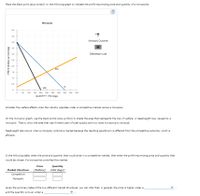
Transcribed Image Text:### Monopoly and Competitive Market Analysis
#### Monopoly Graph
The provided graph illustrates a monopoly market. It includes the following curves:
- **Demand (D)**: Downward-sloping blue line from the top left to the bottom right.
- **Marginal Revenue (MR)**: Downward-sloping black line, steeper than the demand curve.
- **Marginal Cost (MC)**: Upward-sloping orange line.
Axes:
- **X-Axis (Quantity)**: Measures quantity in hot dogs, ranging from 0 to 500.
- **Y-Axis (Price)**: Measures price in dollars per hot dog, ranging from 0 to 5.
#### Monopolist's Profit-Maximizing Price and Quantity
Place the black point (plus symbol) at the intersection of the MR and MC curves. This point indicates the profit-maximizing quantity and price for the monopolist.
#### Deadweight Loss
Shade the area on the monopoly graph to represent the deadweight loss, which occurs due to the loss of welfare or total surplus in a monopoly market compared to a competitive market. This area is typically located between the demand curve and the marginal cost curve beyond the monopoly quantity.
#### Welfare Effects: Competitive Market vs. Monopoly
Consider the welfare implications under both market structures. A competitive market is usually more efficient as it leads to a higher total surplus, whereas a monopoly results in a deadweight loss.
### Table: Market Structure Comparison
Fill in the following table with the respective price and quantity for both competitive and monopoly markets:
| Market Structure | Price (Dollars) | Quantity (Hot Dogs) |
|------------------|------------------|---------------------|
| **Competitive** | | |
| **Monopoly** | | |
### General Observations
From the summary table, it can be inferred that, in general:
- The price is higher under a **monopoly**.
- The quantity is lower under a **monopoly**.
This information aids in understanding how different market structures can impact prices, quantities, and overall market efficiency.

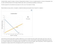
Transcribed Image Text:## Understanding Market Structures: Competition and Monopoly in Hot Dog Markets
### Competitive Market Scenario
Consider the daily market for hot dogs in a small city. Suppose this market is in long-run competitive equilibrium with many hot dog stands, each selling the same kind of hot dogs. In this scenario, every vendor is a price taker and has no market power.
#### Graph Analysis
The graph presented shows the demand (D) and supply (S = MC) curves in the hot dog market.
- **Demand Curve (D):**
- Plotted in blue.
- Represents the relationship between the price of hot dogs and the quantity demanded by consumers.
- **Supply Curve (S = MC):**
- Plotted in orange.
- Represents the market supply, which equals the marginal cost (MC) in a competitive market.
**Graph Explanation:**
- The horizontal axis represents the quantity of hot dogs.
- The vertical axis represents the price per hot dog in dollars.
- The point where both curves intersect is the market equilibrium in perfect competition.
Place the black point (plus symbol) on the graph to indicate the market price and quantity that will result from competition.
### Monopoly Scenario
Assume that one of the hot dog vendors successfully lobbies the city council to obtain the exclusive right to sell hot dogs within the city limits, forming a monopoly. This firm buys out all other vendors and operates as a monopoly. Assuming the change does not affect demand, and the new monopoly's marginal cost curve corresponds exactly to the supply curve in the previous graph.
**New Graph Dynamics:**
- The demand curve (D), marginal revenue curve (MR), and marginal cost curve (MC) for the monopoly firm will be shown.
This shift from a competitive market to a monopoly will illustrate how a single vendor with market power can influence prices and quantities differently from many vendors in a competitive market.
Expert Solution
This question has been solved!
Explore an expertly crafted, step-by-step solution for a thorough understanding of key concepts.
This is a popular solution
Trending nowThis is a popular solution!
Step by stepSolved in 3 steps with 1 images

Knowledge Booster
Learn more about
Need a deep-dive on the concept behind this application? Look no further. Learn more about this topic, economics and related others by exploring similar questions and additional content below.Similar questions
- The graph below depicts the demand curve facing a monopolist. The monopoly has constant marginal costs of $5. On the graph: A). Use the straight line tool to draw the marginal revenue curve. B) use the straight line tool to draw the marginal cost curve up to 60 units of output C) use the point tool to plot the profit maximization point on the demand curve.arrow_forward8 A monopoly has the following demand and Total Cost curve: Demand: P=1000-10Q TC=100Q+5Q2 1. How much profits does the monopoly make at the profit-maximizing level of quantity? $ 2. What is the DWL from the monopoly? $arrow_forward8arrow_forward
- Note:- Do not provide handwritten solution. Maintain accuracy and quality in your answer. Take care of plagiarism. Answer completely. You will get up vote for sure.arrow_forward100 pis possib TTIT The table below shows the quantity of output produced by a monopoly that consumers demand at each price and the monopoly's cost structure. Quantity Price Total Revenue Marginal Revenue $400 350 300 Total Cost Marginal Cost $40 1 $400 $400 750 1,050 1,300 1,500 1,650 1,750 1,800 1,800 $40 375 60 20 3 350 108 48 IS 325 250 164 56 300 200 228 64 6. 275 150 300 72 250 100 380 80 225 50 480 100 200 600 120 What are the profit-maximizing price and quantity? The monopoly should produce units of output and charge a price of $ (Enter your responses as integer values.) What is the monopoly's profit? The monopoly's profit is $ (Enter your response as an integer value.) Enter your answer in each of the answer boxes. Гext Type here to searcharrow_forwardP $9 $7 55 B 300 rounds 740 rounds. 900 rounds MC ATC 1.200 rounds MRWD DWD $10 $9 0 100 200 350 Q 0 100 120 200 Q The graphs represent the demand for use of a local golf course for which there is no significant competition. It has a local monopoly.) P denotes the price of a round of goif and Q is the quantity of rounds sold each day. If the left graph represents the demand during weekdays and the right graph the weekend demand then over the course of a full seven-day week, this price discriminating profit-maximizing golf course should sel a total of $4 MRWE MC ATC Pwearrow_forward
- The graph shown represents the cost and revenue curves faced by a monopoly 18 876543N-OOO7SSAMNI 17 16 15 14 S 13 12 11 10 9 2 1 MC ATC X MR %70%85% -% 90 A. II only B. I and III C. I only D. II and III only 100 110 Which of the following statements is true? . The monopolist's profit maximizing price is $12. 2. The monopolist's profit maximizing quantity is 100. . The monopolist will earn zero profits. 120 130 140 150 160 170 D Quantityarrow_forwardFigure 13.9 Revenue and costs 27 24.50 21 13 # Demand MO 600 800 940 1100 MC ATC B) $11.50 C) $21 D) There is no difference. Quantity Figure 13.9 shows the demand and cost curves for a monopolist. Refer to Figure 13.9. At the profit-maximizing quantity, what is the difference between the monopoly's price and the marginal cost of production? A) $8arrow_forward23 20 15 13 7 1200 1800 MR MC ATC What quantity will the above monopolist produce if it can first degree price discriminate? (Enter a number) How much consumer surplus do consumers get in the above graph if the monopolist first degree price discriminates? number) (Enter aarrow_forward
- 3. Suppose that a monopoly has the following demand curve and total costs: 오 P TR TC ATC MC MR Total Profit 50 40 1 45 50 2 40 72 - 3 35 95 - 4 30 125 - 25 165 6 20 225 a. Fill in the blanks in the preceding table. b. What output will maximize the monopolist's profit? c. What price will the monopolist choose?arrow_forward9 The total revenue curve for a monopolist will do which of the following? A O Start high, decline, and then rise BO Start low, rise, and then decline Start high, rise, and then decline DO Start low, decline, and then risearrow_forwardChapter 9 - Monopoly OPEN Suppose the following are true for a monopolist market: P = 450 - 16Q MR = 450-32Q MC = 55+ 37Q ATC=55+ 18.5Q What is the profit maximizing Price and Quantity? Q* = P = S How much profit did the monopolist earn? Profit = S O E a hp * aarrow_forward
arrow_back_ios
SEE MORE QUESTIONS
arrow_forward_ios
Recommended textbooks for you

 Principles of Economics (12th Edition)EconomicsISBN:9780134078779Author:Karl E. Case, Ray C. Fair, Sharon E. OsterPublisher:PEARSON
 Engineering Economy (17th Edition)EconomicsISBN:9780134870069Author:William G. Sullivan, Elin M. Wicks, C. Patrick KoellingPublisher:PEARSON
 Principles of Economics (MindTap Course List)EconomicsISBN:9781305585126Author:N. Gregory MankiwPublisher:Cengage Learning
 Managerial Economics: A Problem Solving ApproachEconomicsISBN:9781337106665Author:Luke M. Froeb, Brian T. McCann, Michael R. Ward, Mike ShorPublisher:Cengage Learning
 Managerial Economics & Business Strategy (Mcgraw-...EconomicsISBN:9781259290619Author:Michael Baye, Jeff PrincePublisher:McGraw-Hill Education


Principles of Economics (12th Edition)
Economics
ISBN:9780134078779
Author:Karl E. Case, Ray C. Fair, Sharon E. Oster
Publisher:PEARSON

Engineering Economy (17th Edition)
Economics
ISBN:9780134870069
Author:William G. Sullivan, Elin M. Wicks, C. Patrick Koelling
Publisher:PEARSON

Principles of Economics (MindTap Course List)
Economics
ISBN:9781305585126
Author:N. Gregory Mankiw
Publisher:Cengage Learning

Managerial Economics: A Problem Solving Approach
Economics
ISBN:9781337106665
Author:Luke M. Froeb, Brian T. McCann, Michael R. Ward, Mike Shor
Publisher:Cengage Learning

Managerial Economics & Business Strategy (Mcgraw-...
Economics
ISBN:9781259290619
Author:Michael Baye, Jeff Prince
Publisher:McGraw-Hill Education