
ENGR.ECONOMIC ANALYSIS
14th Edition
ISBN: 9780190931919
Author: NEWNAN
Publisher: Oxford University Press
expand_more
expand_more
format_list_bulleted
Question
Refer to the above diagram of the market for corn. If the
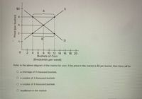
Transcribed Image Text:### Diagram Analysis of the Corn Market
#### Graph Explanation
The graph displays the supply and demand curves for the corn market:
- **Y-axis (Price per bushel):** Ranges from $1 to $5.
- **X-axis (Bushels of Corn, in thousands per week):** Ranges from 0 to 20.
**Supply Curve (S):** Slopes upward from left to right, indicating higher prices lead to an increase in the quantity supplied.
**Demand Curve (D):** Slopes downward from left to right, showing higher prices result in a decrease in quantity demanded.
**Equilibrium Point:** The point where both curves intersect, representing market equilibrium.
**Price Levels:**
- At $4 per bushel, point A shows more supply than demand, creating a surplus.
- At $2 per bushel, point B shows more demand than supply, creating a shortage.
#### Question Analysis
"Refer to the above diagram of the market for corn. If the price in this market is $3 per bushel, then there will be"
- ○ a shortage of 8 thousand bushels.
- ○ a surplus of 4 thousand bushels.
- ○ a surplus of 8 thousand bushels.
- ○ equilibrium in the market.
At $3 per bushel, the quantity supplied is 8,000 bushels, and the quantity demanded is 12,000 bushels, resulting in a shortage of 4,000 bushels.
Expert Solution
This question has been solved!
Explore an expertly crafted, step-by-step solution for a thorough understanding of key concepts.
This is a popular solution
Trending nowThis is a popular solution!
Step by stepSolved in 3 steps

Knowledge Booster
Similar questions
- In a market, the quantity demanded and quantity supplied are equal. Such market is said to be in ______________arrow_forwardSuppose that clothes workers at a certain factory accept a pay cut of $3 per hour. (a) Draw a graph to show how this would affect the market for clothes. (b) Why does this shift occur? How does that affect the equilibrium price and quantityarrow_forwardThe island nation of Coconutistan recently suffered an unfortunate accident which took its water treatment plant offline, leaving residents without clean water in their homes. The plant for bottling water was unaffected by the accident. The graph shows the supply and demand for bottled water before the accident. Assume that $6 is the maximum price for a case of bottled water according to the price gouging laws on the island. Shift one or more curves to show the effect of the accident on the market for bottled water. Price ($)Quantity of bottled water by the case01002003004005006007008009001,000012345678910SupplyDemandPrice ceiling What is the amount of the shortage after the accident? shortage:arrow_forward
- Using supply and demand diagrams show the effects on equilibrium price and quantity for the following situations. Begin at an initial equilibrium and show the effects on the demand or supply curves, as well as the effect on equilibrium price and quantity. (You can just draw them by hand and upload the picture.) The impact of a drought in the Midwest on the market for wheat. The impact of a fall in the price of steel on the market for new cars. The impact of a study showing orange juice consumption lowers the risk of heart attacks on the market for orange juice, and on the market for cranberry juice. The impact of an increase in the price of hot dogs on the market for hot dog buns.arrow_forwardHomework (Ch 07) The following graph shows the supply curve for a group of sellers in the U.S. market for smartphones (orange line). Each seller has only one smartphone to sell. The market price of a smartphone is shown by the black horizontal line at $105. Each rectangle on the graph corresponds to a particular seller in this market: blue (circle symbols) for Jacques, green (triangle symbols) for Kyoko, purple (diamond symbols) for Musashi, tan (dash symbols) for Rina, and orange (square symbols) for Sean. (Note: The name labels are to the right of the corresponding segment on the supply curve.) Use the rectangles to shade the areas representing producer surplus for each person who is willing to sell a smartphone at a market price of $105. (Note: If a person will not sell a smartphone at the market price, indicate this by leaving his or her rectangle in its original position on the palette.) ? 240 210 Sean Jacques 180 150 Kyoko 120 90 Musashi 60 C O PRICE (Dollars per smartphone)…arrow_forwards) In one graph, show what would happen to the market price and quantity for lemons, which can be produced from the same resources as bananas, as a result of the new findings above bananas.arrow_forward
arrow_back_ios
arrow_forward_ios
Recommended textbooks for you

 Principles of Economics (12th Edition)EconomicsISBN:9780134078779Author:Karl E. Case, Ray C. Fair, Sharon E. OsterPublisher:PEARSON
 Engineering Economy (17th Edition)EconomicsISBN:9780134870069Author:William G. Sullivan, Elin M. Wicks, C. Patrick KoellingPublisher:PEARSON
 Principles of Economics (MindTap Course List)EconomicsISBN:9781305585126Author:N. Gregory MankiwPublisher:Cengage Learning
 Managerial Economics: A Problem Solving ApproachEconomicsISBN:9781337106665Author:Luke M. Froeb, Brian T. McCann, Michael R. Ward, Mike ShorPublisher:Cengage Learning
 Managerial Economics & Business Strategy (Mcgraw-...EconomicsISBN:9781259290619Author:Michael Baye, Jeff PrincePublisher:McGraw-Hill Education


Principles of Economics (12th Edition)
Economics
ISBN:9780134078779
Author:Karl E. Case, Ray C. Fair, Sharon E. Oster
Publisher:PEARSON

Engineering Economy (17th Edition)
Economics
ISBN:9780134870069
Author:William G. Sullivan, Elin M. Wicks, C. Patrick Koelling
Publisher:PEARSON

Principles of Economics (MindTap Course List)
Economics
ISBN:9781305585126
Author:N. Gregory Mankiw
Publisher:Cengage Learning

Managerial Economics: A Problem Solving Approach
Economics
ISBN:9781337106665
Author:Luke M. Froeb, Brian T. McCann, Michael R. Ward, Mike Shor
Publisher:Cengage Learning

Managerial Economics & Business Strategy (Mcgraw-...
Economics
ISBN:9781259290619
Author:Michael Baye, Jeff Prince
Publisher:McGraw-Hill Education