Question
Can u pls help me do part 2 and what was the equation used to find the answers. Please

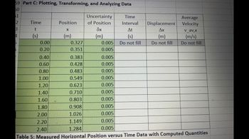
Transcribed Image Text:59 Part C: Plotting, Transforming, and Analyzing Data
50
$1
2
3
4
D
Time
t
(s)
0.00
0.20
0.40
0.60
0.80
1.00
1.20
1.40
1.60
1.80
2.00
2.20
2.40
Position
X
(m)
0.327
0.351
Uncertainty
of Position
8x
(m)
0.005
0.005
0.005
0.005
0.005
0.005
0.005
0.005
0.005
0.005
0.005
0.005
0.005
Time
Interval
At
(s)
Do not fill
Displacement
Ax
(m)
Do not fill
Average
Velocity
v_av,x
(m/s)
Do not fill
0.383
0.428
0.483
0.549
0.623
0.710
0.803
0.908
1.026
1.149
1.284
Table 5: Measured Horizontal Position versus Time Data with Computed Quantities

Transcribed Image Text:play the
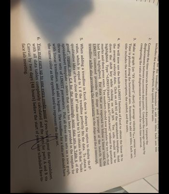
includes the word description, the symbol, and the units.
Tue for the trendline. Remember to add axis titles. Each axis title
2. Compute the time intervals between successive data points. Compute the
displacements between successive data points. Compute the average velocity by
computing the ratio of displacement to time interval for each time interval.
3. Make a graph (an "XY (scatter)" chart) of average velocity Vavx versus time t.
Time is plotted along the horizontal axis. Remember to add axis titles. Each axis
title includes the word description, the symbol, and the units.
4. We will now use the built-in LINEST function of Excel to obtain the linear fit to
the average velocity data. Click on cell 165 of the spreadsheet template. Hold
down the shift key while clicking on cell J69. Ten cells should now be
highlighted. Type "-LINEST(F66:F77,A66:A77,true,true)" without the quotation
marks and then press enter. Ten numbers should now populate the ten cells that
had been highlighted. For data that are expected to follow a linear trend, the
LINEST command provides the slope and y-intercept of the best-fit linear
trendline while also providing the uncertainty in the slope and the y-intercept.
5. When adding a trendline in Excel, there is always the option to display the R²
value, which is equal to 1 if the trendline perfectly fits the data. To obtain a
qualitative idea of how close the R² value must be to 1 to obtain a fit that "looks
good", repeat step C.4 for the increasingly noisy data sets in Table 6 of the
spreadsheet template - notice that space has been provided in the template for
three new sets of LINEST parameters. Plot all three data sets on a new graph,
with linear trendlines, and add a legend. The trendline for a data set should have
the same color as the symbols used to represent the data set.
6. You may earn up to one extra credit point if you turk in your data spreadsheet,
with all data tables completely calculated and the pots for parts A and B via
Canvas by two days (48 hours) before the start of your next scheduled face-to-
face lab meeting.
Expert Solution
arrow_forward
Step 1 t
Time interval will be = final time - initial time
While displacement interval will be
= final postion - inital position
Step by stepSolved in 2 steps with 1 images

Knowledge Booster
Similar questions
arrow_back_ios
SEE MORE QUESTIONS
arrow_forward_ios