
MATLAB: An Introduction with Applications
6th Edition
ISBN: 9781119256830
Author: Amos Gilat
Publisher: John Wiley & Sons Inc
expand_more
expand_more
format_list_bulleted
Related questions
Question
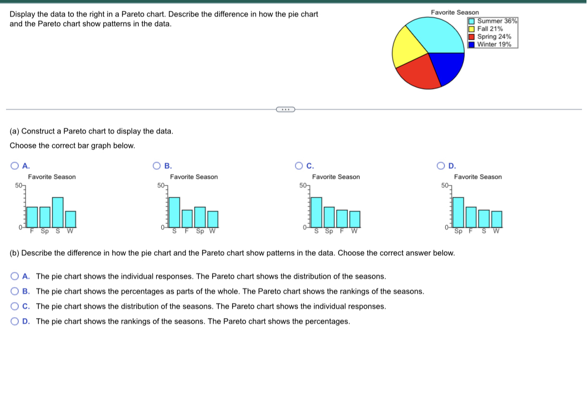

Transcribed Image Text:### Displaying Data Using Charts
The task is to display data about favorite seasons using a Pareto chart and to describe the difference in how a pie chart and the Pareto chart reveal patterns in the data.
A **Pareto chart** is a type of bar graph where values are plotted in descending order of frequency, cumulative percentages are often plotted with a line, and it is used to identify the most significant factors in a dataset. In contrast, a **pie chart** shows the proportions of different categories as slices of a pie, making it easy to see the relative sizes of each category.
#### Given Data:
- **Pie Chart: Favorite Season**
- Summer: 36%
- Fall: 21%
- Spring: 24%
- Winter: 19%
This pie chart represents the distribution of individuals' favorite seasons.
#### Instruction:
(a) **Constructing a Pareto Chart:**
Choose the correct bar graph to represent the data as a Pareto chart.
Options:
- **A:** Order (Fall, Spring, Summer, Winter)
- **B:** Order (Summer, Fall, Spring, Winter)
- **C:** Order (Summer, Fall, Winter, Spring)
- **D:** Order (Spring, Fall, Summer, Winter)
Since a Pareto chart should display the data in descending order of percentage, the correct choice is **B**, where:
- Summer (36%) is the highest bar.
- Followed by Spring (24%).
- Then Fall (21%).
- Finally, Winter (19%).
(b) **Describing Differences in Display:**
Choose the correct answer to describe how the pie chart and the Pareto chart show patterns in the data:
- **A:** The pie chart shows the individual responses. The Pareto chart shows the distribution of the seasons.
- **B:** The pie chart shows the percentages as parts of the whole. The Pareto chart shows the rankings of the seasons.
- **C:** The pie chart shows the distribution of the seasons. The Pareto chart shows the individual responses.
- **D:** The pie chart shows the rankings of the seasons. The Pareto chart shows the percentages.
The most accurate description is:
- **B:** The pie chart shows the percentages as parts of the whole. The Pareto chart shows the rankings of the seasons.
### Graph/Diagram Explanation:
- **Pie Chart:** Displays the favorite seasons in a circular graph divided into slices. Each slice represents
Expert Solution
This question has been solved!
Explore an expertly crafted, step-by-step solution for a thorough understanding of key concepts.

This is a popular solution

Trending nowThis is a popular solution!

Step by stepSolved in 3 steps with 2 images

Knowledge Booster

Similar questions
- (a) What is the median starting salary? 41,41,55,45,42,39,38,44,42,32 The median starting salary is: $ thousands of dollars(b) Which of the following would you use to display the data?A. pie chartB. contingency tableC. histogramD. bar grapharrow_forwardHow do I find the mean? Do i put it in ascending order first, or it doesn't matter?arrow_forwardTipedarrow_forward
- What is the median?arrow_forwardA Likert Scale is a tool used in many sample surveys to collect opinions on a statement. In this exercise you are asked to use a scale that runs from 5=strongly agree 4-agree 3-neither agree nor disagree 2-disagree 1-strongly disagree What sort of data is a Likert Scale, and why?arrow_forwardGabriel and Lucia took a road trip across the country. The room costs, in dollars, for their overnight stays are listed in the accompanying table. Find the mean of the distribution.arrow_forward
- 1 #+= ABC The following are the ages of 13 mathematics teachers in a school district. 33, 34, 35, 37, 39, 42, 49, 50, 52, 53, 53, 56, 59 Notice that the ages are ordered from least to greatest. Give the five-number summary and the interquartile range for the data set. Five-number summary 8 Minimum: Lower quartile: Median: Upper quartile: Maximum: Interquartile range: ↑ 2 § % X £ # 1 3 0 S ¥ $ 4 + & 5 = * 6 ( ; 7 ) 8 I ! I 9 "1 undo ? 0 Español ABC ? F D 1 Aa V < retur #-arrow_forwardPlease construct a Pareto chart for the data displayed!arrow_forwardA: {3, 5, 5, 5, 7} B: {5, 7, 7, 9, 9} median of A median of B Varrow_forward
- Español Over the past several months, customers at Stymie's department store have been asked to fill out customer satisfaction surveys. In the surveys, the customers rate their shopping experience on a scale of 0 to 100. Here are 24 recent ratings. 14, 16, 18, 25, 27, 34, 37, 39, 41, 45, 47, 50, 51, 53, 53, 53, 61, 61, 67, 73, 77, 83, 85, 86 圖 Send data to calculator Aa Frequency 8- 6- 5 5 4- 3 3 2- 20 Customer satisfaction rating 40 60 80 100 O Mean (a) Which measures of central tendency do O Median not exist for this data set? Choose all that O Mode apply. O None of these measures I Mean (b) Suppose that the measurement 86 (the largest measurement in the data set) were replaced by 97. Which measures of central tendency would be affected by the change? Choose all that apply. O Median O Mode O None of these measures (c) Suppose that, starting with the original data set, the largest measurement were O Mean O Median removed. Which measures of central O Mode tendency would be changed from…arrow_forwardUse the display of data to find the mean, median, mode, and midrange. Q 9 10 11 12 13 14 15 16 8 Score The mean of the data is (Round to the nearest tenth as needed.) The median of the data is (Round to the nearest tenth as needed.) Select the correct choice below and, if necessary, fill in the answer box to complete your choice. Aouenbelarrow_forwardLauren is a college sophomore majoring in business. This semester Lauren is taking courses in accounting, economics, management information systems, public speaking, and statistics. The sizes of these classes are, respectively, 380, 60, 25, 70, and 65. (a) Find the mean and the median of the class sizes. Mean Median (b) What is a better measure of Lauren's "typical class size-the mean or the median? Median O Meanarrow_forward
arrow_back_ios
arrow_forward_ios
Recommended textbooks for you
- MATLAB: An Introduction with ApplicationsStatisticsISBN:9781119256830Author:Amos GilatPublisher:John Wiley & Sons Inc
 Probability and Statistics for Engineering and th...StatisticsISBN:9781305251809Author:Jay L. DevorePublisher:Cengage Learning
 Statistics for The Behavioral Sciences (MindTap C...StatisticsISBN:9781305504912Author:Frederick J Gravetter, Larry B. WallnauPublisher:Cengage Learning
  Elementary Statistics: Picturing the World (7th E...StatisticsISBN:9780134683416Author:Ron Larson, Betsy FarberPublisher:PEARSON
 The Basic Practice of StatisticsStatisticsISBN:9781319042578Author:David S. Moore, William I. Notz, Michael A. FlignerPublisher:W. H. Freeman
 Introduction to the Practice of StatisticsStatisticsISBN:9781319013387Author:David S. Moore, George P. McCabe, Bruce A. CraigPublisher:W. H. Freeman
MATLAB: An Introduction with Applications
Statistics
ISBN:9781119256830
Author:Amos Gilat
Publisher:John Wiley & Sons Inc
Probability and Statistics for Engineering and th...
Statistics
ISBN:9781305251809
Author:Jay L. Devore
Publisher:Cengage Learning
Statistics for The Behavioral Sciences (MindTap C...
Statistics
ISBN:9781305504912
Author:Frederick J Gravetter, Larry B. Wallnau
Publisher:Cengage Learning
Elementary Statistics: Picturing the World (7th E...
Statistics
ISBN:9780134683416
Author:Ron Larson, Betsy Farber
Publisher:PEARSON
The Basic Practice of Statistics
Statistics
ISBN:9781319042578
Author:David S. Moore, William I. Notz, Michael A. Fligner
Publisher:W. H. Freeman
Introduction to the Practice of Statistics
Statistics
ISBN:9781319013387
Author:David S. Moore, George P. McCabe, Bruce A. Craig
Publisher:W. H. Freeman