MATLAB: An Introduction with Applications
6th Edition
ISBN: 9781119256830
Author: Amos Gilat
Publisher: John Wiley & Sons Inc
expand_more
expand_more
format_list_bulleted
Concept explainers
Question
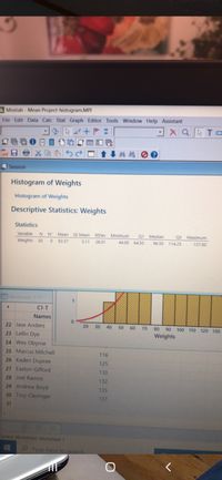
Determine what percentage of your data is within 2 standard deviations of the
does this data seem to be

Transcribed Image Text:**Histogram of Weights**
**Descriptive Statistics: Weights**
**Statistics**
- **Variable**: Weights
- **N**: 30
- **Mean**: 92.37
- **SE Mean**: 5.11
- **StDev**: 28.01
- **Minimum**: 44.00
- **Q1**: 64.50
- **Median**: 96.50
- **Q3**: 114.25
- **Maximum**: 137.00
**Explanation of the Histogram**
The histogram displayed visually represents the distribution of the weights dataset.
- **X-axis**: Displays the weights ranging from approximately 0 to 130.
- **Y-axis**: Indicates the frequency of each weight range.
- The histogram bars are yellow, showing intervals of weight grouped in categories.
- A red curve is overlaid on the histogram, likely representing a normal distribution fit for the dataset.
**Data Table**
Names and corresponding weights are listed:
- Jase Anders
- Leelin Dye
- Wes Obyrne
- Marcus Mitchell
- Kaden Dupree: 116
- Easton Gifford: 125
- Joel Ramos: 130
- Andrew Boyd: 135
- Troy Clevinger: 137
These values provide a sample representation of individual weights within the dataset.
Expert Solution
This question has been solved!
Explore an expertly crafted, step-by-step solution for a thorough understanding of key concepts.
Step by stepSolved in 2 steps with 1 images

Knowledge Booster
Learn more about
Need a deep-dive on the concept behind this application? Look no further. Learn more about this topic, statistics and related others by exploring similar questions and additional content below.Similar questions
- lecture(12.5a): The mean of the population is 50. The standard deviation is 10. If a person row score is 47 (a) What is the percentile rank?arrow_forwardI just need help solving this.arrow_forward(2) Look at the dotplot of the data below: 200 400 600 800 1000 1200 CHOL a. Estimate (don't calculate) the mean. 1 MATH16 - ELEMENTARY STATISTICS WRITTEN HW #3 - SECTIONS 3.1 - 3.3 b. Would you expect the median to be less than / more than / or approximately equal to the mean? Explain your reasoning.arrow_forward
- Mean is advantageous than the median because a. It is not influenced by extreme values b. Data needs to be sorted out c. It does not consider all values d. It considers all values in a dataarrow_forwardTest the claim that for the population of college students, the mean weight equals to 132 lb. Sample data are summarized as n=101, x¯¯¯x¯x¯¯¯x¯=137 lb, s=14.2 lb. Use a significant level of 0.10.arrow_forwardThis is math economicsarrow_forward
- I just need help solving this.arrow_forwardThe table below displays the mean and mean absolute deviation (MAD) of the distance (in miles) covered on the treadmill by Laura, Jayden, and Emma during their gym time for 7 consecutive days. Who has the greatest variability in the distance covered on the treadmill? On average, who covers the farthest distance? Who is the most consistent runner?arrow_forwardWhat does the standard deviation tell you about a set of data?arrow_forward
arrow_back_ios
SEE MORE QUESTIONS
arrow_forward_ios
Recommended textbooks for you
 MATLAB: An Introduction with ApplicationsStatisticsISBN:9781119256830Author:Amos GilatPublisher:John Wiley & Sons Inc
 Probability and Statistics for Engineering and th...StatisticsISBN:9781305251809Author:Jay L. DevorePublisher:Cengage Learning
 Statistics for The Behavioral Sciences (MindTap C...StatisticsISBN:9781305504912Author:Frederick J Gravetter, Larry B. WallnauPublisher:Cengage Learning
 Elementary Statistics: Picturing the World (7th E...StatisticsISBN:9780134683416Author:Ron Larson, Betsy FarberPublisher:PEARSON
 The Basic Practice of StatisticsStatisticsISBN:9781319042578Author:David S. Moore, William I. Notz, Michael A. FlignerPublisher:W. H. Freeman
 Introduction to the Practice of StatisticsStatisticsISBN:9781319013387Author:David S. Moore, George P. McCabe, Bruce A. CraigPublisher:W. H. Freeman

MATLAB: An Introduction with Applications
Statistics
ISBN:9781119256830
Author:Amos Gilat
Publisher:John Wiley & Sons Inc

Probability and Statistics for Engineering and th...
Statistics
ISBN:9781305251809
Author:Jay L. Devore
Publisher:Cengage Learning

Statistics for The Behavioral Sciences (MindTap C...
Statistics
ISBN:9781305504912
Author:Frederick J Gravetter, Larry B. Wallnau
Publisher:Cengage Learning

Elementary Statistics: Picturing the World (7th E...
Statistics
ISBN:9780134683416
Author:Ron Larson, Betsy Farber
Publisher:PEARSON

The Basic Practice of Statistics
Statistics
ISBN:9781319042578
Author:David S. Moore, William I. Notz, Michael A. Fligner
Publisher:W. H. Freeman

Introduction to the Practice of Statistics
Statistics
ISBN:9781319013387
Author:David S. Moore, George P. McCabe, Bruce A. Craig
Publisher:W. H. Freeman