
MATLAB: An Introduction with Applications
6th Edition
ISBN: 9781119256830
Author: Amos Gilat
Publisher: John Wiley & Sons Inc
expand_more
expand_more
format_list_bulleted
Related questions
Concept explainers
Question
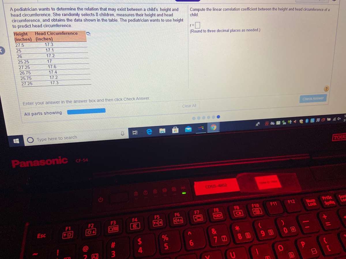

Transcribed Image Text:A pediatrician wants to determine the relation that may exist between a child's height and
head circumference. She randomly selects 8 children, measures their height and head
circumference, and obtains the data shown in the table. The pediatrician wants to use height
to predict head circumference.
Compute the linear correlation coefficient between the height and head circumference of a
child.
Height Head Circumference
(inches) (inches)
27.5
25
(Round to three decimal places as needed.)
17.3
17.1
26
25.25
27.25
26.75
25.75
27 25
17.2
17
17.6
17.4
17.2
17.3
Enter your answer in the answer box and then click Check Answer.
All parts showing
Clear All
Check Answer
Type here to search
TOUG
Panasonic
CF-54
CDSS-4852
TERMO TOGA
O O O O D ()
Scre
Loc
PrtSc
Num
Lock
F10
F11
F12
F7
F8
F9
SysRq
F5
F6
F3
F4
A
8
F1
F2
Esc
&
7 0
8 B
90
5
A2
24
近
%#3
Expert Solution
This question has been solved!
Explore an expertly crafted, step-by-step solution for a thorough understanding of key concepts.

This is a popular solution

Trending nowThis is a popular solution!

Step by stepSolved in 3 steps with 1 images

Knowledge Booster


Learn more about
Need a deep-dive on the concept behind this application? Look no further. Learn more about this topic, statistics and related others by exploring similar questions and additional content below.Similar questions
- Solve the problem. A dot plot of the speeds of a sample of 50 cars passing a policeman with a radar gun is shown. below. L 45 47 49 07 0.50 What proportion of the motorists were driving above the posted speed limit of 55 miles per hour? 0.64 51 0.14 I 53 55 57 59 61 63 65 67 69arrow_forwardlecture(12.1): A statistics class is made up of 22 students learning on line and 15 studying in person. What percentage of the class is learning in person?arrow_forwardUse the data set below to find the FNS and then construct a Box and Whiskers Plot on the paper your teacher gave you. {6, 8, 12, 19, 27, 32, 54} LV = Q1 = Q2 = Q3 HV =arrow_forward
- which dot plot represents these data?arrow_forwardEducation The following ordered pairs give the entrance exam scores x and the grade-point averages y after 1 year of college for 10 students. (75, 2.3), (82, 3.0), (90, 3.6), (65, 2.0), (70, 2.1), (88,3.5), (93, 3.9), (69,2.0), (80, 2.8), (85, 3.3) (a))Create a scatter plot of the data. Does the relationship between x and y appear to be approximately linear? Explain.arrow_forwardThe data represents the heights of eruptions by a geyser. Use the heights to construct a stemplot. Identify the two values that are closest to the middle when the data are sorted in order from lowest to highest. Height of eruption (in.) 69 33 50 900 80 50 40 70 50 68 79 54 Which plot represents a stemplot of the data? OA. 3 002 4049 5008 6005 7006 8009 906 B. 33 400 500024 605689 70009 806 90 Identify the two values that are closest to the middle when the data are sorted in order from lowest to highest. The values closest to the middle are inches and (Type whole numbers. Use ascending order.) inches. O C. 33 4045689 50009 6006 70002 80 90 52 66 65 60 70 70 40 86arrow_forward
- Use a scatter plot to display the data shown in the table below. The data represents the number of students per teacher and the average teacher salaries (in thousands of dollars) in 10 school districts. Number of Students per Teacher Average Teacher's Salary 17.2 28.6 17.8 46.6 18.2 32.1 17.4 27.6 18.4 39.8 17.6 32.8 15.0 49.5 17.5 38.4 13.7 42.1 18.0 32.4 1.Construct a scatter diagram. 2.Describe the relation between students per teacher and average teacher salary. A. As the amount of students per teacher increases, the average teacher salary also increases. B. As the amount of students per teacher decreases, the average teacher salary increases. C. There appears to be no relation between students per teacher and average teacher salary.arrow_forwardd-Whisker Plots HOTSPOT LABEL Find the range and interquartile range (IQR) for the monthly rainfall (in millime- ters) in Seattle based on the box-and-whisker plot below. Average Monthly Rainfall in Seattle (millimeters) in | bartleby - G... 20 80 140 +++ 200 . Press each hotspot. Label the corresponding number below with the requested value. All Charges Пarrow_forwardWaiting times (in minutes) of customers at a bank where all customers enter a single waiting line and a bank where customers wait in individual lines at three different teller windows are listed below. Find the coefficient of variation for each of the two sets of data, then compare the variation. is cou Bank A (single line): 6.5 6.6 Bank B (individual lines): 6.7 6.8 7.1 7.3 7.5 7.6 7.6 7.6 0 rms o 4.3 5.4 5.9 6.1 6.7 7.6 7,7 8.5 9.4 9.8 %. The coefficient of variation for the waiting times at Bank A is (Round to one decimal place as needed.)arrow_forward
- Use a stem-and-leaf plot to display the data, which represent the numbers of hours 24 nurses work per week. Describe any patterns. 40 40 44 48 35 40 36 58 32 36 40 35 D 30 28 36 40 36 40 33 40 32 38 29 Determine the leaves in the stem-and-leaf plot below. Key: 3|3 = 33 Hours worked 2 4 What best describes the data? O A. Most nurses work under 40 hours per week. O B. Most nurses work over 40 hours per week. O C. Most nurses work between 40 and 50 hours per week, inclusive. O D. Most nurses work between 30 and 40 hours per week, inclusive. 40 3.arrow_forwardWaiting times (in minutes) of customers at a bank where all customers enter a single waiting line and a bank where customers wait in individual lines at three different teller windows are listed below. Find the coefficient of variation for each of the two sets of data, then compare the variation. Bank A (single line): 6.6 6.7 6.7 6.8 7.0 7.2 7.5 7.7 7.7 7.7 6.7 7.7 7.8 8.4 9.2 9.7 Bank B (individual 4.1 5.4 5.8 6.2 lines): www The coefficient of variation for the waiting times at Bank A is%. (Round to one decimal place as needed.)arrow_forwardDraw a scatter diagram and find r for the data shown in the table. (Round r to three decimal places.) x y 10 15 20 42 30 60 30 54 50 70 60 85 find rarrow_forward
arrow_back_ios
SEE MORE QUESTIONS
arrow_forward_ios
Recommended textbooks for you
- MATLAB: An Introduction with ApplicationsStatisticsISBN:9781119256830Author:Amos GilatPublisher:John Wiley & Sons Inc
 Probability and Statistics for Engineering and th...StatisticsISBN:9781305251809Author:Jay L. DevorePublisher:Cengage Learning
 Statistics for The Behavioral Sciences (MindTap C...StatisticsISBN:9781305504912Author:Frederick J Gravetter, Larry B. WallnauPublisher:Cengage Learning
  Elementary Statistics: Picturing the World (7th E...StatisticsISBN:9780134683416Author:Ron Larson, Betsy FarberPublisher:PEARSON
 The Basic Practice of StatisticsStatisticsISBN:9781319042578Author:David S. Moore, William I. Notz, Michael A. FlignerPublisher:W. H. Freeman
 Introduction to the Practice of StatisticsStatisticsISBN:9781319013387Author:David S. Moore, George P. McCabe, Bruce A. CraigPublisher:W. H. Freeman
MATLAB: An Introduction with Applications
Statistics
ISBN:9781119256830
Author:Amos Gilat
Publisher:John Wiley & Sons Inc
Probability and Statistics for Engineering and th...
Statistics
ISBN:9781305251809
Author:Jay L. Devore
Publisher:Cengage Learning
Statistics for The Behavioral Sciences (MindTap C...
Statistics
ISBN:9781305504912
Author:Frederick J Gravetter, Larry B. Wallnau
Publisher:Cengage Learning
Elementary Statistics: Picturing the World (7th E...
Statistics
ISBN:9780134683416
Author:Ron Larson, Betsy Farber
Publisher:PEARSON
The Basic Practice of Statistics
Statistics
ISBN:9781319042578
Author:David S. Moore, William I. Notz, Michael A. Fligner
Publisher:W. H. Freeman
Introduction to the Practice of Statistics
Statistics
ISBN:9781319013387
Author:David S. Moore, George P. McCabe, Bruce A. Craig
Publisher:W. H. Freeman