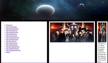
Can someone help me fix my flexboxes so all the boxes take up the same amount of space instead of the right box being crunched and my image not showing up? I am trying to get it so that the right box not only has the same amount of space on the page as the other two but also the image I have inside takes up that entire right most box.
HTML CODE:
<title>Flexbox Coding</title>
<link rel="stylesheet" href="style.css">
</head>
<body>
<header class="header-image">
<img src="night-planets-header-8854-1024x300.jpg" alt="Header Image">
</header>
<div class="flex-container">
<div>
<ul>
<li><a href="Overview.html">Overview</a></li>
<li><a href="The_First_Doctor.html">The First Doctor</a></li>
<li><a href="The_Second_Doctor.html">The Second Doctor</a></li>
<li><a href="The_Third_Doctor.html">The Third Doctor</a></li>
<li><a href="The_Fourth_Doctor.html">The Fourth Doctor</a></li>
<li><a href="The_Fifth_Doctor.html">The Fifth Doctor</a></li>
<li><a href="The_Sixth_Doctor.html">The Sixth Doctor</a></li>
<li><a href="The_Seventh_Doctor.html">The Seventh Doctor</a></li>
<li><a href="The_Eighth_Doctor.html">The Eighth Doctor</a></li>
<li><a href="The_War_Doctor.html">The War Doctor</a></li>
<li><a href="The_Ninth_Doctor.html">The Ninth Doctor</a></li>
<li><a href="The_Tenth_Doctor.html">The Tenth Doctor</a></li>
<li><a href="The_Eleventh_Doctor.html">The Eleventh Doctor</a></li>
<li><a href="The_Twelfth_Doctor.html">The Twelfth Doctor</a></li>
<li><a href="The_Thirteenth_Doctor.html">The Thirteenth Doctor</a></li>
<li><a href="survey.html">survey</a></li>
</ul>
</div>
<div>
<img src="OverviewImage.jpg" alt="Overview">
</div>
<div>
<img src="OverviewImage.jpg" alt="Overview">
The Doctor is a Time Lord from the planet Gallifrey who travels through time and space in the TARDIS, a blue police box. Possessing the unique ability to regenerate into a new form when mortally wounded, the Doctor has been portrayed by various actors over the years. Motivated by a strong sense of justice and compassion, the Doctor works to thwart evil, solve problems, and protect civilizations, often accompanied by diverse companions on these thrilling adventures.
</div>
</div>
<footer class="footer-image">
<img src="TardisFooter.jpg" alt="Footer Image">
</footer>
</body>
</html>
CSS CODE:
body {
background-color: blue;
margin: 0;
padding: 0;
}
.table {
width: 100%;
table, th, td;
border: 1px solid white;
}
.flex-container {
display: flex;
}
.flex-container > div {
background-color: white;
width: 25%;
margin: 5px;
padding: 5px;
font-size: 16px;
}
.header-image img,
.footer-image img,
.flex-container > div img {
width: 100%;
height: 200px;
}
.flex-container > div:last-child {
flex: 1;
}
.footer-image {
text-align: center;
background-color: white;
padding: 10px;
}

Trending nowThis is a popular solution!
Step by stepSolved in 4 steps with 3 images

- How to do this exercise? Halloween 15 Add a transition and an animation In this exercise, you’ll add a transition and an animation to the product page that you created in exercise 11. When you’re done, the page should look similar to this: Specifications • Add a transition for the widths of the images in the right sidebar of the cat.html file in the products folder that will last for three seconds and use the linear speed curve. The transition should increase the width of an image to 125 pixels when the mouse hovers over an image. Be sure to provide for all browsers. • Add an animation for the image in the section that will cause the image to move up and down when the page is loaded. The animation should last for half a second, use the ease-in-out speed curve, repeat six times, and alternate directions on each repetitionarrow_forward1 What types of argument does the jQuery factory method accept? 2. With which jQuery method can you get or set a CSS property value? 3. What statement would you use to attach a method to the click event of an element with the ID of elem, to make it slowly hide? 4. How can you retrieve an element node object from a jQuery selection object? 5. What statement would set the sibling element immediately preceding one with the ID of news to display in bold? 6. What are the key advantages and disadvantages of using a software framework when constructing web applications? 7. What are the advantages of React's component-based approach to constructing user interfaces? 8. Describe the differences between props and state in React.arrow_forwardThe _________ method loads a style sheet named style.css for a node or a scene. Question 16 options: node.setStyleSheet("style.css"); node.getStyleSheets.setStyleSheet("style.css"); node.setStylesheets("style.css"); node.getStylesheets.add("style.css");arrow_forward
- what I have so far please help with what you can Separate your style sheets into three files:/styles/colors.css/styles/formatting.css/styles/transitions-animations.css <!DOCTYPE html><html> <head> <title>Home Page</title> <link rel="stylesheet" type="text/css" href="./styles/colors1.css"> <link rel="stylesheet" type="text/css" href=""> <link rel="stylesheet" type="text/css" href=""> </head> <body> <!--Added main tag--> <main> <!--Added nav tag--> <nav> <a href="index.html">Home</a> <a href="contact.html">Contact</a> <a href="about.html">About</a> </nav> <h1>Welcome to my (about me) site</h1> <picture> <source media="(min-width:650px)" srcset="./images/me3-650.jpg"> <source media="(min-width:465px)"…arrow_forwardComplete the following webpage assignment. Assignment Instructions: Design a webpage to simulate a Blog. The website must have a banner image and a featured image with multiple resolutions to be active at different resolution breakpoints just as discussed in this lesson. Include a jQuery script in your project to further enhance the user experience. Use one of the CDN libraries. The script is up to your discretion though you must be able to justify its use. The blog page must be aesthetically pleasing and follow a traditional blog structure. It may help to look at the many WordPress templates available on the net.arrow_forwardHTML One way of centering a div element with class name "inner" inside of another larger div element with class name "outer" with having inner being 200 X 200 pixels and outer being 400 X 400 pixels would be: (Assume that they are nested in the html file page and NOT decoupled and self-contained) Both div elements have borders a. .inner{ margin-top:200px; margin-left:200px; } b. div { margin-top:100px; margin-left:100px; } c. .inner{ margin-top:100px; margin-left:100px; } d. .inner{ margin-left: 100px; } Given the following html, what would be the correct css to make the ul element red text <html> <head> <link rel=…arrow_forward
 Database System ConceptsComputer ScienceISBN:9780078022159Author:Abraham Silberschatz Professor, Henry F. Korth, S. SudarshanPublisher:McGraw-Hill Education
 Starting Out with Python (4th Edition)Computer ScienceISBN:9780134444321Author:Tony GaddisPublisher:PEARSON
 Digital Fundamentals (11th Edition)Computer ScienceISBN:9780132737968Author:Thomas L. FloydPublisher:PEARSON
 C How to Program (8th Edition)Computer ScienceISBN:9780133976892Author:Paul J. Deitel, Harvey DeitelPublisher:PEARSON
 Database Systems: Design, Implementation, & Manag...Computer ScienceISBN:9781337627900Author:Carlos Coronel, Steven MorrisPublisher:Cengage Learning
 Programmable Logic ControllersComputer ScienceISBN:9780073373843Author:Frank D. PetruzellaPublisher:McGraw-Hill Education


