
MATLAB: An Introduction with Applications
6th Edition
ISBN: 9781119256830
Author: Amos Gilat
Publisher: John Wiley & Sons Inc
expand_more
expand_more
format_list_bulleted
Related questions
Question
I have provided the box plot below, please only answer the highlighted questions
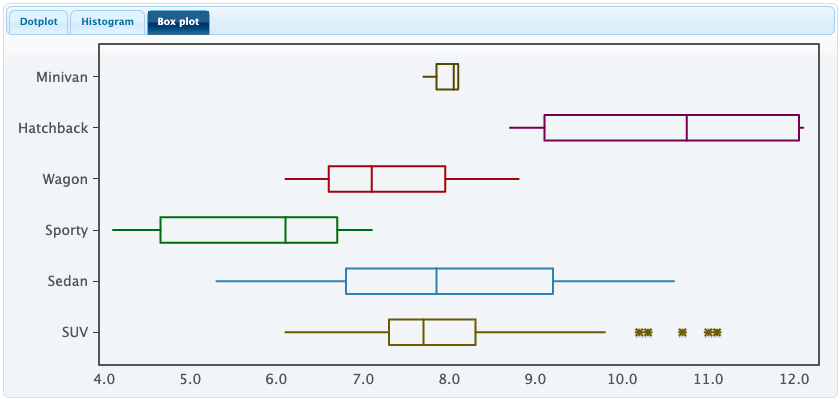

Transcribed Image Text:### Box Plot Analysis of Vehicle Types
This box plot visually represents the distribution of a specific variable (not specified) across six different vehicle types: Minivan, Hatchback, Wagon, Sporty, Sedan, and SUV. Each box plot consists of a box and two whiskers, illustrating the range and distribution of the data for each category.
#### Components of the Box Plot:
- **Box:** Represents the interquartile range (IQR), which contains the middle 50% of the data. The edges of the box are the first quartile (Q1) and the third quartile (Q3).
- **Whiskers:** Extend from the edges of the box to the smallest and largest values within 1.5*IQR from the quartiles.
- **Median Line:** A line inside the box denotes the median (Q2) of the data.
- **Outliers:** Points beyond the whiskers which are considered outliers.
#### Detailed Breakdown by Vehicle Type:
1. **Minivan:**
- **Median:** Slightly above 7.0
- **IQR:** Narrow, signifying a small spread in the data.
- **Range:** Approximately between 7.0 and 7.5, indicating minimal variability.
2. **Hatchback:**
- **Median:** Around 8.0
- **IQR:** Data is spread from approximately 7.0 to 8.5.
- **Range:** Extends from about 6.0 to 9.5, showing a moderate spread.
3. **Wagon:**
- **Median:** Close to 8.0
- **IQR:** Narrower, spanning roughly from 7.0 to 8.0.
- **Range:** Falls between about 6.5 and 8.5.
4. **Sporty:**
- **Median:** Approximately 8.0
- **IQR:** Spreads from roughly 6.8 to 8.2.
- **Range:** Stretches from about 6.3 to 8.7, indicating some variability.
5. **Sedan:**
- **Median:** Significantly higher at around 9.5
- **IQR:** Broad, from near 8.0 to 10.0, suggesting considerable spread.
- **Range:** From approximately 7

Transcribed Image Text:### Vehicle Acceleration by Type: Educational Exercise
#### Introduction
This exercise uses the dataset "Cars2020," which contains detailed information about new car models in the year 2020. The goal is to analyze vehicle acceleration by car type using statistical methods.
#### Instructions
1. **Data Preparation**:
- Upload the "Cars2020" dataset.
- Use the Statkey software to generate side-by-side boxplots comparing acceleration times to 60 mph (variable: Acc60) across different vehicle types (variable: Type).
2. **Tasks**:
- Include a screenshot of the generated boxplots in your report.
- These variables (Acc60 and Type) are not in the dropdown menu in Statkey, so you'll need to manually input them.
3. **Analysis Questions**:
a. **Association Analysis**:
- Does there appear to be an association between car type and acceleration time?
- Provide a description of how the generated boxplots support your answer.
b. **Acceleration Extremes**:
- Identify the type of car with the highest acceleration time.
- Identify the type of car with the lowest acceleration time.
c. **Outlier Identification**:
- Using the boxplot, identify all outliers.
- Document the values of these outliers and indicate the car type they correspond to.
d. **Variability Analysis**:
- Determine which vehicle type has the lowest variability in acceleration time.
#### Explanation of Boxplots
1. **Boxplot Components**:
- **Median**: Line inside the box showing the middle value of the data.
- **Quartiles**: The box itself, representing the interquartile range (IQR) which contains the middle 50% of the data.
- **Whiskers**: Lines extending from the box to the smallest and largest values within 1.5 * IQR from the quartiles.
- **Outliers**: Points beyond the whiskers, representing data points significantly different from the others.
2. **Interpreting Side-by-Side Boxplots**:
- Use side-by-side boxplots to easily compare distributions across different car types.
- Look at the spread, center (median), and outliers to make inferences about group similarities and differences.
#### Example
- **Screenshot of Boxplots** (Include your screenshot here)
- **Analysis**:
- Describe the associations
Expert Solution
This question has been solved!
Explore an expertly crafted, step-by-step solution for a thorough understanding of key concepts.

Step by stepSolved in 3 steps

Knowledge Booster

Similar questions
- ication.com/ext/map/index.html?_con=con&external_browser%3D0&launchUrl=https%253A%252F%252Flearn.wallacestate.edu%252Fwebapps%252Fblackbo... pe O Maps A consulting group was hired by the Human Resources Department at General Mills, Inc. to survey company employees regarding their degree of satisfaction with their quality of life. A special index, called the index of satisfaction, was used to measure satisfaction. Six factors were studied, namely, age at the time of first marriage (x1), annual income (xX2), number of children living (x3), value of al assets (xa), status of health in the form of an index (xg), and the average number of social activities per week-such as bowling and dancing (xg). Suppose the multiple regression equation is: ŷ = 16.24 + 0.017x1 + 0.0028x2 + 42x3 + 0.0012x4 + 0.19x5 + 26.8x6 a. What is the estimated index of satisfaction for a person who first married at 18, has an annual income of $26,500, has three children living, has assets of $156,000, has an index of…arrow_forwardwhat would be the values submitted into each blank? having a hard time reading the linesarrow_forwardsummarize skew, parallel and perpendicular lines.arrow_forward
- Darnell and Jake are playing a game they made up which includes throwing darts at this target. The point values for each region of the target are shown. The radius of the 50-point region is 3 inches. The width of each of the other regions is 4 inches. 5 concentric circles where each circle contains values from 10, 20, 30, 40 and 50. Darnell and Jake are currently tied in their game, and Jake has to choose one of these options: Option 1: He can accept the tie, and the game is over. Option 2: He can make one more throw. Jake wins if he earns at least 30 points on the throw, but he loses if he earns less than 30 points. Complete each part of this task to determine which option Jake should choose. Part A Describe the process you could use to find the probability that Jake will earn at least 30 points on a throw, given that he hits the target? Note: Assume that it is equally likely that he will hit any region in the target.arrow_forwardWhat is the form, direction, and strength of relationships where r is -.33, .06, and .33? Compare and contrast these relationships to each other.arrow_forwardWrite the equestion of the circle whose center is (5,2) and has circumstances of 30 inches. You will need to use the mathtypes .arrow_forward
- Kara is sorting buttons by length for a craft project.the line plot shows the length of each button l.if Kara lines up all the 3/4-inch buttons,what would be the the total lengtharrow_forwardTwo motorcycles start at the same point. One motorcycle travels 15km due north and stops. The second motorcycle travels 32km due west and stops. Which value is closest to the distance between the motorcycles when they stop?arrow_forwardGraph a line that passes through (0,0) and (2.3).arrow_forward
arrow_back_ios
SEE MORE QUESTIONS
arrow_forward_ios
Recommended textbooks for you
- MATLAB: An Introduction with ApplicationsStatisticsISBN:9781119256830Author:Amos GilatPublisher:John Wiley & Sons Inc
 Probability and Statistics for Engineering and th...StatisticsISBN:9781305251809Author:Jay L. DevorePublisher:Cengage Learning
 Statistics for The Behavioral Sciences (MindTap C...StatisticsISBN:9781305504912Author:Frederick J Gravetter, Larry B. WallnauPublisher:Cengage Learning
  Elementary Statistics: Picturing the World (7th E...StatisticsISBN:9780134683416Author:Ron Larson, Betsy FarberPublisher:PEARSON
 The Basic Practice of StatisticsStatisticsISBN:9781319042578Author:David S. Moore, William I. Notz, Michael A. FlignerPublisher:W. H. Freeman
 Introduction to the Practice of StatisticsStatisticsISBN:9781319013387Author:David S. Moore, George P. McCabe, Bruce A. CraigPublisher:W. H. Freeman
MATLAB: An Introduction with Applications
Statistics
ISBN:9781119256830
Author:Amos Gilat
Publisher:John Wiley & Sons Inc
Probability and Statistics for Engineering and th...
Statistics
ISBN:9781305251809
Author:Jay L. Devore
Publisher:Cengage Learning
Statistics for The Behavioral Sciences (MindTap C...
Statistics
ISBN:9781305504912
Author:Frederick J Gravetter, Larry B. Wallnau
Publisher:Cengage Learning
Elementary Statistics: Picturing the World (7th E...
Statistics
ISBN:9780134683416
Author:Ron Larson, Betsy Farber
Publisher:PEARSON
The Basic Practice of Statistics
Statistics
ISBN:9781319042578
Author:David S. Moore, William I. Notz, Michael A. Fligner
Publisher:W. H. Freeman
Introduction to the Practice of Statistics
Statistics
ISBN:9781319013387
Author:David S. Moore, George P. McCabe, Bruce A. Craig
Publisher:W. H. Freeman