2) Imagine that the blue light and orange light from the source were blocked. What color(s) would now be present in the spectrum of light observed? + + V I G Y R Violet Indigo Blue Green Yellow Orange Red 3) Which of the following is the most accurate spectral curve for the spectrum described in Question 2? Figure 1 VIВG Y O R V I B G Y 0 R VIВG Y O R Energy Output (per second)_ º Energy Output (per second) C Energy Output (p Energy Output (per second) 2

icon
Related questions
Question

answer only q3
**Part I: Spectral Curves**

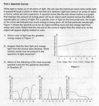
White light is made up of all colors of light. We can see the individual colors when white light is passed through a prism or when we look at a rainbow. Light can come in an array of types or forms, which we call a spectrum. A spectral curve (like the one shown below) is a graph that displays the amount of energy given off by an object each second versus the different wavelengths (or colors) of light. For a specific color of light on the horizontal axis, the height of the curve will indicate how much energy is being given off at that particular wavelength.

**Figure 1** shows the spectral curve for an object emitting more red and orange light than indigo and violet. Notice that the red end of the curve is higher than the violet end, so the object will appear slightly reddish in color.

1) **Which color of light has the greatest energy output in Figure 1?**

2) **Imagine that the blue light and orange light from the source were blocked. What color(s) would now be present in the spectrum of light observed?**

3) **Which of the following is the most accurate spectral curve for the spectrum described in Question 2?**

**Explanation of the Diagrams:**

- **Figure 1** shows a spectral curve graph with the horizontal axis labeled with colors: Violet (V), Indigo (I), Blue (B), Green (G), Yellow (Y), Orange (O), and Red (R). The vertical axis is labeled "Energy Output (per second)." The curve indicates higher energy output towards the red end of the spectrum.
  
- Three spectral curve options (a, b, and c) are provided for Question 3:
  - **Diagram (a)** shows varying energy outputs across the spectrum with distinct peaks.
  - **Diagram (b)** shows two distinct peaks with very low energy outputs in between.
  - **Diagram (c)** shows very low energy output across all colors, except for one peak.

These diagrams help visualize how different colors contribute to the overall energy output of light emitted by an object.
Transcribed Image Text:**Part I: Spectral Curves** White light is made up of all colors of light. We can see the individual colors when white light is passed through a prism or when we look at a rainbow. Light can come in an array of types or forms, which we call a spectrum. A spectral curve (like the one shown below) is a graph that displays the amount of energy given off by an object each second versus the different wavelengths (or colors) of light. For a specific color of light on the horizontal axis, the height of the curve will indicate how much energy is being given off at that particular wavelength. **Figure 1** shows the spectral curve for an object emitting more red and orange light than indigo and violet. Notice that the red end of the curve is higher than the violet end, so the object will appear slightly reddish in color. 1) **Which color of light has the greatest energy output in Figure 1?** 2) **Imagine that the blue light and orange light from the source were blocked. What color(s) would now be present in the spectrum of light observed?** 3) **Which of the following is the most accurate spectral curve for the spectrum described in Question 2?** **Explanation of the Diagrams:** - **Figure 1** shows a spectral curve graph with the horizontal axis labeled with colors: Violet (V), Indigo (I), Blue (B), Green (G), Yellow (Y), Orange (O), and Red (R). The vertical axis is labeled "Energy Output (per second)." The curve indicates higher energy output towards the red end of the spectrum. - Three spectral curve options (a, b, and c) are provided for Question 3: - **Diagram (a)** shows varying energy outputs across the spectrum with distinct peaks. - **Diagram (b)** shows two distinct peaks with very low energy outputs in between. - **Diagram (c)** shows very low energy output across all colors, except for one peak. These diagrams help visualize how different colors contribute to the overall energy output of light emitted by an object.
Expert Solution
trending now

Trending now

This is a popular solution!

steps

Step by step

Solved in 2 steps

Blurred answer