PRICE LEVEL INFLATION RATE The following graph shows the short-run Phillips curve (SPC) for the United States in 1974. Shift the curve to illustrate what happened between 1974 and 1978. UNEMPLOYMENT RATE -0- SHPC (?) The following graph shows the aggregate demand (AD) and short-run aggregate supply (AS) curves for the United States in 1974. Shift the aggregate supply curve to approximate what happened between 1974 and 1978. OUTPUT AD AS --- AS The following table presents historical unemployment and inflation data in the United States for the years 1974 through 1978. Unemployment Rate Inflation Rate Year (Percent) (Percent) 1974 5.6 11.0 1975 8.5 9.1 1976 7.7 5.8 1977 7.1 6.5 1978 6.1 7.6 Plot the data for these five years on the following graph. Note: You will not be graded on how you plot the points, but plotting the points accurately on the graph will help you examine the relationship between unemployment and inflation during this period and solve the problems that follow. INFLATION RATE (Percent) 6 5 13 12 Data Points 11 10 9 4 2 3 4 5 6 7 B 9 10 11 UNEMPLOYMENT RATE (Percent) Which of the following statements most accurately describes the relationship between inflation and unemployment in the United States during this time period? The short-run Phillips curve remained stable. The short-run Phillips curve shifted to the left after actual inflation was lower than expected. The short-run Phillips curve shifted to the right after actual inflation was higher than expected.
PRICE LEVEL INFLATION RATE The following graph shows the short-run Phillips curve (SPC) for the United States in 1974. Shift the curve to illustrate what happened between 1974 and 1978. UNEMPLOYMENT RATE -0- SHPC (?) The following graph shows the aggregate demand (AD) and short-run aggregate supply (AS) curves for the United States in 1974. Shift the aggregate supply curve to approximate what happened between 1974 and 1978. OUTPUT AD AS --- AS The following table presents historical unemployment and inflation data in the United States for the years 1974 through 1978. Unemployment Rate Inflation Rate Year (Percent) (Percent) 1974 5.6 11.0 1975 8.5 9.1 1976 7.7 5.8 1977 7.1 6.5 1978 6.1 7.6 Plot the data for these five years on the following graph. Note: You will not be graded on how you plot the points, but plotting the points accurately on the graph will help you examine the relationship between unemployment and inflation during this period and solve the problems that follow. INFLATION RATE (Percent) 6 5 13 12 Data Points 11 10 9 4 2 3 4 5 6 7 B 9 10 11 UNEMPLOYMENT RATE (Percent) Which of the following statements most accurately describes the relationship between inflation and unemployment in the United States during this time period? The short-run Phillips curve remained stable. The short-run Phillips curve shifted to the left after actual inflation was lower than expected. The short-run Phillips curve shifted to the right after actual inflation was higher than expected.
Macroeconomics: Principles and Policy (MindTap Course List)
13th Edition
ISBN:9781305280601
Author:William J. Baumol, Alan S. Blinder
Publisher:William J. Baumol, Alan S. Blinder
Chapter6: How Statisticians Measure Inflation
Section6.A: How Statisticians Measure Inflation
Problem 5TY
Question
Transcribed Image Text:PRICE LEVEL
INFLATION RATE
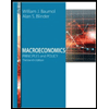
The following graph shows the short-run Phillips curve (SPC) for the United States in 1974.
Shift the curve to illustrate what happened between 1974 and 1978.
UNEMPLOYMENT RATE
-0-
SHPC
(?)
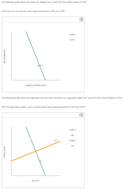
The following graph shows the aggregate demand (AD) and short-run aggregate supply (AS) curves for the United States in 1974.
Shift the aggregate supply curve to approximate what happened between 1974 and 1978.
OUTPUT
AD
AS
---
AS
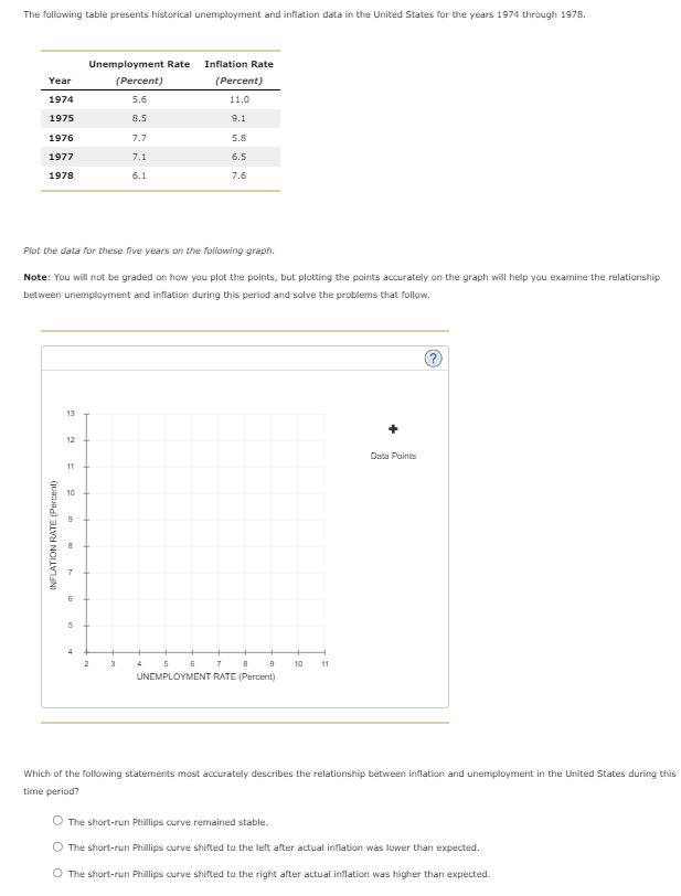
Transcribed Image Text:The following table presents historical unemployment and inflation data in the United States for the years 1974 through 1978.
Unemployment Rate
Inflation Rate
Year
(Percent)
(Percent)
1974
5.6
11.0
1975
8.5
9.1
1976
7.7
5.8
1977
7.1
6.5
1978
6.1
7.6
Plot the data for these five years on the following graph.
Note: You will not be graded on how you plot the points, but plotting the points accurately on the graph will help you examine the relationship
between unemployment and inflation during this period and solve the problems that follow.
INFLATION RATE (Percent)
6
5
13
12
Data Points
11
10
9
4
2
3
4 5 6 7
B
9
10
11
UNEMPLOYMENT RATE (Percent)
Which of the following statements most accurately describes the relationship between inflation and unemployment in the United States during this
time period?
The short-run Phillips curve remained stable.
The short-run Phillips curve shifted to the left after actual inflation was lower than expected.
The short-run Phillips curve shifted to the right after actual inflation was higher than expected.
Expert Solution
This question has been solved!
Explore an expertly crafted, step-by-step solution for a thorough understanding of key concepts.

This is a popular solution!

Trending now
This is a popular solution!

Step by step
Solved in 2 steps

Recommended textbooks for you
Macroeconomics: Principles and Policy (MindTap Co…
Economics
ISBN:
9781305280601
Author:
William J. Baumol, Alan S. Blinder
Publisher:
Cengage Learning


Macroeconomics: Principles and Policy (MindTap Co…
Economics
ISBN:
9781305280601
Author:
William J. Baumol, Alan S. Blinder
Publisher:
Cengage Learning


Economics (MindTap Course List)
Economics
ISBN:
9781337617383
Author:
Roger A. Arnold
Publisher:
Cengage Learning